News Site Redesign

News Site Redesign

How might we modernize a legacy news site to improve usability and engagement through clearer content structure and immersive reading flows?

Company

TVBS Media Inc.

My Role

Product Design Lead

Platform

Web, Mobile

Period

2024

Project Overview

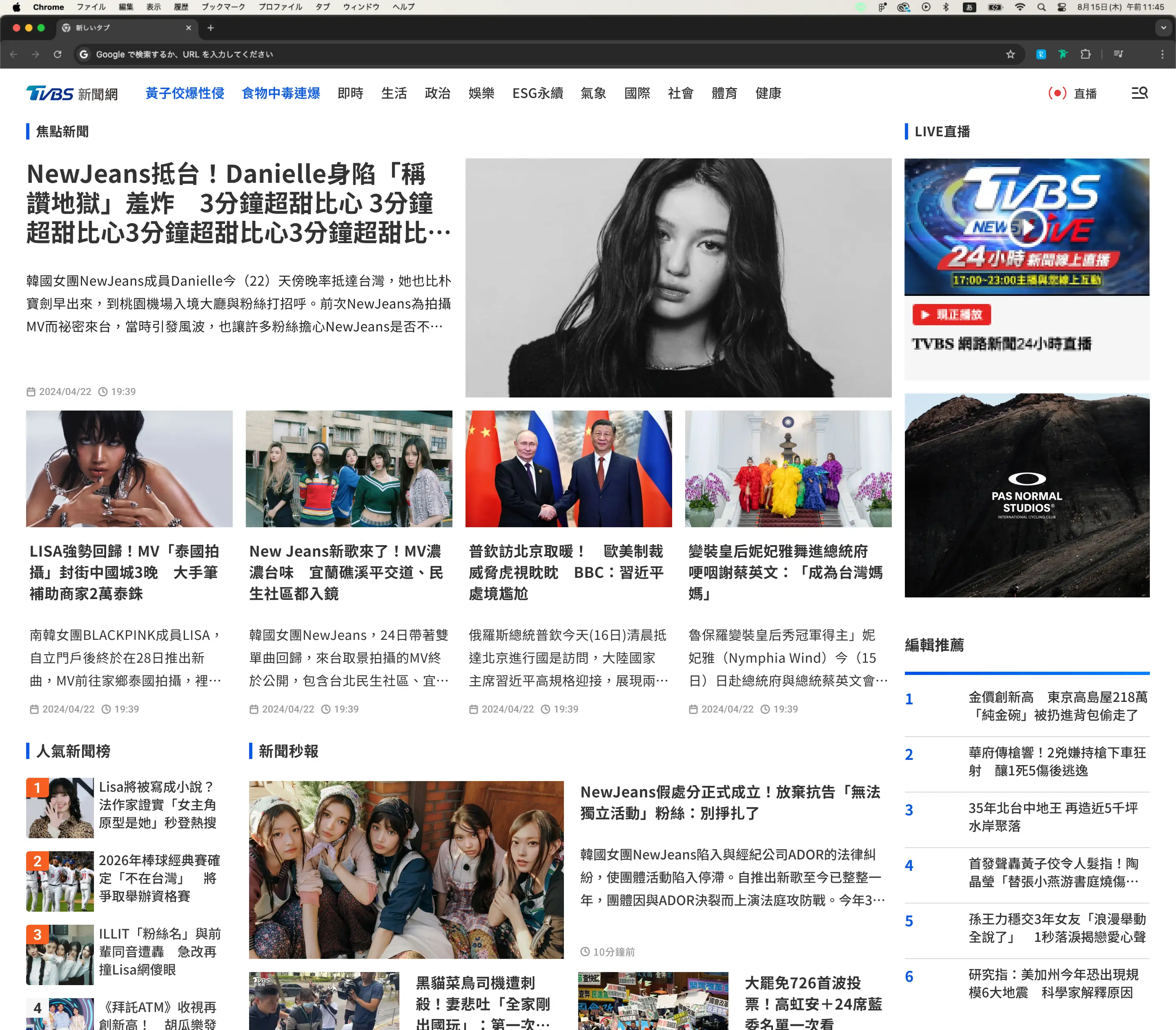
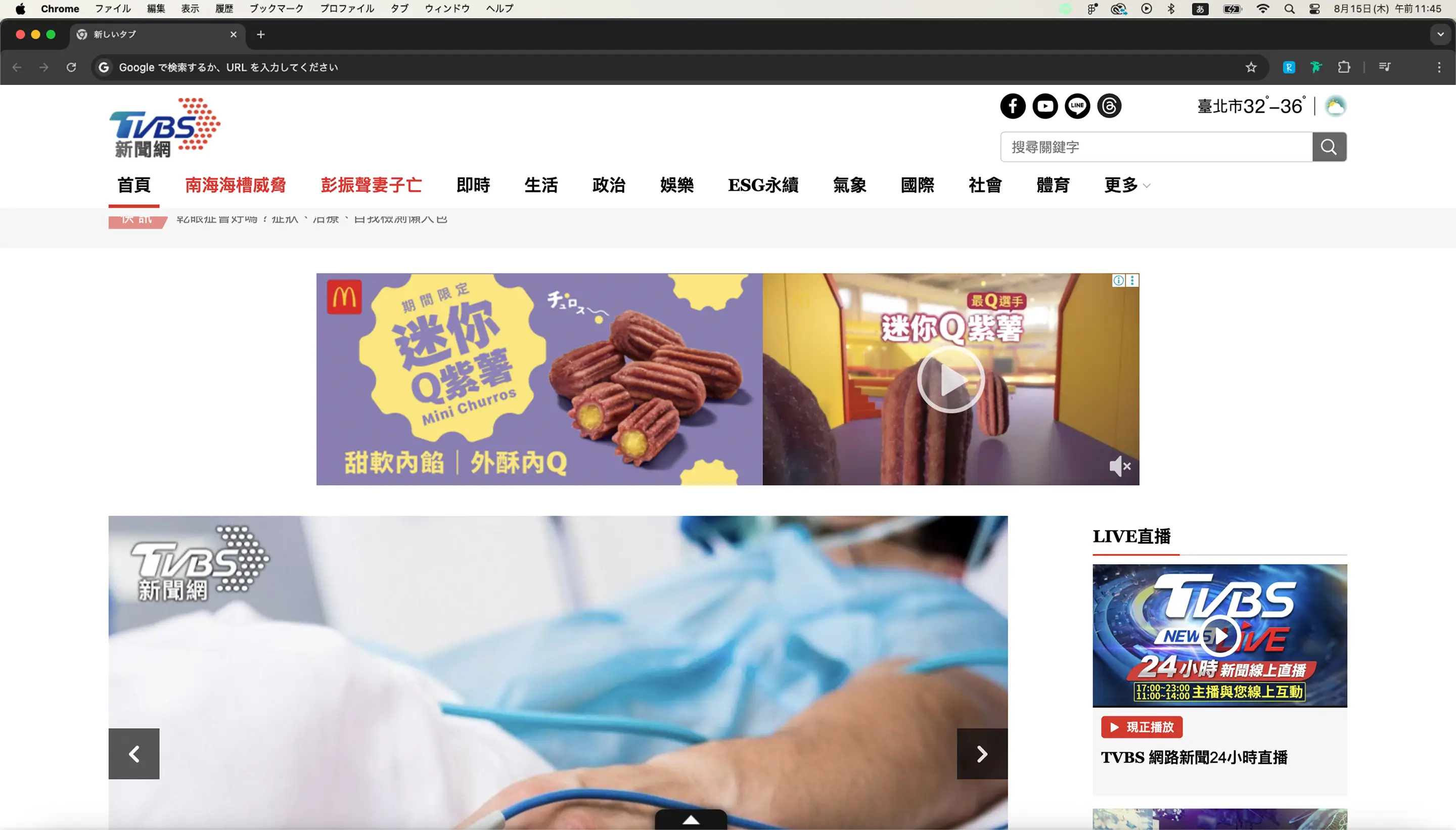
TVBS News is one of Taiwan’s leading news platforms with a large readership. Over time, however, an ad-first operation and a strong emphasis on breaking updates led to visible issues: fragmented reading flow, unclear information hierarchy, and increasingly rigid editorial operations.

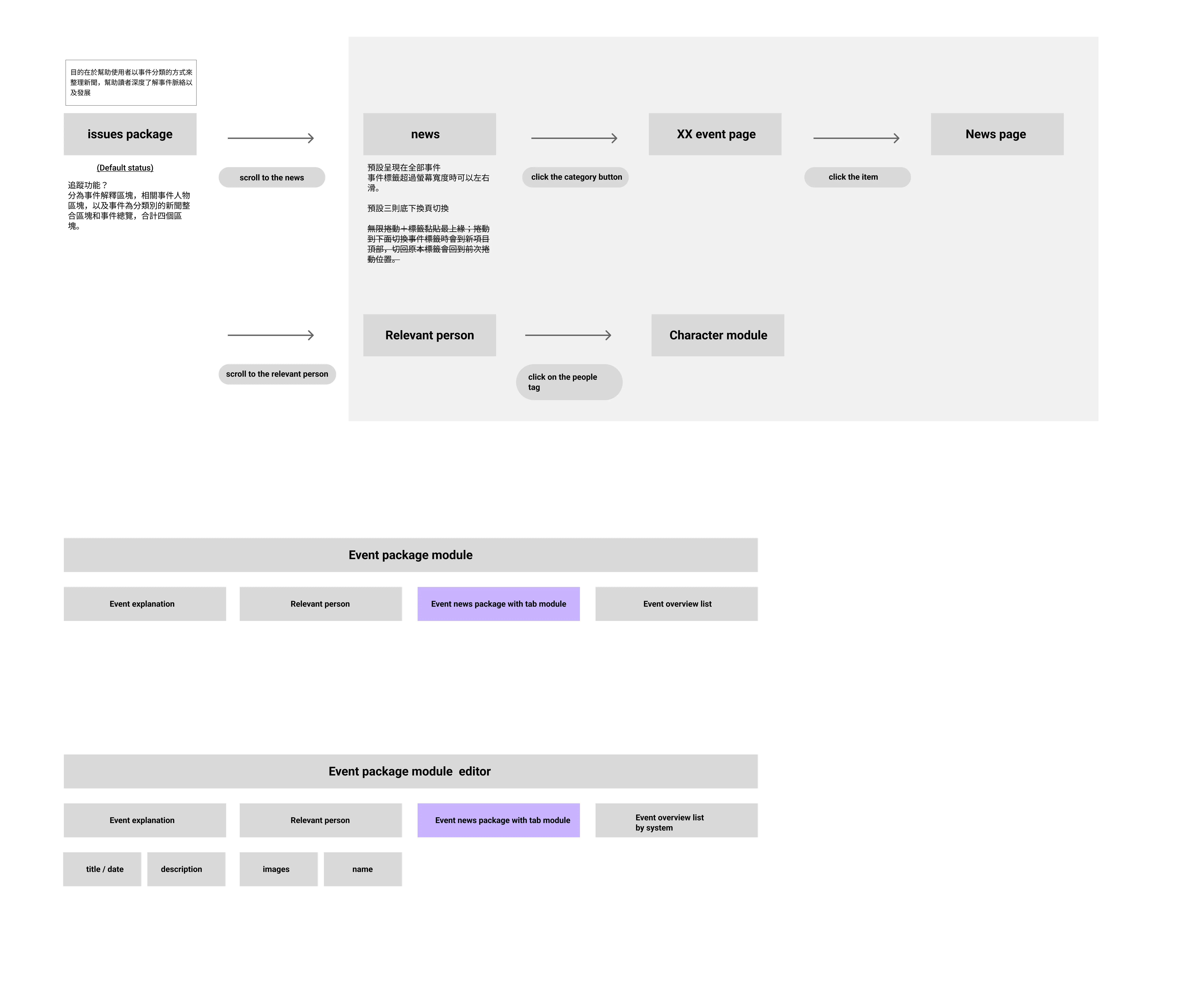
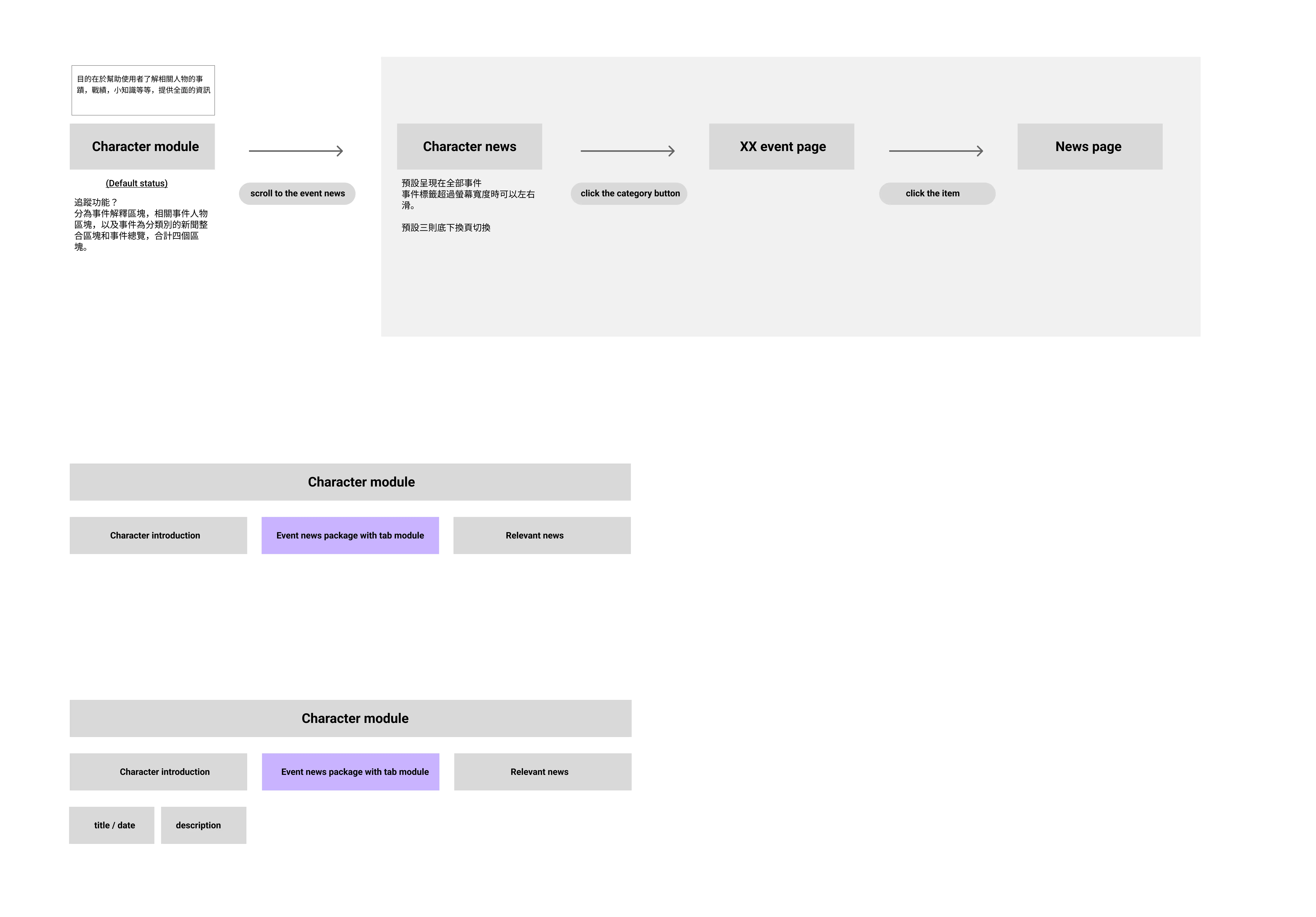
In this project, I was the sole designer and led a mobile-first redesign. Centered on restoring reading flow and clarifying story structure, the goal was to build an operational, modular storytelling system—balancing user experience, editorial requirements, and advertising constraints.

Goal
Improve reading flow by reducing cognitive interruption from dense mid-article ads.
Strengthening information hierarchy for quick comprehension
Increase session depth through clear, relevant continuation paths
Support editorial scalability with reusable modular components
Target Metrics
Metric
Baseline
Goal
Bounce Rate
69.6%
↓ under 50%
PV per Session
1.63
↑ 2.1–2.4
Mobile engagement consistency
Inconsistent
Mobile-first component system

responsibilities

Defined the core problem framing
Identified that fragmented reading flow—caused by ad placement and unclear hierarchy—was the primary driver of user drop-off, shaping the redesign direction.
Led the end-to-end redesign across web and mobile
Re-established layout rhythm, clarified narrative structure, and introduced modular content patterns to support immersive reading.
Developed a scalable component system
Content, media, and navigation modules were structured as reusable components, enabling editors to build consistent story paths without relying on ad-hoc adjustments.
Balanced user experience and ad revenue requirements
Collaborated with editorial and sales teams to preserve key ad placements while reducing cognitive interruption.
Facilitated cross-team alignment
Worked with product, engineering, and editorial stakeholders to align on scope, feasibility, and rollout sequencing.
Supported implementation through full delivery
Provided specifications, interaction documentation, and design QA to ensure accurate execution.

Problem Insights

The core issue was the breakdown of reading flow. Dense ad placements in the middle of articles frequently interrupted the narrative and caused early exits.
This issue was reinforced by several systemic factors:
1
Outdated information hierarchy
Users could not quickly scan or locate key ideas, making it harder to stay engaged.
2
Lack of guided continuation
After finishing an article, users had no contextual guidance on what to read next.
Underlying Cause
3
Limited CMS flexibility
Editors lacked the tools to structure stories consistently, which made layout and hierarchy issues persist over time.

Design Process / Strategy

I designed the process around how readers actually consume news—and why they drop off. Rather than a purely visual refresh, I focused on structural design that restores reading flow and supports editorial consistency.
Behavioral & Content Analysis
Analyzing GA4 behavioral data and scroll-depth metrics, I found that user drop-offs tended to cluster at points where ads interrupted the reading flow.
User Interview & Journey Mapping
Through 1:1 user interviews, I found clear differences in why readers consume news and how they scan content. Some want to check breaking updates quickly, some prioritize background and context, and others read passively without a specific goal—resulting in diverse behavior patterns.

Across these patterns, a shared issue emerged: dense ad placement and unclear information hierarchy frequently disrupted the reading flow.
👉 The legacy site lacked contextual clarity and modular flexibility
🧑‍🔬
“I couldn’t tell where this article fits in the full story. I need more context.”
→ (3 participants from different backgrounds)
Introduced a timeline module to show how news events evolve over time.
👩‍💼
“There’s just too much going on. My eyes don’t know where to focus.”
→ (3 participants from different backgrounds)
Refined spacing, section grouping, and layout rhythm to enhance readability.
👉 Reading flow disrupted by excessive ad placement
👩‍💼
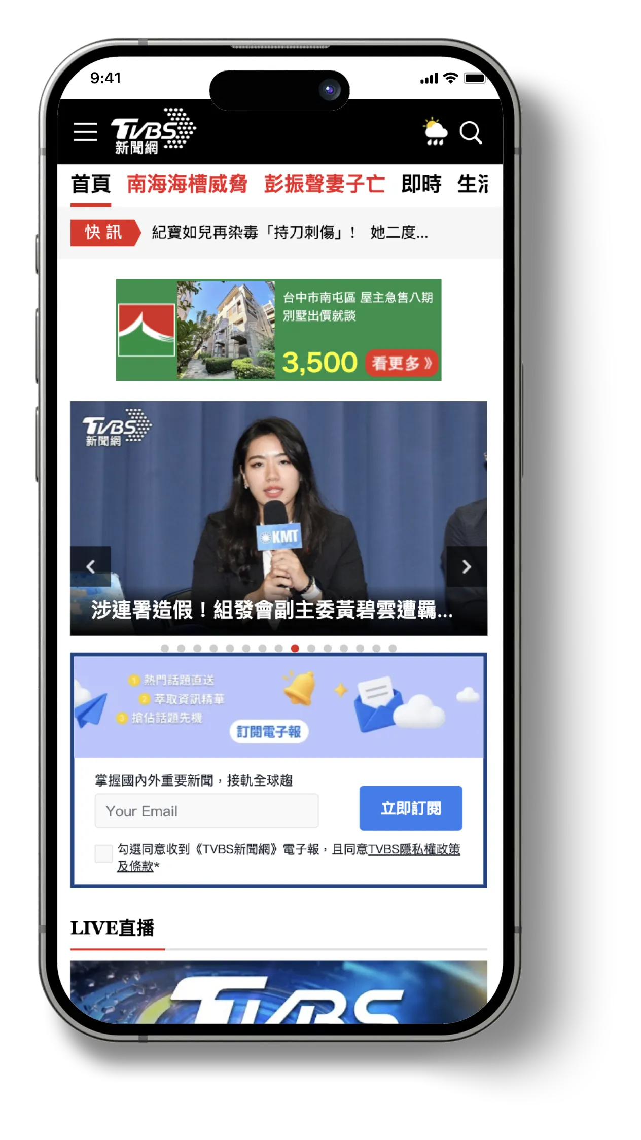
“I stopped using the TVBS app because the ads were too annoying."
→ (2 participants from different backgrounds)
Rethought the placement and density of ads, implementing modular ad blocks with minimal content interruption.
🧑‍💻
"I scroll down and immediately see the comments and ads—it’s too noisy."
→ (4 participants from different backgrounds)
Reorganized the comment section and adjusted default behavior to reduce visual overload.
👉 Users had no clear way to continue reading after finishing an article
🧑‍💻
“I finish reading and just leave. The suggestions below don't seem related.”
→ (3 participants from different backgrounds)
Designed a related content module and a “Shuffle!” exploration feature to increase relevant discovery.
🧑‍💻
“I’m not sure why these stories are being shown to me.”
→ (3 participants from different backgrounds)
Improved visual grouping and theme indicators to better communicate story relevance.
👉 Outdated backend tools made updating content slow and rigid
👩‍🔧
“While end users couldn’t directly perceive the CMS limitations, signs like outdated articles and inconsistent layouts reflected the underlying editorial inefficiencies. → (In-house news editor)
Based on these findings, we also proposed CMS design improvements—including layout previews, media handling flows, and content structure guidelines—to enhance the editorial team’s workflow.
Note
Note: Not every participant articulated root causes with the same depth, so we synthesized feedback through three archetypes—The Busy Skimmer, The Context Seeker, and The Passive Reader—to guide design decisions without overgeneralizing.
💁
See detailed Persona and User journey map
Persona
Based on insights from user interviews, I synthesized readers’ behavioral patterns into three primary reading orientations. This translated observed behaviors into a practical design model that I could directly apply to design decisions.
👩‍💼
Busy Skimmer
User Type
Office workers, Freelancers, Mobile readers
Usage Habits
  • Skims headlines and key points
  • Reads on mobile during commutes
  • Values efficiency
Pain Points
  • Distracted by intrusive ads
  • Hard to focus on key content
Design Opportunities
  • Reduce ad density
  • Improving mobile scannability
🧑‍🔬
Context Seeker
User Type
Students, Knowledge workers, Researchers
Usage Habits
  • Explores related content
  • Prefers structured guidance and context
Pain Points
  • Lacks event chronology
  • Unclear topic relationships
Design Opportunities
  • Timeline modules
  • Guided “Next to Read” Paths for Related Content
🧑‍💻
Passive Reader
User Type
Social media traffic users (FB, LINE, etc.)
Usage Habits
  • Clicks in via social media
  • Leaves quickly
  • Doesn’t explore further
Pain Points
  • No clear continuation
  • Insufficient cues to encourage exploration
Design Opportunities
  • Guided recommendations
  • Lightweight exploratory interactions
These three orientations became the basis for interaction reasoning. To visualize how each persona navigates news flows and where friction occurs, I mapped detailed user journeys.
User journey map
I also created detailed user journeys to visualize how each persona follows evolving news stories—and where friction occurs at different stages. This helped me pinpoint key friction points and clarify concrete design opportunities.
Entry Point
Enters via push notification or quick headline scan
Headline browsing from homepage or bookmarks
Clicks through from FB/LINE or a messaging app
Scanning the Article
Skims for main point and key visuals
Reads in-depth, checks related sources
Quickly scrolls, reads just the headline and maybe the lead
Seeking Context
Often skips supporting info or sub-sections
Wants timeline, background, source links
Doesn’t actively seek more info
Reaching End of Page
Stops at conclusion or gets blocked by ads
Expects related articles or structured follow-up
Sees clutter (comments or ads) and exits right away
Pain Points
• Ad placement interrupts flow
• Too many dense sections
• Hard to spot key points
• No visual timeline
• Poor grouping of related content
• Overwhelming structure
• No guided content path
• Content seems irrelevant
• Distracting layout
Design Opportunities
• Summarized content blocks
• Focused layouts with reduced ads
• Timeline module
• Topic-based aggregation
• Highlight source credibility
• Post-article suggestion (Shuffle)
• Reduce comment clutter
• More visual cues
Strategy Alignment with Editorial and Business Teams
To identify where interruptions could be reduced without harming revenue, I led alignment discussions with the editorial and sales teams. I mapped out which ad placements needed to remain fixed (non-negotiables) versus which layout areas could be adjusted, creating clear boundaries for design iteration.
Modular System Definition
Building on these findings, I designed a modular storytelling system. By structuring the experience as a set of reusable components, editors can present evolving stories with clarity and consistency—without relying on ad-hoc, one-off adjustments.

UI / UX Design Solutions

Conceptual Design Phase
Laying the strategic foundation for a scalable news experience

To address both user behavior and organizational requirements, I conducted cross-functional discovery early on—reviewing analytics, content performance, and stakeholder input.

From 2023 GA4 data, mobile was the primary traffic source: pageviews were roughly 6× higher and active users about 5× higher than desktop. However, session depth was higher on desktop. This suggested potential reading friction in the mobile experience, which led me to adopt a mobile-first design direction.

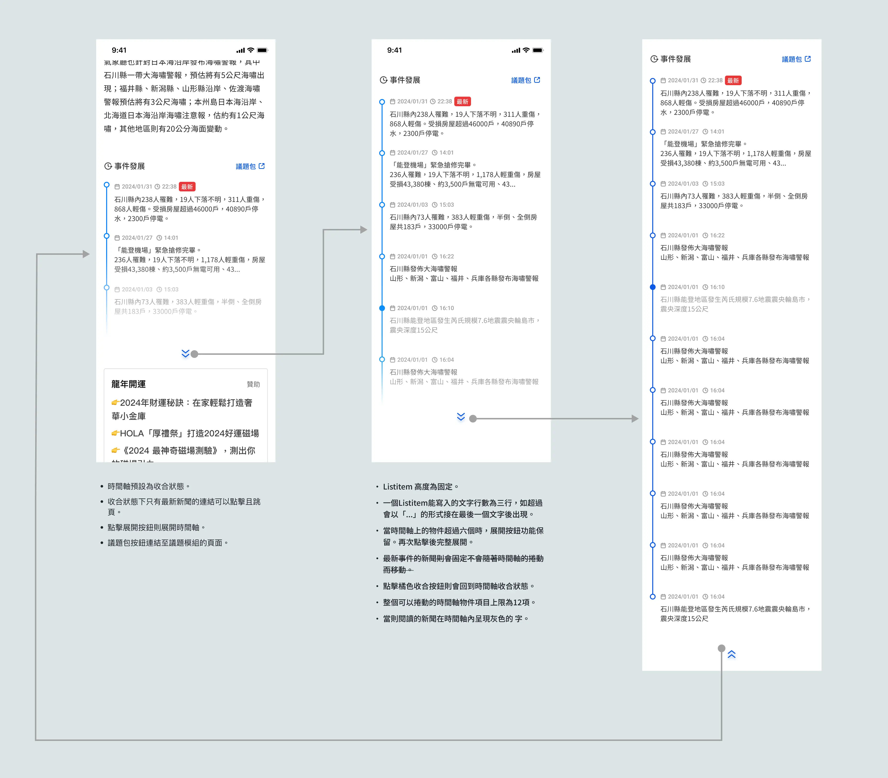
Based on personas, reading journeys, and prototype validation, I proposed 11 concept ideas and consolidated them into a working prototype for testing. I evaluated the concepts using the following criteria:

  • Information hierarchy clarity
  • Scannability and reading flow
  • Relevance of guided exploration
Feature Prioritization through User and Stakeholder Alignment
To decide which concepts should move into the next phase, I presented each feature idea to usability test participants and asked them to evaluate it based on perceived usefulness and relevance to their own reading habits. This helped identify the ideas with the highest user value.

I then led a prioritization workshop with the editorial lead, PM, and engineers to assess each concept in terms of feasibility, impact on editorial workflow, and implementation cost. The final roadmap was defined by balancing user value, operational stability for the editorial team, and technical readiness—while aligning with release timing and resource constraints.
Prioritized for Implementation
Two features were selected for initial development due to their high user impact and low editorial complexity:
1
Helping Readers Follow the Story
Timeline Module for evolving news coverage
Accelerate Business Growth at Speed and Scale with Insurtech
Problem
Readers had to open multiple articles and mentally reconstruct timelines, increasing cognitive load.
Design Rationale
What I believed was necessary was a system that surfaces chronological context directly within the reading experience, without increasing editorial overhead each time a story is updated—such as rewriting summaries or creating one-off layouts.
Solution — Timeline Module
  • Placed at the end of the article
  • Collapsed by default
  • Expandable timeline of related updates
  • CMS-driven item management
Outcome
Readers gain context at a glance, increasing the likelihood of continued reading within the same story cluster.
2
Encouraging Continued Reading
“Shuffle Next” Exploration Button
Accelerate Business Growth at Speed and Scale with Insurtech
Problem
Generic recommendations failed to motivate continued reading.
Design Rationale
Provide a low-effort, interactive way to continue browsing that doesn’t rely on personalization—so readers can actively surface something that matches their current interest.
Solution — Shuffle Next

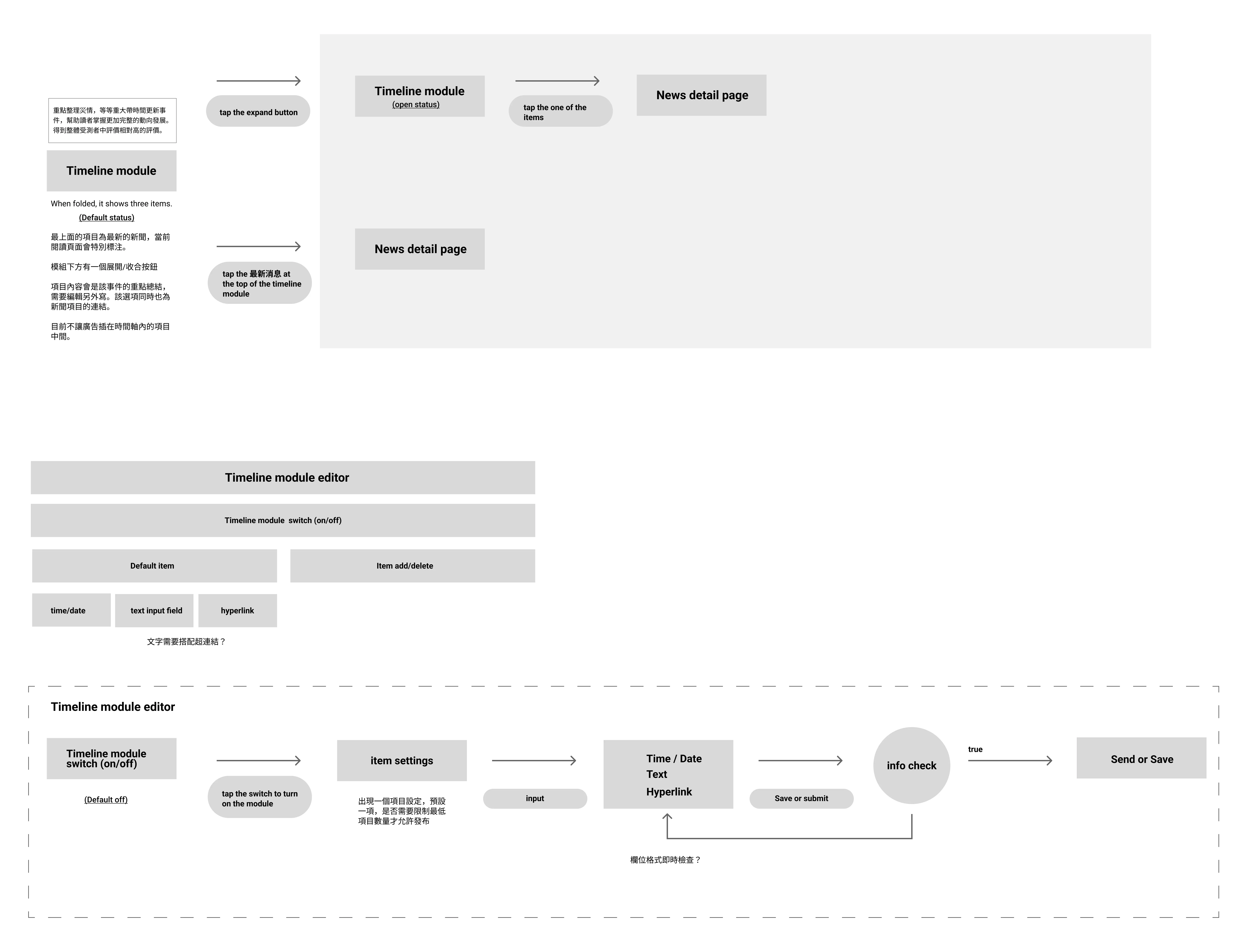
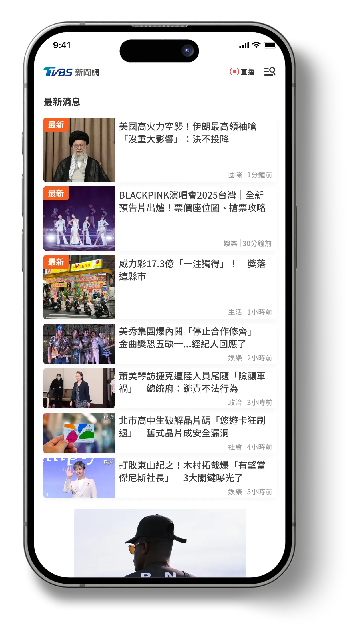
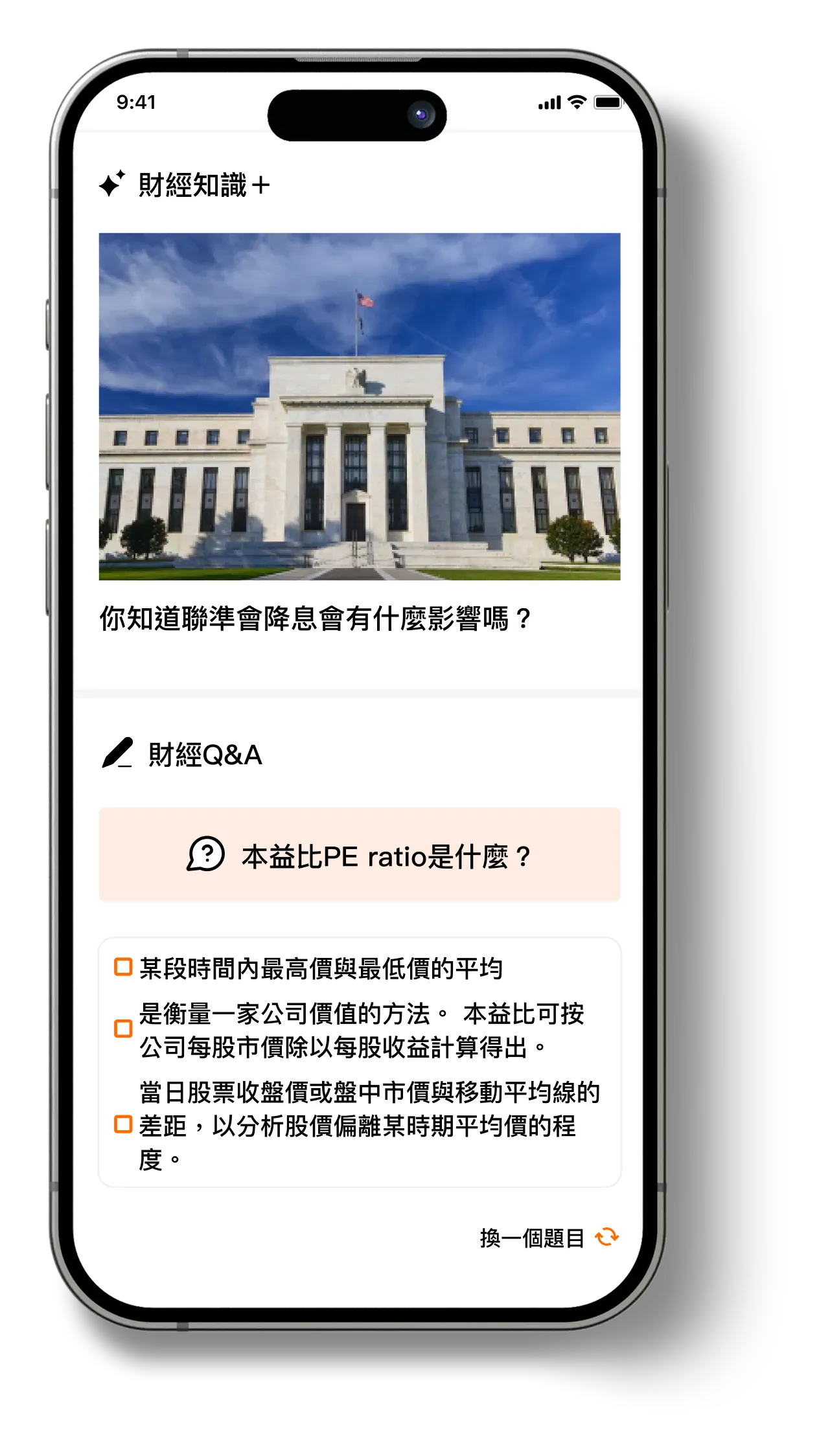
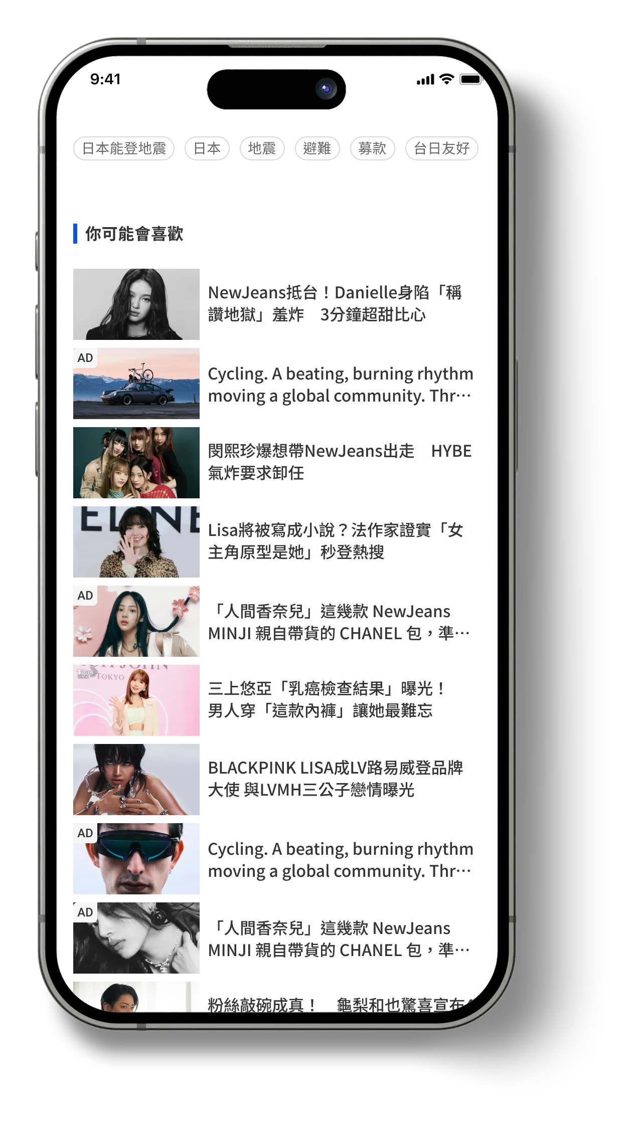
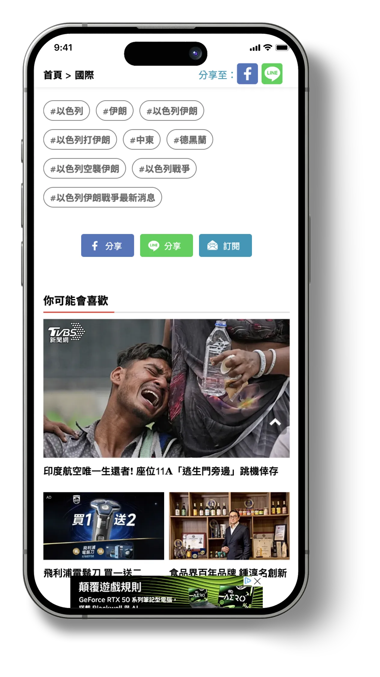
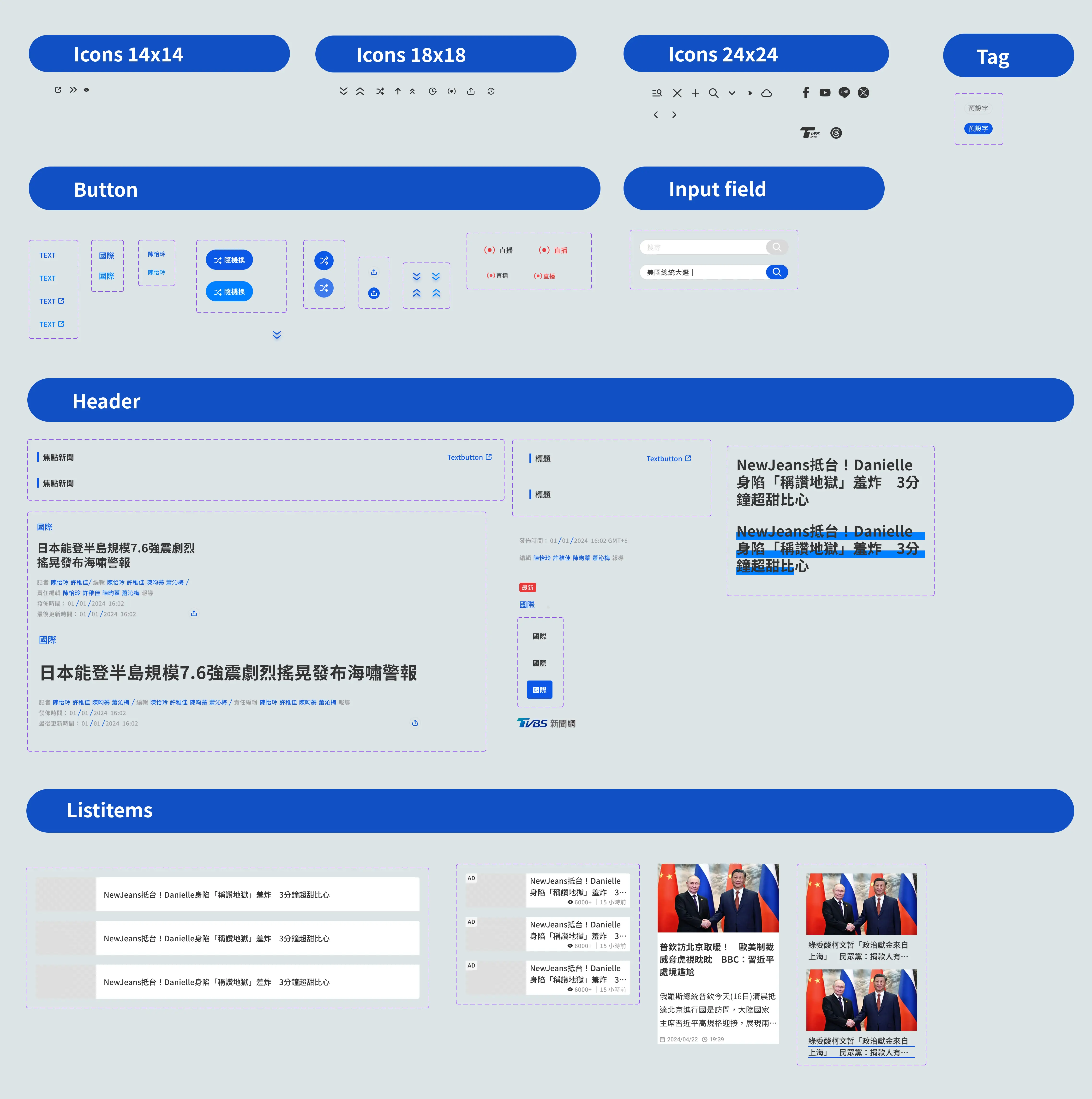
A lightweight module at the end of the article. I designed it so that each tap surfaces three fresh stories drawn from a mix of trending, recent, and under-explored categories.

  • Emphasizes category diversity and recency to widen discovery
  • Avoids user-specific targeting; no profiles or history needed
  • Refreshes on every tap so readers can interact until something feels right
Outcome
By letting readers interact and “roll” into something relevant, session depth increases the likelihood of continued reading, extending discovery beyond habitual reading patterns.
Additional Prototypes for Exploration
The following high-fidelity prototypes were explored as part of a phased redesign roadmap. While they were not included in the initial release, their effectiveness was validated through user research and internal reviews, and they are planned for implementation in a future development phase.
3
Dropdown Index for Long Reads
Jump-to-section functionality for easier navigation in long-form journalism.
Accelerate Business Growth at Speed and Scale with Insurtech
Problem
Readers of long-form articles often lose track of structure and need to manually scroll to find specific sections.
Design Rationale
We needed to improve navigability without breaking immersion or requiring article restructuring.
Solution — In-Article Dropdown Index

Detects section headers automatically

  • Displays a compact dropdown near the article start
  • Allows quick jump to any section
  • Works across mobile and desktop layouts
Outcome
Reduces scroll fatigue and improves retention for long-form content.
4
Real-Time & Trending Indicators
More immediate visual language to highlight urgency.
Accelerate Business Growth at Speed and Scale with Insurtech
Problem
Readers often could not distinguish between breaking news and regular articles.
Design Rationale
The signaling needed to be clear but not overwhelming or sensational.
Solution
  • Unified tag system for “Live” / “Trending”
  • Consistent iconography and color tokens
  • Clear placement above headlines
Outcome
Improves attention routing and reduces scanning effort.
5
Issue Packages
Thematic News Bundles for evolving storylines
Accelerate Business Growth at Speed and Scale with Insurtech
Problem
Readers following ongoing events often struggle to locate all related articles across days or weeks.
Design Rationale
We needed a way to group articles under a shared storyline that updates over time, without requiring editorial rewriting.
Solution — Issue Packages
  • Automatically groups related articles through tags and editorial logic
  • Presents content as a vertical timeline on a dedicated hub page
  • Allows readers to follow the story chronologically and jump directly to specific update points
Outcome
Improves comprehension of complex or evolving news stories and increases depth of article exploration.
6
Public Figure Pages
A persistent profile hub summarizing biography, coverage history, and recent news mentions.
Accelerate Business Growth at Speed and Scale with Insurtech
Problem
Readers often recognize names but lack background context to understand who the person is or why they matter in the news.
Design Rationale
Providing stable identity hubs helps users build context without requiring separate searches.
Solution — Public Figure Profiles
  • Auto-aggregates articles mentioning the person
  • Includes short background description and related topics
  • Accessible via name links in articles or a dedicated directory
Outcome
Builds deeper context and supports broader exploration across related coverage.
Category-Specific Concepts
7
🎬 Entertainment Section Enhancements
Problem
Entertainment readers often browse casually and rely on familiar names rather than categories.
Design Rationale
We needed to make exploration fun, low-effort, and personality-driven.
Solution
  • Region-based segmentation (J-POP / K-POP / Western)
  • Related celebrity modules to surface recent updates
  • Lightweight interactive elements (e.g., quizzes or mini-highlights)
Outcome
This improves reading flow and increases both time spent per visit and depth of engagement.
8
⚽️ Sports Section Enhancements
Problem
Sports content is often followed intermittently, and readers who return after some time frequently lose context, making ongoing stories difficult to follow.
Design Rationale
We needed to offer fast catch-up formats that fit daily consumption.
Solution
  • Summarizes key matches, stats, and highlights of the day
  • Allows users to catch up with minimal scrolling
  • Works well for both casual and dedicated fans
Outcome
Strengthens daily engagement and encourages habitual return.
9
💵 Finance Section Enhancements
Problem
Casual readers feel intimidated by dense terminology and unfamiliar market structures.
Design Rationale
We aimed to provide “entry ramps” to make financial news easier to start and continue reading.
Solution
  • Mini explainer cards embedded within articles
  • Introduces key terms and context in simple language
  • Repeated across articles to reinforce familiarity
Outcome
Boosts accessibility and improves willingness to revisit financial news.
Core Experience Redesign
While homepage traffic was lower than article consumption, the redesign was treated as a broader system improvement rather than a homepage-only refresh. I focused on four core areas: reimagining the homepage as a brand entrance and content anchor, restoring reading flow on article pages, consolidating navigation through a scalable hamburger menu, and establishing a modular design system to support editorial consistency and iteration.
10
Homepage Recomposition
A homepage redesign that balances brand presence with efficient access to key content.
Accelerate Business Growth at Speed and Scale with Insurtech
Although homepage-driven traffic is not as high as article consumption, I determined that the homepage still plays an outsized role as a brand entry point—shaping user perception and influencing referral paths. Based on this, I proposed a layout that emphasizes a multi-story carousel, a “Week in Review” section to summarize key takeaways, and an “Upcoming Events” area to highlight what’s next. This structure maintains a balance between brand expression and information access, while naturally guiding users through the most important narratives.

For the design concept, I referenced practices from leading international media and structured the page around category-based content blocks organized by recency and importance. The overall palette retains TVBS’s signature blue to convey professionalism and a calm tone. With a clean layout and generous spacing, the experience feels more breathable and reduces visual fatigue.

Looking ahead, these content blocks are designed to be extensible—potentially enabling personalization based on user preferences. Given that homepage ad revenue carries relatively less weight, I also reserved flexible space that can be used when needed, without compromising clarity.
👇 Compared with legacy design
Challenges with the Previous Homepage Design
The original homepage suffered from visual clutter and inconsistent UI elements. An oversized livestream button redirected users away from the main page experience, while the listitem components varied in structure and spacing.

On mobile, limited screen real estate was not effectively utilized, leading to cramped layouts and poor hierarchy. Conversely, the desktop layout—despite having ample space—felt visually overwhelming due to disproportionate scaling and density of elements.
11
Article Page Redesign
An article page redesign that restores reading flow by prioritizing clarity, readability, and content focus.
Accelerate Business Growth at Speed and Scale with Insurtech
To address users’ main pain point—difficulty distinguishing core content from cluttered ads—we redesigned the article page as a key application of the new design system. In collaboration with editorial, business, and advertising stakeholders, I identified high-performance ad placements that should remain unchanged for revenue reasons, while introducing visual and content guidelines to reduce intrusive formats and prioritize readability.

The updated layout preserves the premium “sky banner” ad at the top, followed by a large magazine-style image that visually anchors the article. Redundant UI elements—such as multiple social share buttons and font size controls—were removed in favor of leveraging native device features. This approach simplifies the interface and prioritizes readability, resulting in a more focused and seamless user experience.
To better solve the identified user pain points, we analyzed second-half 2024 data:
👉
Total site traffic: 400 million visits
👉
Total clicks: 90 million
👉
Click share of original 24-category navigation bar: 0.53%
👉
Search bar: 0.05%
👉
Breaking news ticker (“快訊”): 0.11%
👉
Font size change buttons: 1.25%
👉
Social sharing buttons (Facebook, Line, Newsletter): 1.06%
In the old design, key UI elements reduced the content area and increased visual complexity. Based on this, my direction was not full removal, but organization and consolidation.

I consolidated navigation into a hamburger menu. While its usage rate is low (0.06%), I kept it as an access path for users who still need it. I also merged sharing into a single, clear button.

For text size, I aligned article typography with the device’s native text-size settings in coordination with engineering. This decision was informed by the observation that older users often adjust system-level text size. If supported well, this approach can replace the in-UI font-size toggle, and I plan to validate it through post-release user feedback.

The breaking-news ticker was repurposed as an ad slot, but interviews showed that 3 out of 4 participants skipped it. This indicated the module had lost its original information value, so I determined a realignment with stakeholders was necessary to restore its intended purpose.
Improved Layouts Based on User Insights
Redesigned article pages focused on simplifying the interface, consolidating actions, and improving readability across all screen sizes.
1
Streamlining Based on Usage Data
Low-engagement elements were removed or nested within the hamburger menu to declutter the interface and improve content visibility.
2
Reducing Visual Clutter for Better Readability
On the left, visual clutter from ads and sharing tools was reduced, and low-engagement tags were grouped horizontally to preserve vertical space and improve scanability.
3
Designing for Both Clarity and Performance
On the right, ad units were reformatted into list-style items to create a cleaner layout and increase visibility.
👇 Compared with legacy design
Legacy designs with cluttered interfaces, inconsistent visual focus, and overlapping functionalities.
📌 Hamburger menu REdesign
Refining the Navigation Experience
The new hamburger menu consolidates previously scattered navigation elements into a unified, scalable structure. High-priority features such as search and issue-based content packages are now grouped within the menu, alongside the full category navigation that was formerly displayed externally.

The revised structure also anticipates future needs—allowing for the addition of nested submenus as the editorial team expands its content offering. Account access, newsletter subscriptions, and app download links are also integrated here, streamlining the entry points for various user actions.

Additionally, a theme toggle option appears within the menu, enabling users to adjust between light and dark modes based on system preferences or personal choice.
📌 Design System
To support long-term consistency and scalable updates—while minimizing editorial overhead—I built a modular design system. This enabled internal teams to manage UI variations efficiently while preserving TVBS’s brand value and visual consistency.

The system is anchored in TVBS’s signature blue, conveying calmness, professionalism, and credibility. Given the content-heavy nature of the site—with numerous ads and media assets—I emphasized clarity through structured layouts, visual hierarchy, and simplified containers that minimize distractions and direct user focus to the most relevant content.
Establishing Visual Consistency
From typography and color tokens to component libraries, each element was carefully crafted to reflect TVBS’s brand values while supporting a consistent, efficient design process across various content types and layouts.
Establishing Visual Consistency
From typography and color tokens to component libraries, each element was carefully crafted to reflect TVBS’s brand values while supporting a consistent, efficient design process across various content types and layouts.
Color value
Token
Elemennts

Team & Ownership

Key Design Ownership
This project was a highly collaborative effort across the Editorial, Business, and Product teams. Throughout the research, planning, and implementation phases, I partnered closely with stakeholders to align on goals, constraints, and feasibility. Within that collaborative process, I took ownership and led the following key design areas:
1
Reconciling Editorial and Business Goals
Redesigned article and homepage layouts to improve readability and narrative flow while accommodating editorial workflows and advertising constraints—balancing user experience with revenue considerations.
2
Design System Development
Established a modular design system covering content blocks, ad placements, and thematic modules, ensuring visual consistency while maintaining editorial flexibility.
3
Early Concept Testing & Prototyping
Created low- and high-fidelity prototypes to validate content hierarchy, reading flow, and micro-interactions. Iterated based on usability findings and technical feasibility.
4
Cross-Team Design Facilitation
Translated user insights into actionable wireframes and specifications, coordinating closely with engineers, product managers, and editorial stakeholders to maintain alignment throughout the process.
Team Collaboration
Collaborated with PMs, engineers, editorial leads, and ad sales to ensure the redesign served both user needs and business priorities.
Facilitated working sessions to help stakeholders converge on shared objectives, transforming complex editorial input into clear design decisions.
Also supported proposal presentations to senior leadership to align on strategic direction.

Impact & Takeaways

Although the redesigned experience was not launched before my departure, the proposed improvements were fully aligned with stakeholder KPIs and business goals.The updated structure, modular components, and exploration patterns were designed to increase engagement, reduce bounce rate, and provide a scalable foundation for future growth.
Validated UX Improvements
Early usability testing confirmed that the modular layout significantly improved clarity and reading continuity—especially for mobile-first users.
Strengthened Cross-Team Alignment
By grounding decisions in data and user insights, I helped build shared ownership across editorial, product, and business stakeholders, reducing friction and accelerating decision-making.
Introduced Product Thinking into Editorial Process
Shifted the conversation from page-level visual adjustments to system-level experience strategy, supporting long-term digital transformation efforts.
Established a Scalable Design Foundation
Defined principles such as timeline-based storytelling, thematic clustering, and modular content blocks that enable future personalization and richer engagement patterns.
Key Learnings
1
Aligning Stakeholders & UX Goals
Developed frameworks to balance diverse team priorities while keeping user needs at the center.
2
Merging Data with Qualitative Insight
Strengthened my ability to synthesize analytics and interview findings into actionable design strategy.
3
Navigating Digital Transformation in Legacy Contexts
Learned how to guide teams through organizational habits and constraints to unlock progress.
4
Designing Beyond UI
Reinforced the role of design as a lever for strategy, alignment, and long-term product direction, not just interface creation.