Launchpad

Launchpad

How can we empower SME insurers to efficiently create user-friendly product pages in their journey toward digital transformation?

Company

OneDegree Global

My Role

Sr. Product Designer

Platform

Web, SaaS

Period

2022

Project Overview

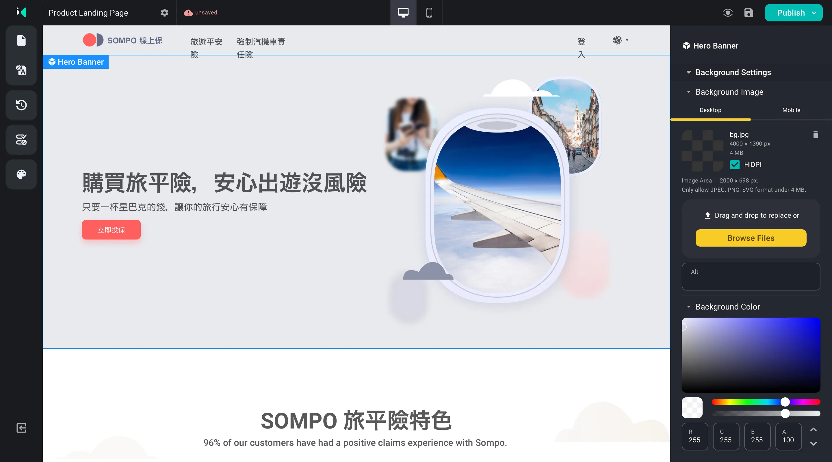
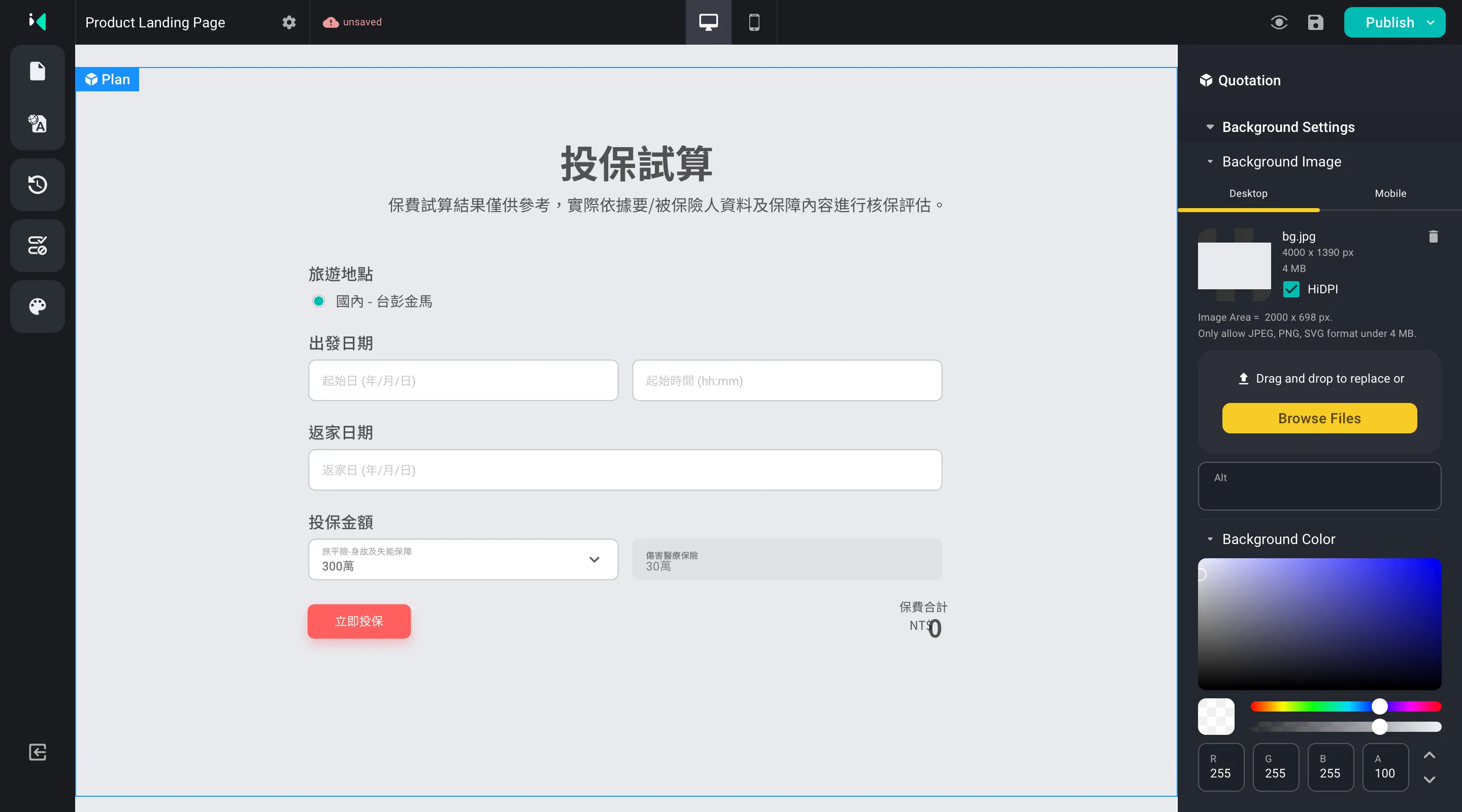
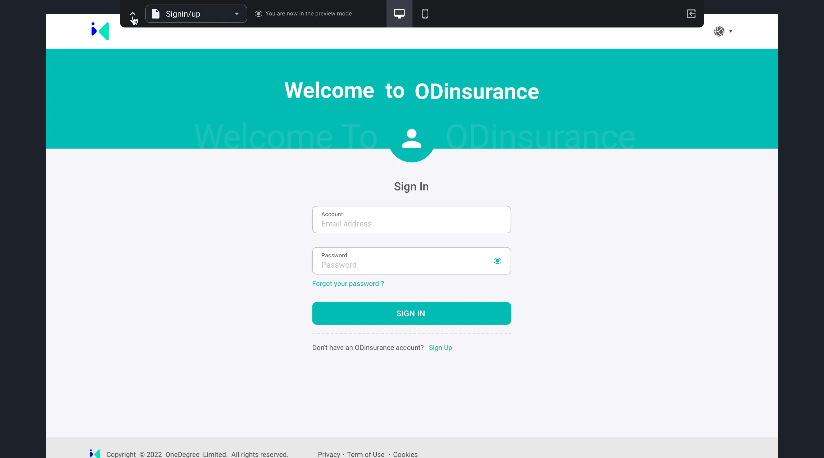
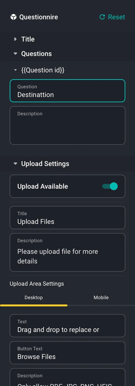
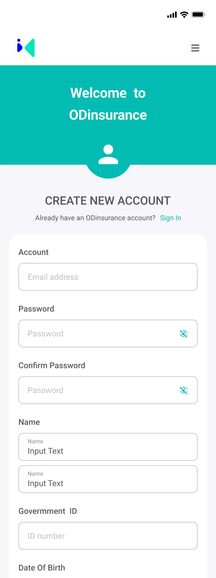
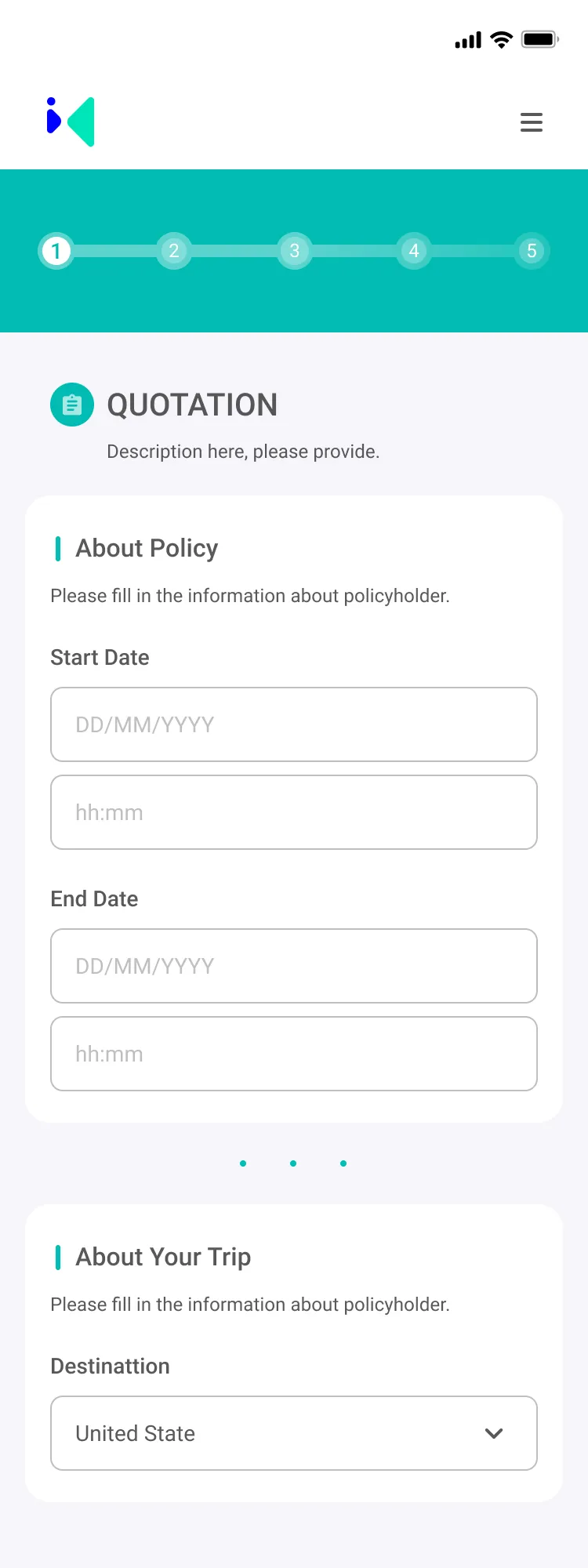
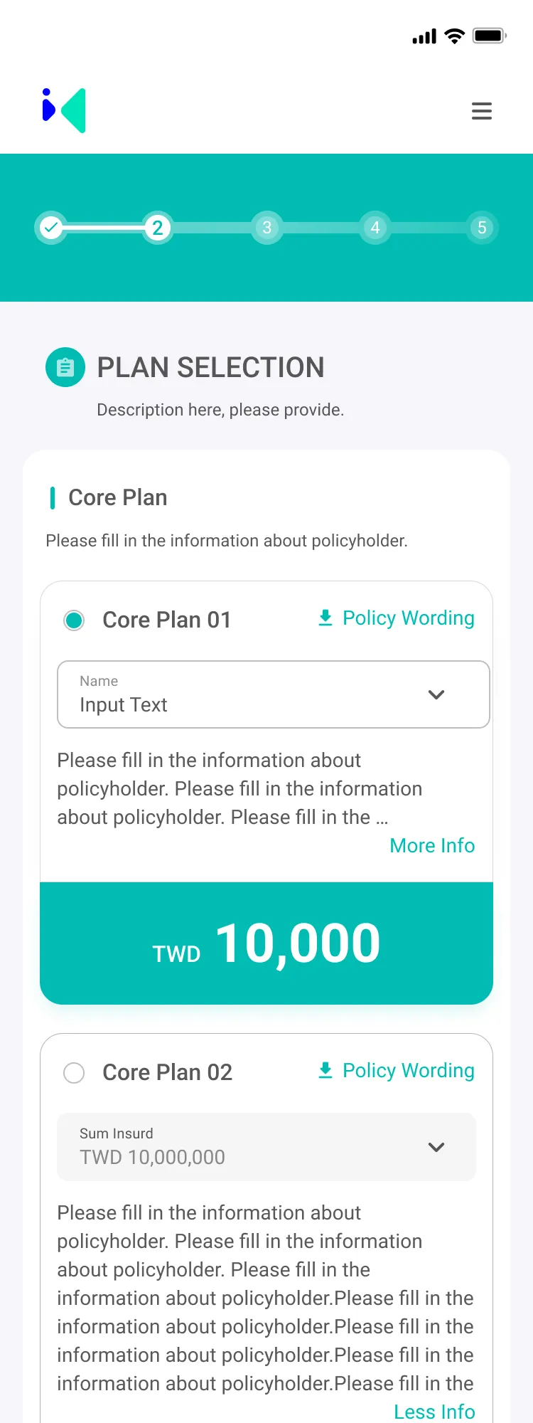
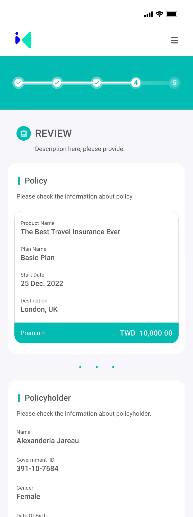
Launchpad is a modular content and product-page builder designed for small and medium-sized insurers who need to move faster but don’t have large in-house IT teams.

Before Launchpad, every new campaign or product update often required a custom build: marketing needed to brief product teams, product had to wait for developers, and releases regularly took more than three months to complete. Page layouts were inconsistent across products and brands, and even simple copy changes required engineering involvement.

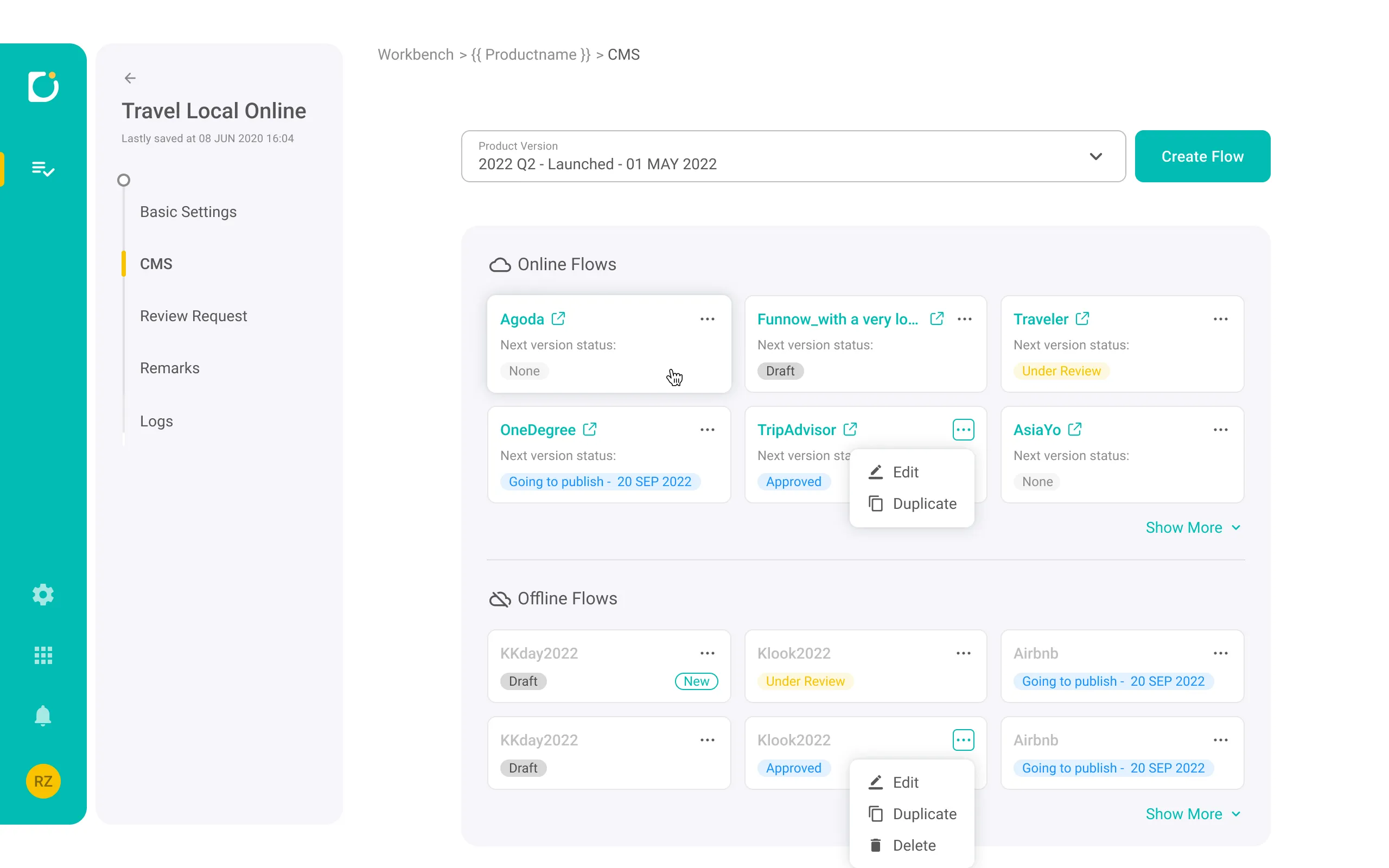
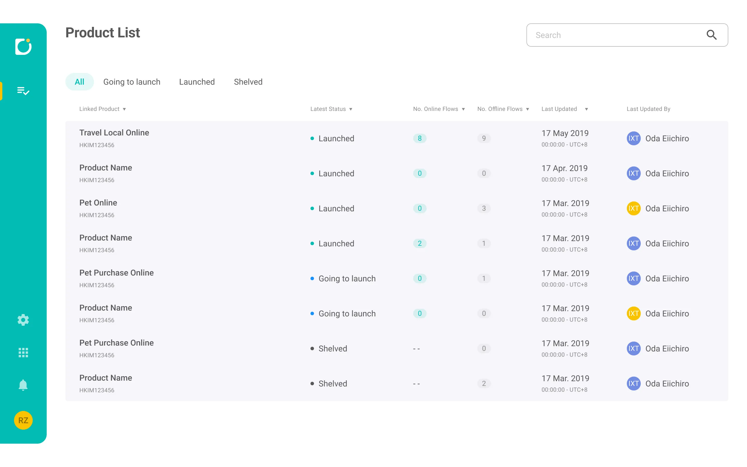
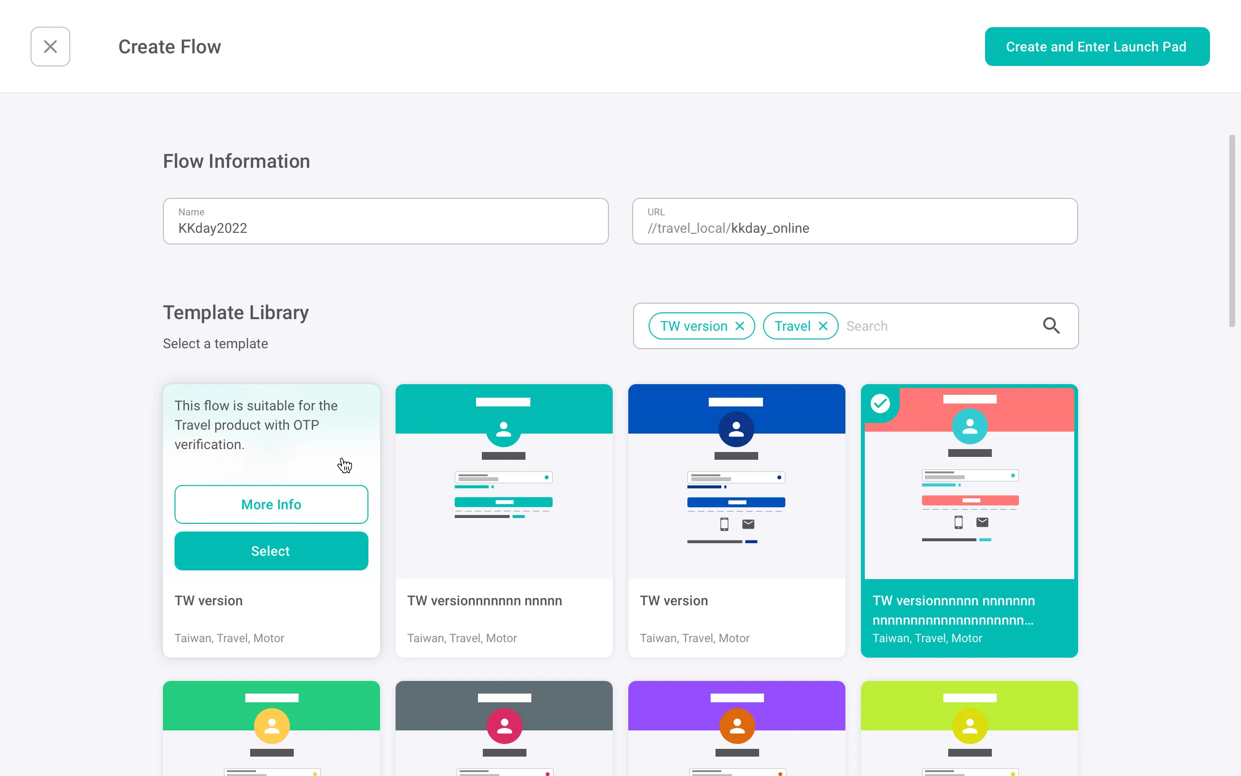
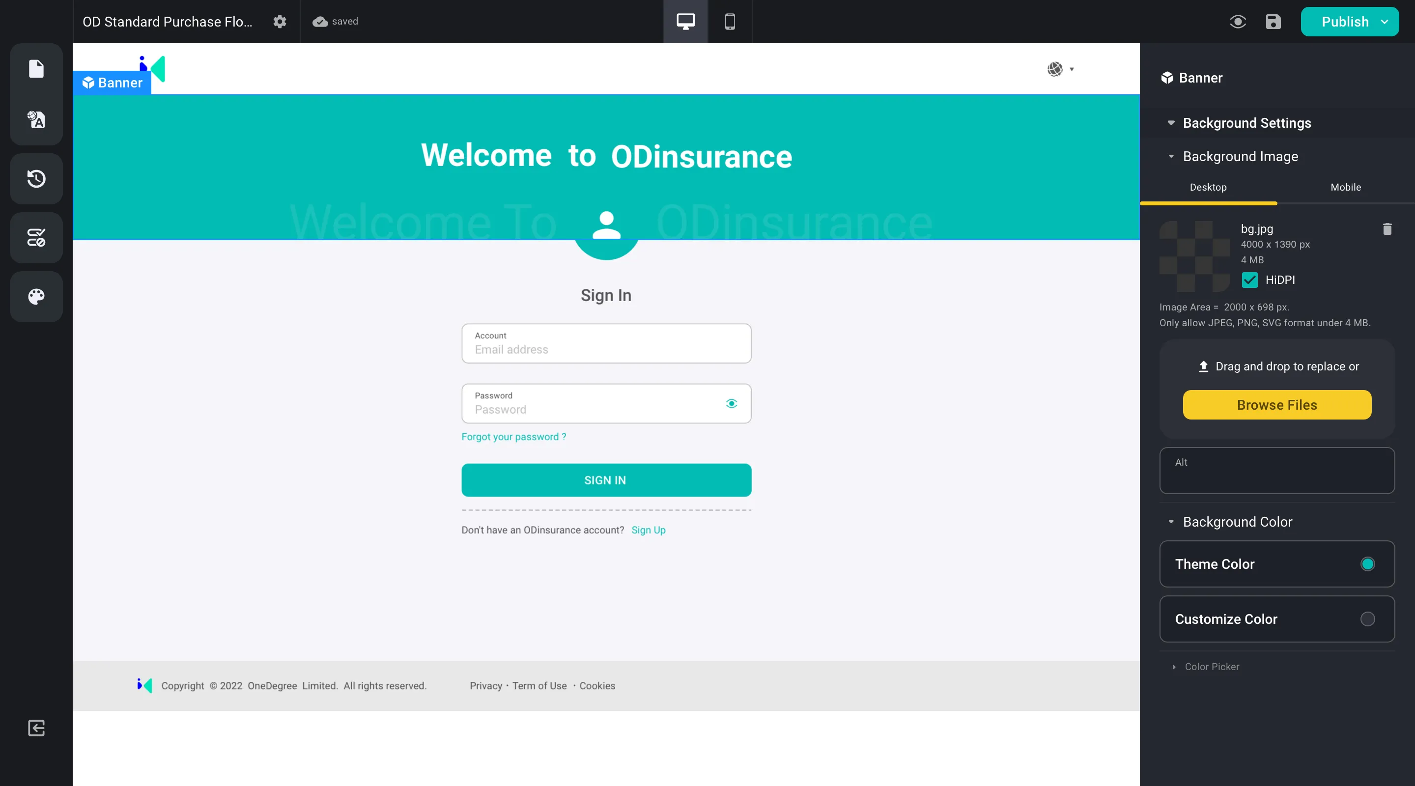
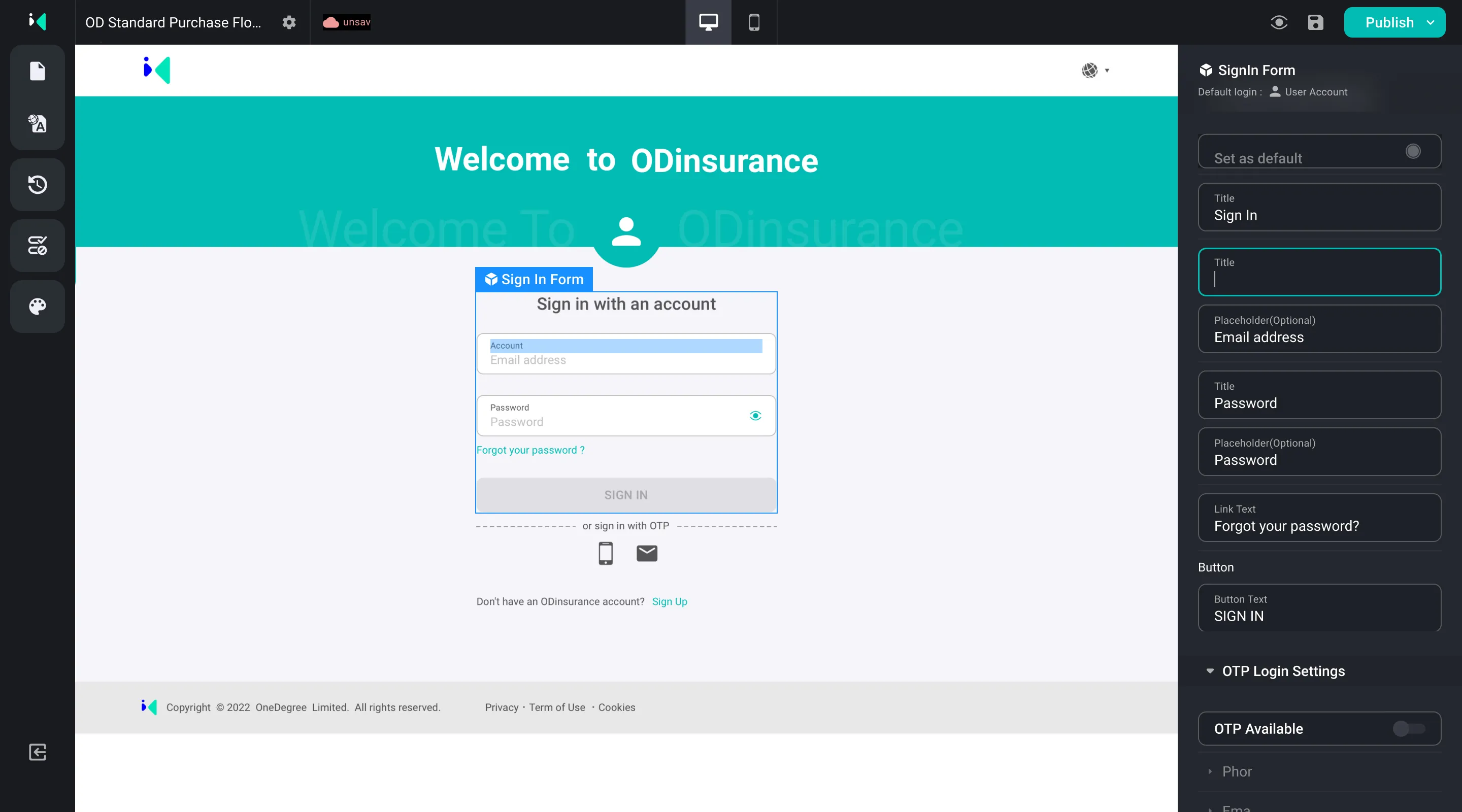
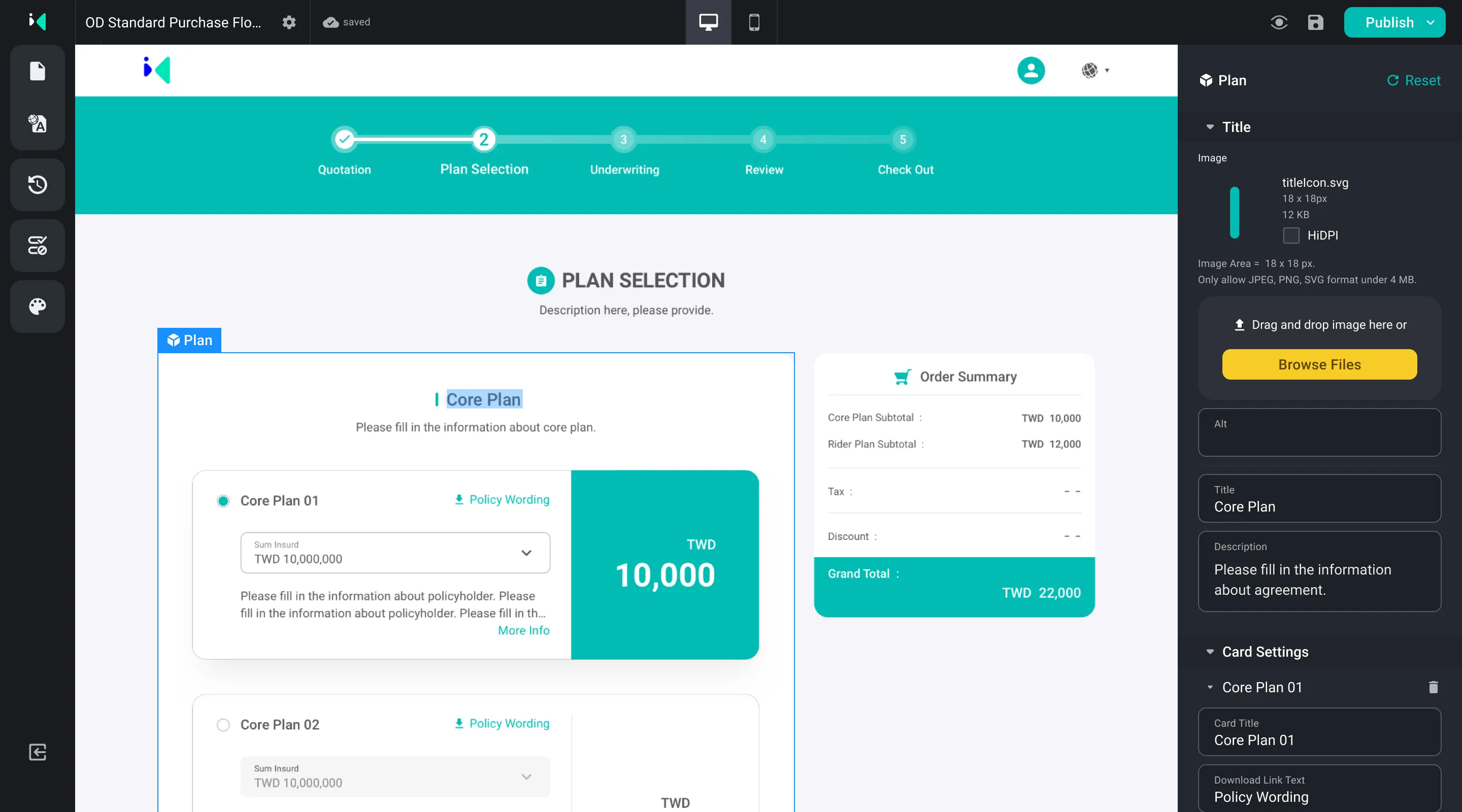
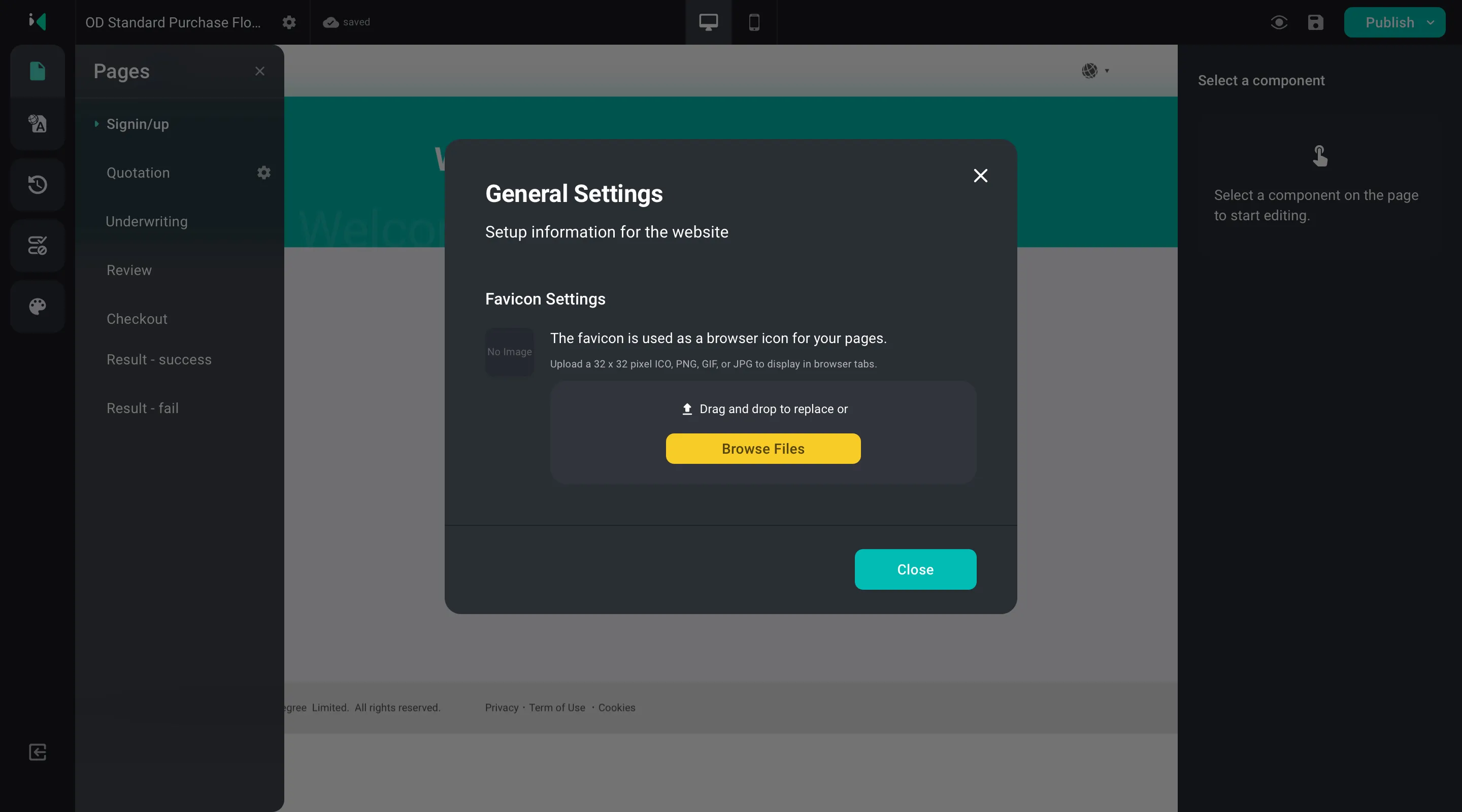
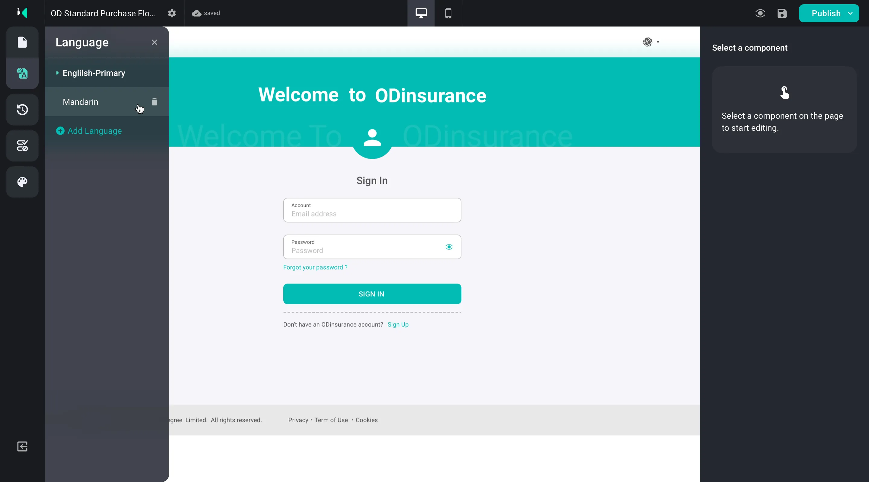
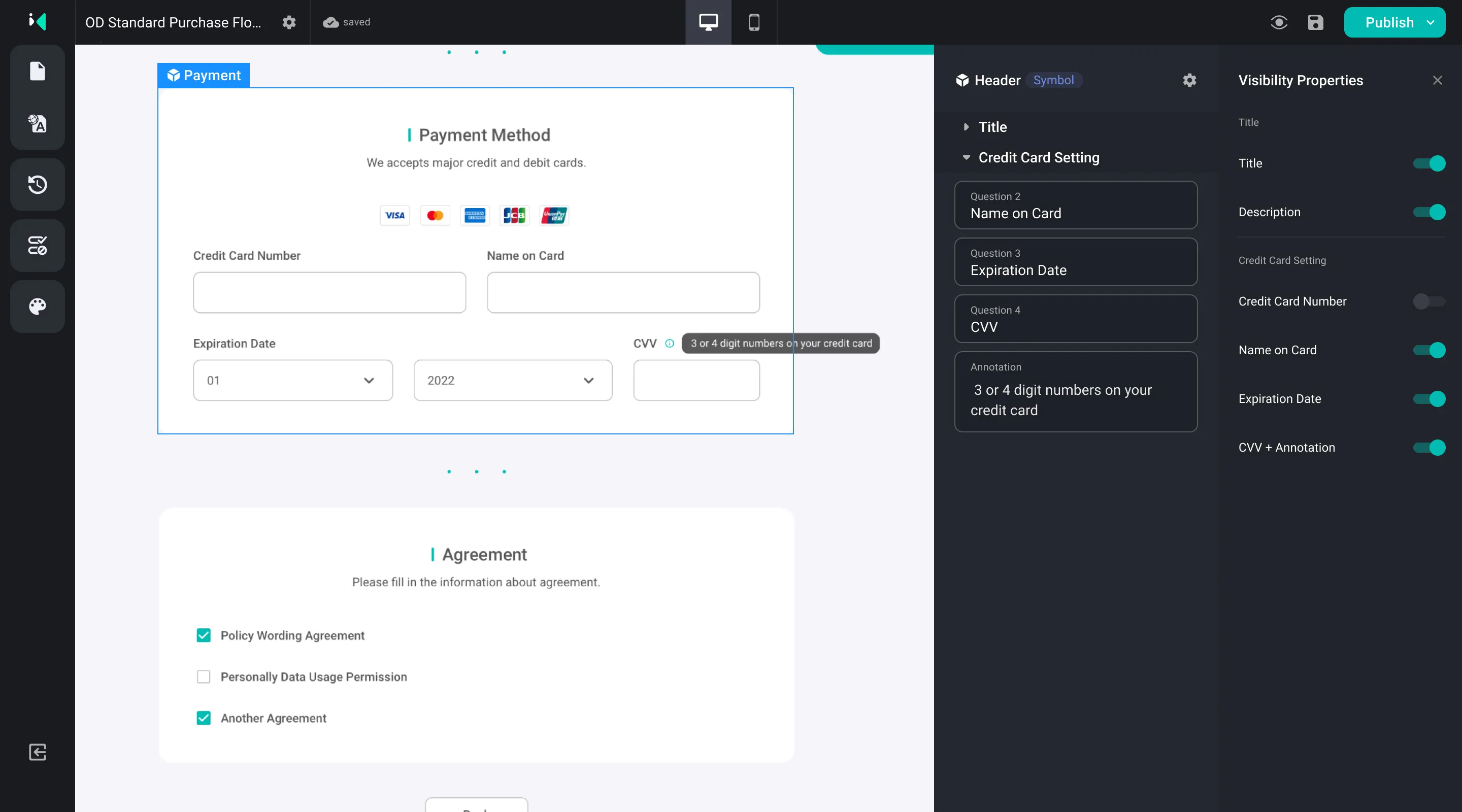
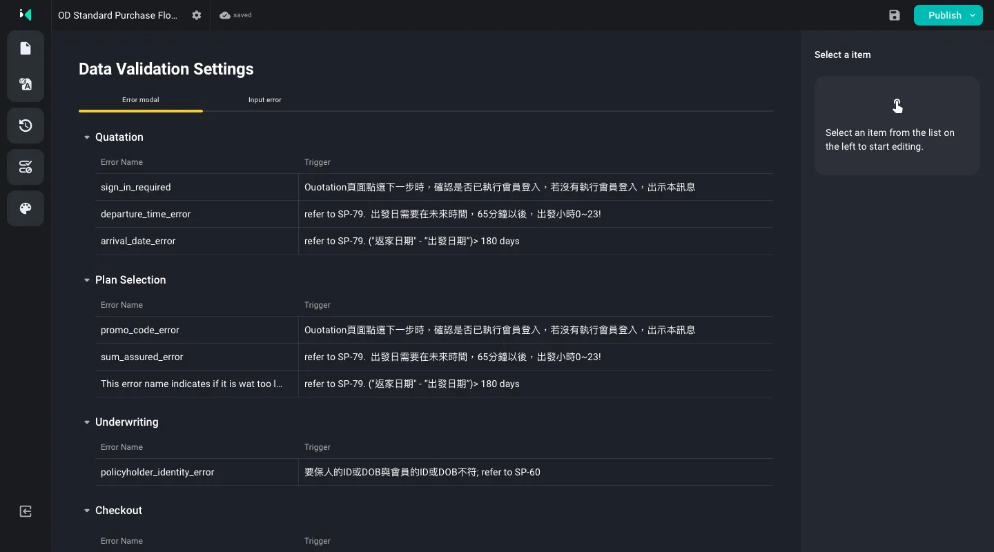
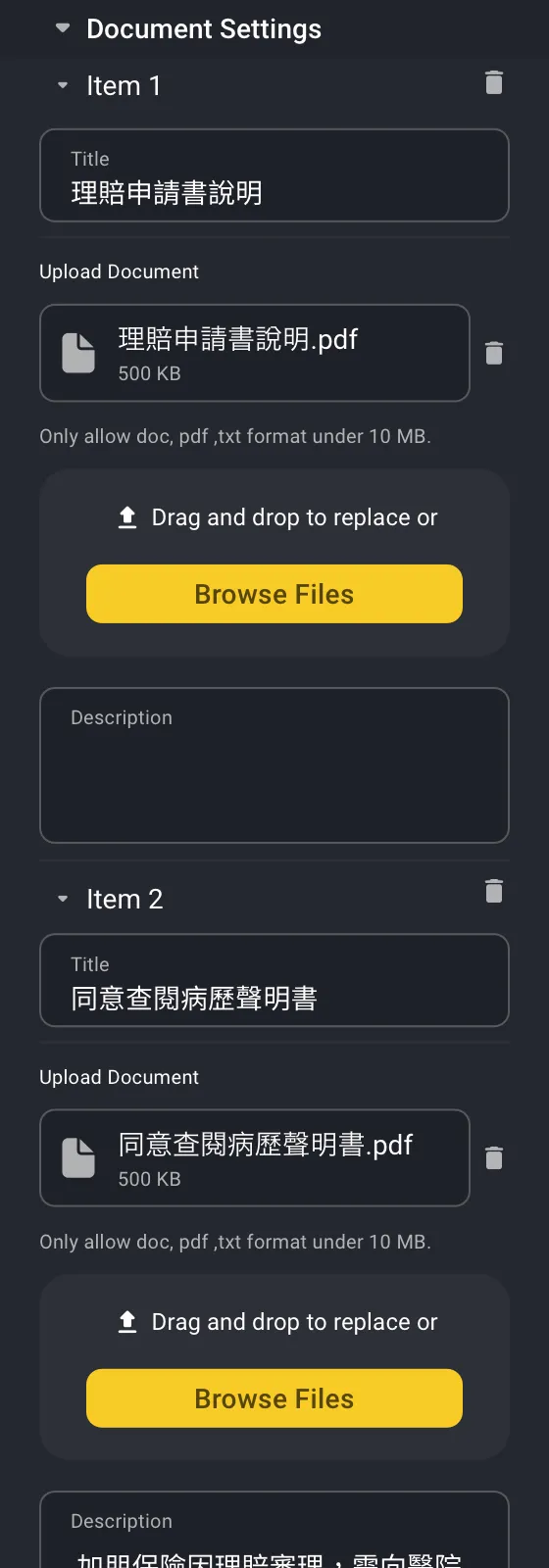
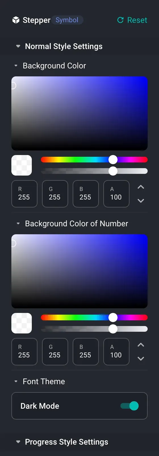
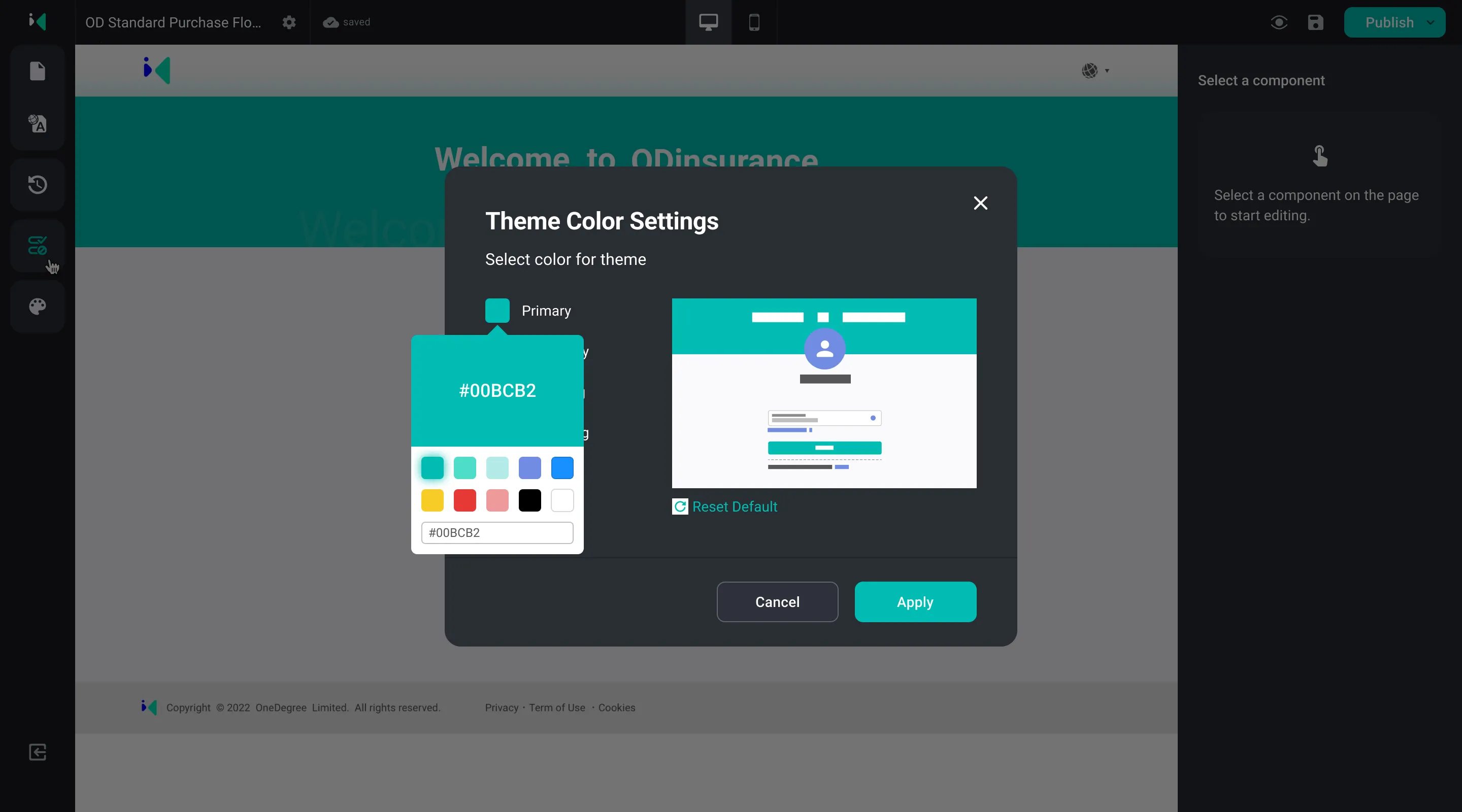
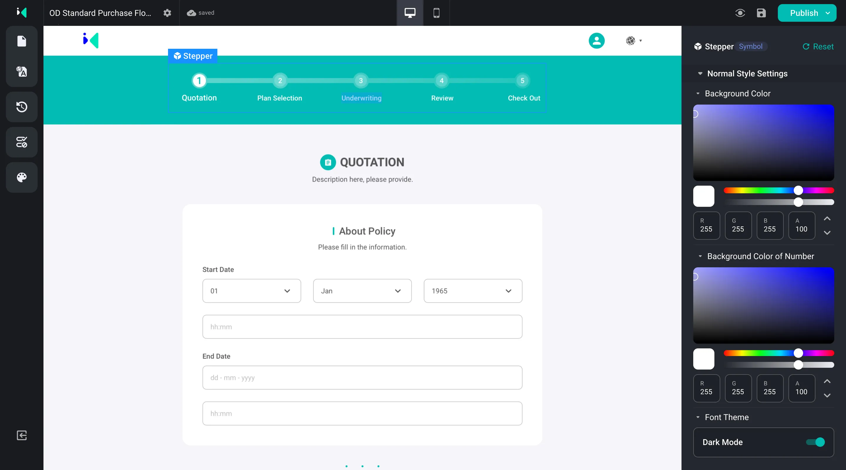
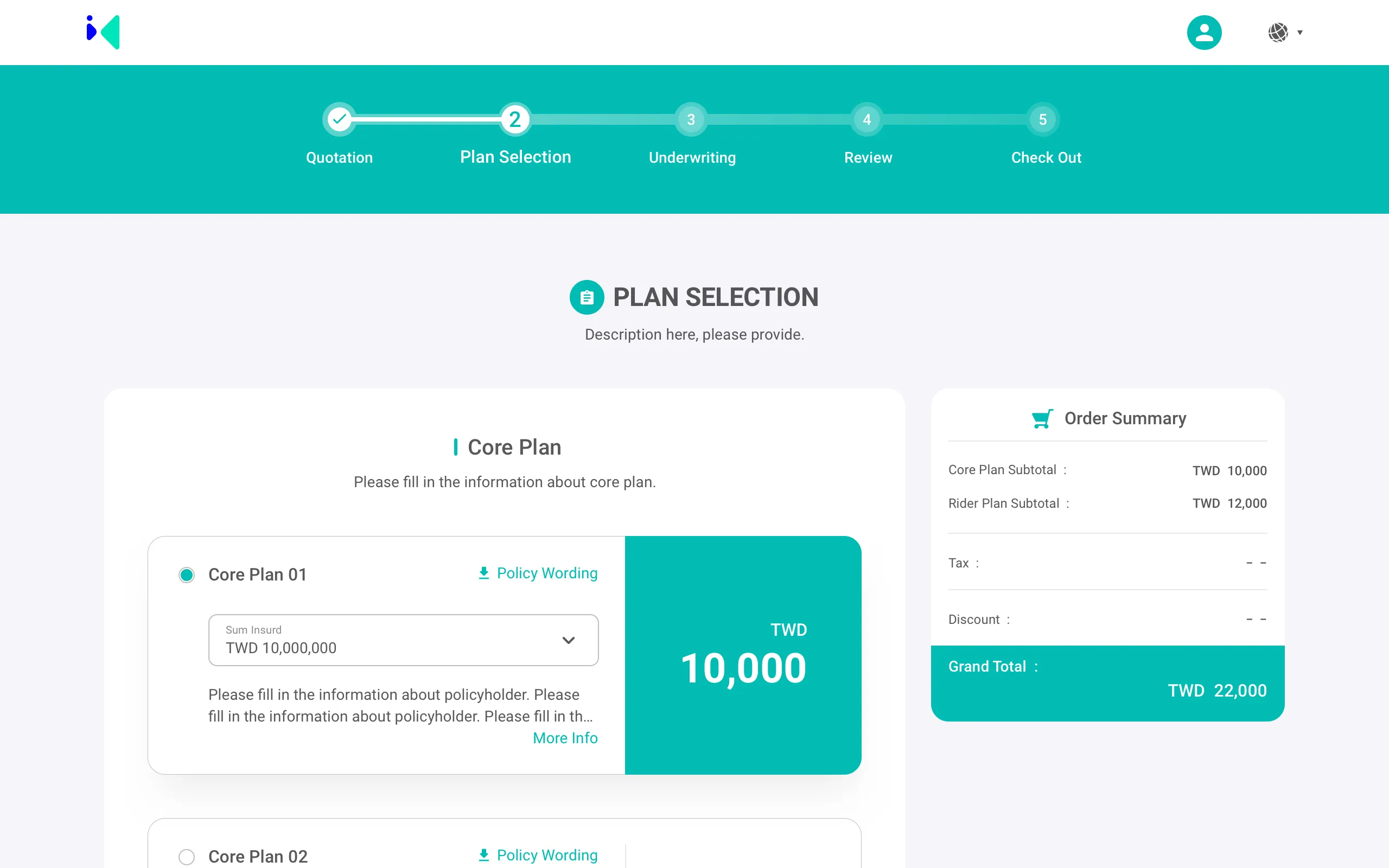
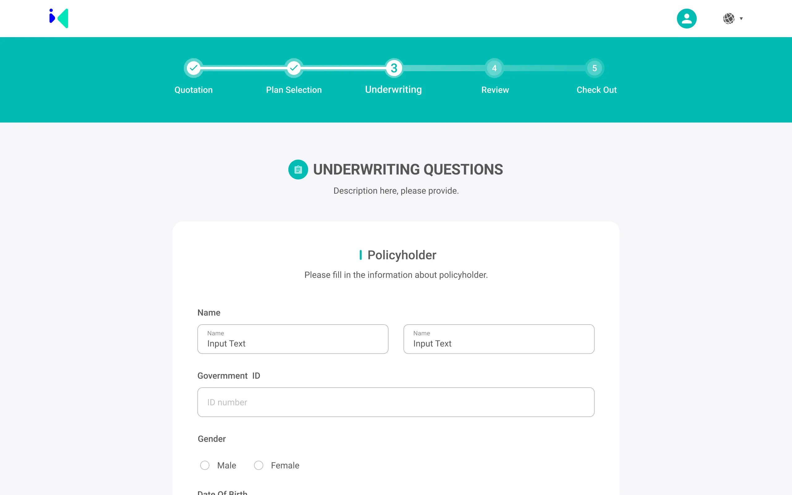
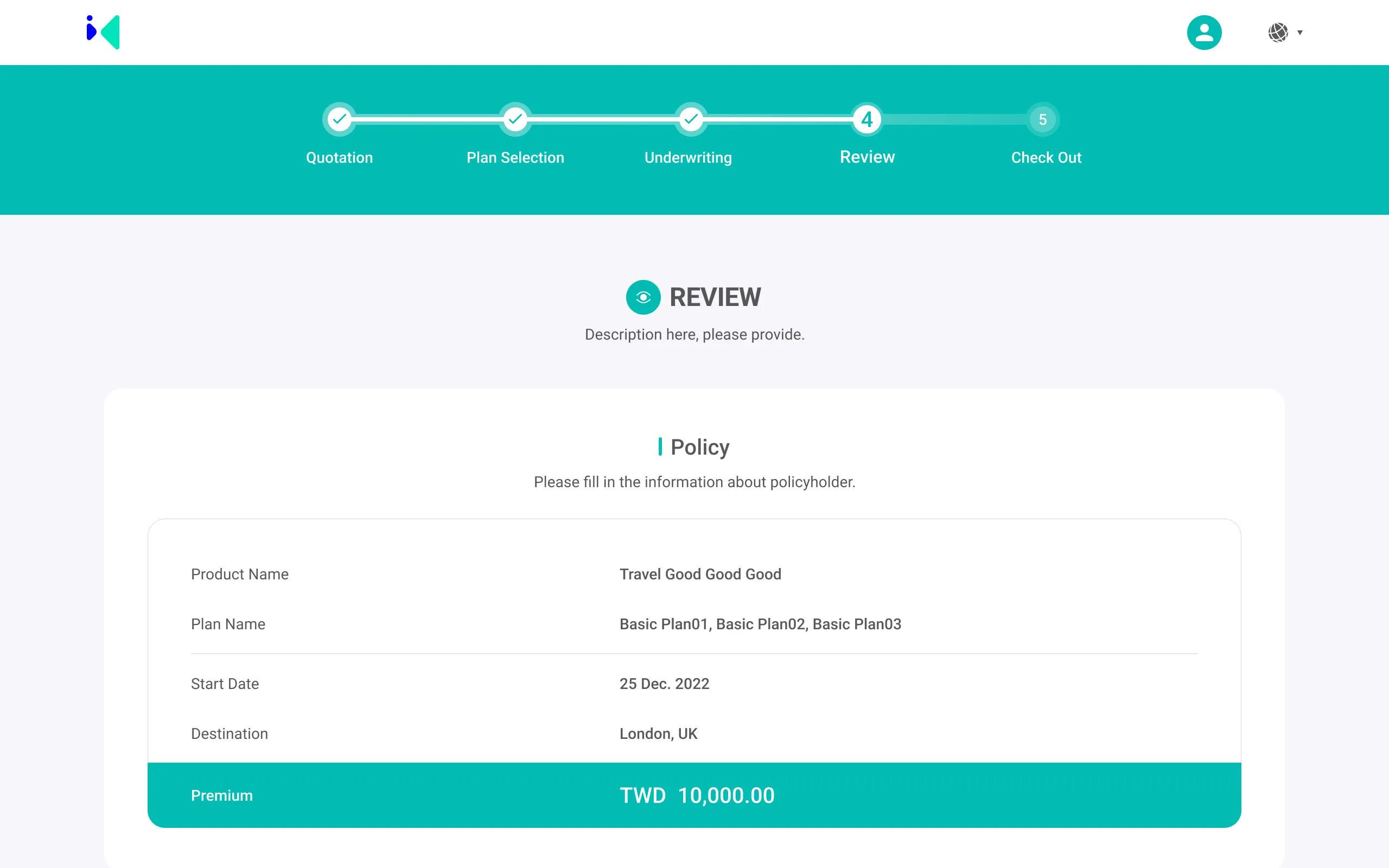
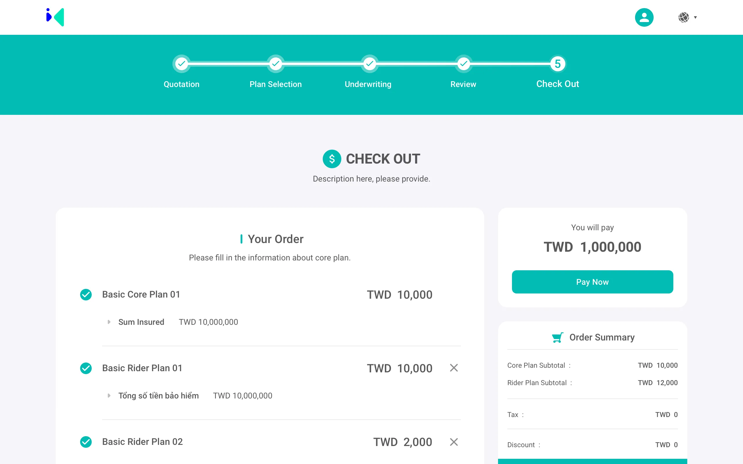
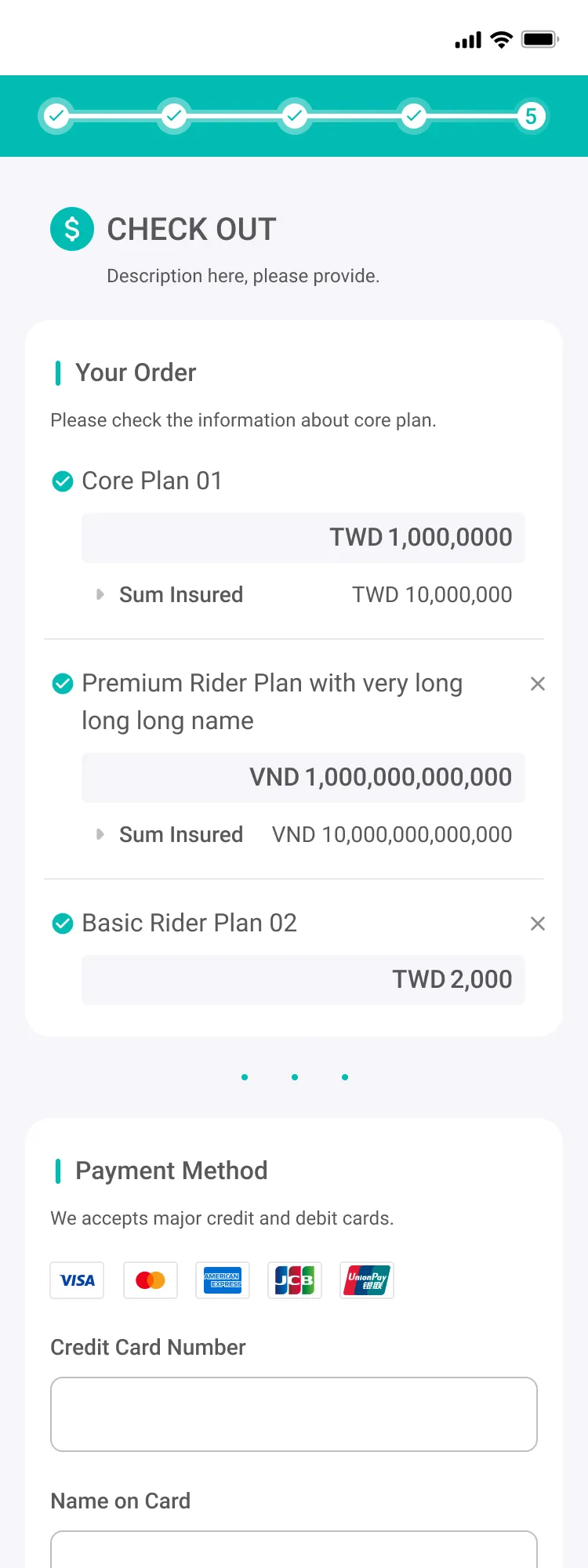
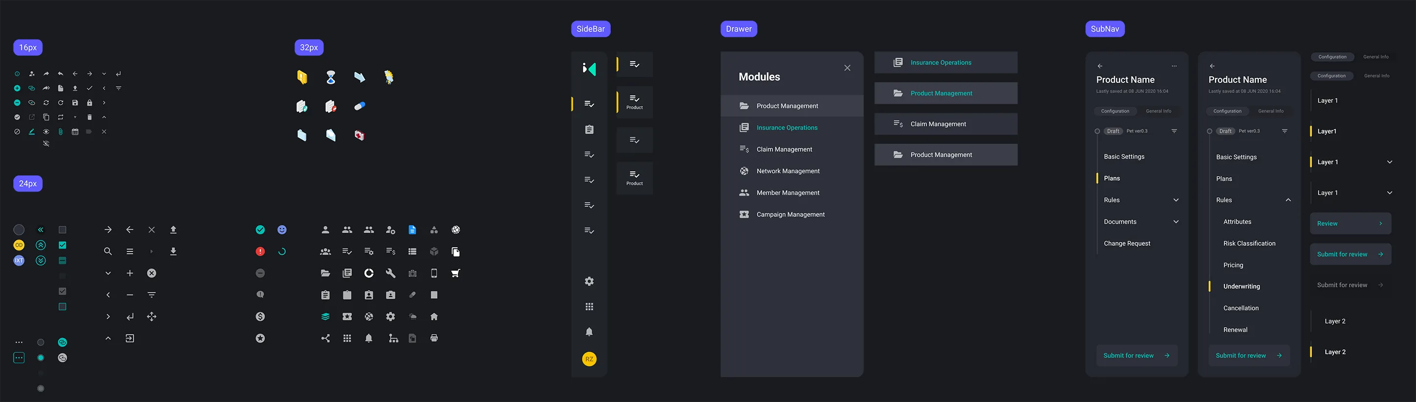
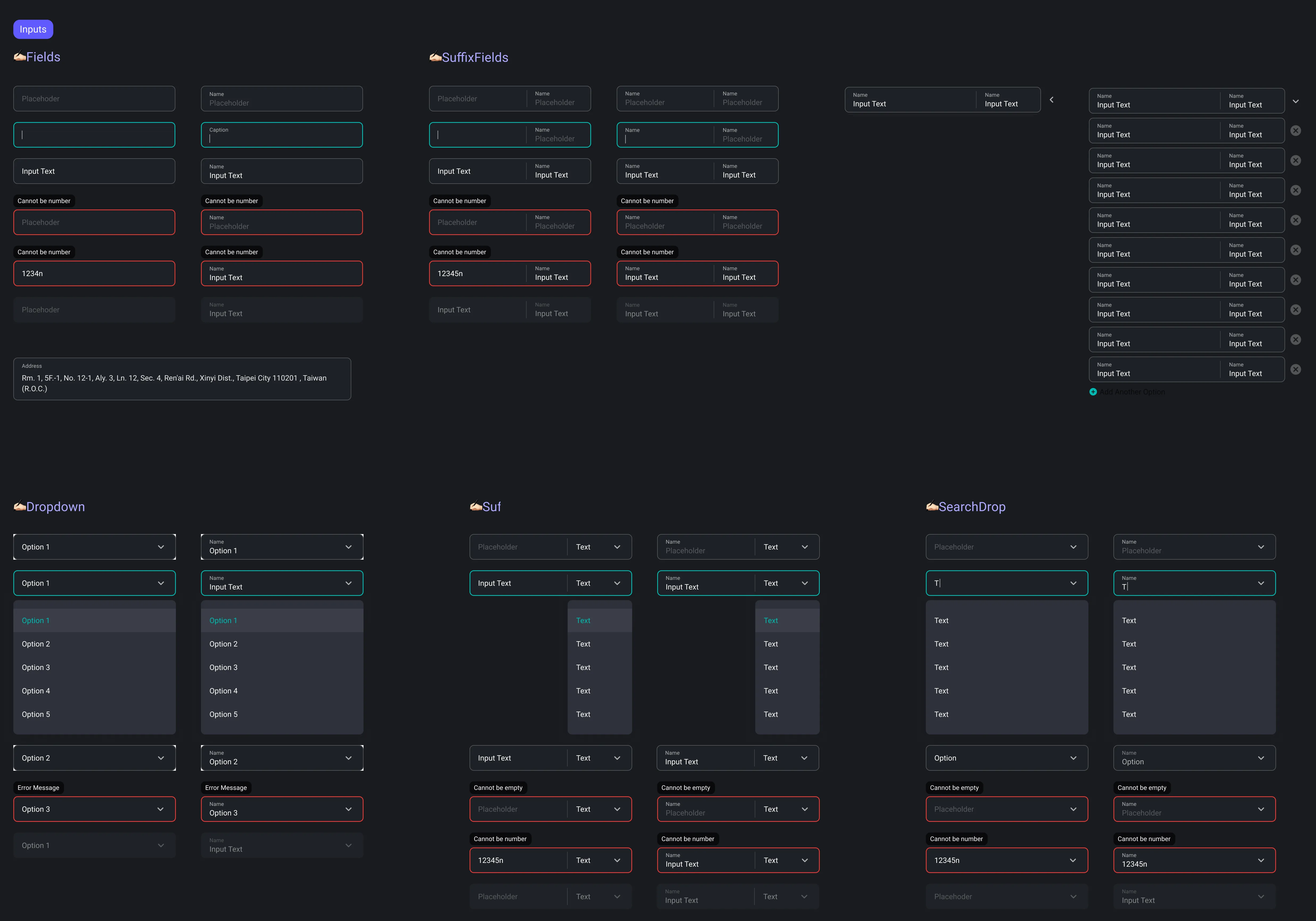
Launchpad solves this by providing a template-driven CMS tailored specifically for insurance. Users can assemble pages from reusable layout blocks, configure forms, upload assets, and publish complete product and purchase flows—without writing code.

Our goal was to create a scalable, intuitive editor that reduces dependency on developers, standardizes page quality, and supports SME insurers in their digital transformation journey.

responsibilities

UI/UX Design
Collaborated with the UX designer who established the initial IA and core flows, then took ownership of UX for new features while continuing to lead UI and interaction design across the editor.
Modular component system
Proposed and led the modular layout architecture, defining how reusable blocks—such as product sections, FAQ, forms, and media—compose a full page.
Unified right-side configuration panel
Designed the universal configuration panel used across all modules, creating one consistent editing pattern and significantly reducing learning effort for non-technical users.
Interaction & Motion
Defined module behavior, editing logic, and micro-interactions including selection states, drag-and-drop patterns, and transitions to make page-building intuitive.
Visual Direction
Established an editor-friendly visual style that is modern, neutral, and compatible with multiple insurers' brand guidelines.
Technical workarounds
Proposed solutions for engineering constraints—such as structured preview states and hybrid API-driven preview—to maintain user confidence despite limited real-time preview capabilities.
Cross-functional collaboration & demo enablement
Worked closely with PM and engineers to ensure feasibility. Delivered prototypes, annotated specs, and demo assets used in internal alignment and client presentations.

Problem Insights

The design process was shaped by insights gathered from internal teams—including business, onboarding, and support—since direct access to end-users was limited. Across these discussions, three consistent pain points emerged:
1
Heavy reliance on developers for even simple layout or content adjustments
2
Inconsistent page structure and visual quality across different products and brands
3
Long turnaround time, often more than three months, to launch or update product pages

Design Process / Strategy

With limited access to end-users, we grounded decisions in internal insights and focused on building a modular, scalable editor for non-technical teams.
Understanding Business & User Needs
Because direct access to end-users was limited, we gathered insights from internal teams such as business, onboarding, and support. Their recurring feedback highlighted long release cycles, fragmented workflows, and heavy dependence on developers for even minor updates. These insights clarified what the editor needed to solve and directly informed the strategy outlined below.
Task Mapping & Prioritization
We mapped the essential tasks non-technical users must complete when building a product page: selecting layouts, editing content, configuring forms and steps, and validating changes. By prioritizing these core tasks—rather than trying to support every edge case—the editor remained streamlined, predictable, and aligned with operational needs.
Modular Editing Model
I proposed and shaped a modular editing model that allows pages to be assembled from reusable blocks such as product highlights, FAQs, forms, and media modules. This structure improved scalability, increased consistency across insurers, and reduced repetitive engineering work.
Editor Interaction Patterns
I defined the interaction logic behind the editing experience, including module selection, drag-and-drop behavior, and key visual states and transitions. These patterns kept the editor intuitive and predictable, allowing non-technical users to assemble pages with confidence.
Visual System for Editor
I developed a visual language optimized for an editor environment—neutral, structured, and brand-agnostic. This allowed the system to support multiple insurers while keeping the interface calm and readable during long working sessions.
Late-Stage UX Improvements
As the editor evolved, I designed new feature flows, refined module configurations, and improved clarity across the editing experience. These iterations strengthened usability, reduced friction, and ensured advanced capabilities still aligned with the core interaction model.

UI / UX Design Solutions

CMS Module Integration
The editor integrates with the IXT platform or external systems via API, enabling structured product data to be imported and managed centrally. Users can import product data, submit items for review, schedule launches, and unlist products through a template-driven interface designed for speed and clarity.
Edit Mode & 
Page Customization
To empower users with limited technical backgrounds, we designed an intuitive editing experience centered on layout modules. This reduced reliance on IT teams while enabling efficient updates to product and purchase pages.
📌 Addressing Technical Limitations
Unlike traditional website builders, our editor lacked full live preview functionality. To close this gap, we proposed a Standard API integration that enables real-time data binding and in-editor previews—critical for increasing user confidence and reducing friction during the publishing process.
📌 Modular Editing with Unified Side Panel
All page types follow the same editing logic: users select a page module to reveal a dedicated configuration panel on the right. This unified system enables a consistent and predictable experience across the platform. Instead of learning different workflows for each page, users interact with a single structure—editing text, uploading assets, and adjusting display settings within the same panel layout.
📌 Visual Design for Broad Brand Compatibility
Early explorations featured expressive UI treatments—soft shadows, rounded corners, and blur effects. However, stakeholder feedback revealed the importance of aligning with various insurers’ brand guidelines. We refined the style to be more minimal and neutral, balancing clarity with broad brand compatibility.
📌 Template-Based Customization
Users can assemble pages using predefined layout blocks such as product highlights, forms, FAQs, and media sections. These templates support quick swapping, theme color selection, and background image uploads—making brand-aligned customization fast and accessible without deep technical skill.
Modular layout system
Each section is a swappable block—choose from presets to build pages quickly while keeping design consistent.
Purchase Flow Template
A modular, step-by-step flow covering account creation, plan selection, form input, quotation, and checkout. Designed to help SME insurers launch a complete digital buying experience with minimal technical effort.
Design System
To ensure scalability and usability across insurance product pages, I established a modular design system based on atomic design principles. The system included reusable layout blocks, flexible UI components, and a semantic color structure to support future expansion.

As part of this effort, I also introduced a dark theme to enhance visual clarity and reduce eye strain, especially for long-form reading scenarios bringing a modern, tech-forward feel to a traditionally conservative industry.
Design System
I established a modular design system based on atomic design principles. Each screen is composed of atoms, molecules, and reusable layout blocks. This allowed us to maintain consistency across product and purchase pages, reduce design and development overhead when adding new modules, and support both light and dark themes through semantic color tokens. The semantic color system clearly defined states (default, hover, error, success), making handoff smoother and ensuring the UI remained adaptable across different brands.
Component Architecture
Visualizing the foundation of our modular system each screen is built from atoms, molecules, and reusable layout blocks, ensuring maintainability and scalability.
Semantic Color Tokens
A structured semantic color system was created to support both light and dark themes. Design tokens ensured consistency and simplified handoff across states and components.

Team & Ownership

Key Design Ownership
This project involved close collaboration across product, engineering, and business teams. Below are the areas I directly owned or led:
1
Proposed and introduced a new visual language tailored specifically for CMS-style editors, successfully integrating it into the product
2
Conducted competitor research and defined editing logic based on industry-standard page builders to inform design decisions
3
Designed the right-side configuration panel for all module types, including text, image, login, and product modules
4
Led the design and iteration of the end-to-end purchase flow, covering steps from login, plan selection, form questions, to checkout
5
Independently planned feature flows based on market research and product requirements, ensuring usability and clarity
6
Consolidated and reviewed final layouts to ensure visual and functional coherence across the landing page, editor, and purchase flow
Team Collaboration
I worked alongside two UI designers and one UX designer throughout the project. One UI designer focused on the Product Landing Page, while the other led the design of the CMS module and editor. I later consolidated and refined these outputs to ensure a cohesive overall experience.
I collaborated closely with the product manager, who supported the integration of my proposed design direction into the roadmap and helped align cross-functional resources for execution.
In addition to designing, I took part in multiple rounds of discussions to clarify requirements and explore feasible solutions with developers. To support smooth implementation, I delivered annotated specs and modular breakdowns.
I also provided demo-ready assets for partner presentations, helping the team communicate the product’s value effectively.

Impact & Takeaways

Anticipated Outcomes
📉Up to 60% Reduction in Development Time
By leveraging predefined templates and a structured editing flow, insurance teams could potentially launch product and purchase pages in about 1 month, compared with the typical 2–3 months required through outsourced development. This could shorten time-to-market and significantly reduce operational overhead.
💰Around 50% reduction in engineering & QA workload
Early feedback suggested that the modular system could substantially reduce internal development effort and testing time.
⏱️Easy to Learn
The simplified editing model helped non-technical teams get started quickly and understand the core workflow with minimal onboarding effort.
💬 Feedback from Sandbox Testing
“Features are designed specifically for the insurance industry, making them complete and user-friendly.”
“We tried WordPress, but the learning curve was too high. This tool feels tailored for us.”
Key Learnings
1
Balance ambition with practicality
Designing for traditional industries requires carefully calibrating advanced features with the actual capabilities and workflows of users. Ambitious ideas must be shaped into solutions that fit how teams really work.
2
Translating complex B2B needs into usable structures
Through expert interviews with insurers and operations teams, I learned the importance of turning niche business rules—often undocumented—into clear, intuitive UX structures. This reinforced how critical domain understanding is when designing internal tools.