ICE View

ICE View

How might we evolve a glanceable cover-screen experience to deliver clearer, more informative feedback without adding complexity?

Company

HTC

My Role

UI Designer

Platform

Mobile

Period

2015
Project Overview
Based on our previous smartphone case, we developed "Ice View." That also enables users to interact with the phone when it is closed. The Ice View gives a new ID design, a smooth and borderless surface with an almost opaque front cover different from the Dot View. Users can respond to notifications and calls, control music, and launch the camera to take a photo. It can display more information details and provide more functionality, bringing CMF and Visual design challenges to a new level.
Responsibilities
Visual Concept, Animation, Motion Design, Prototype, UI Design, Design Coordination.

Lead from the early visual concept to the launch.

To Lead 2 UI designers in this project. Hosted a brainstorming for the user interface ideas and had a brief introduction to the ice view. Then we picked a direction and moved forward. The result was stunning, and we applied for patents to protect it.(D182760)

Participating in cross-disciplinary collaboration

Co-worked with ID designers on UI and hardware adjustment to improve the legibility. We work closely with the engineer to help them to fix the design issues. Everyone involved in the project worked seamlessly to ensure that visual design is qualified for the requirement.

Create motion design

I also as a motion designer in this project. I provided the animation prototype to verify the whole operating process, and also designed all of the animation for this project. Besides, based on my experience of the Dot View case, that gains me more efficiently to build the motion elements.

Reviewing and fine-tuning

The final product reviewed by project member, and CMF designers to check the legibility, mistriggering rate, visual elements appearance, and functions are working or not. If some issues have occurred, we will fine-tune to the perfect states.
Our goal is to improve
Previous product limitation
Due to the screen size of the limitation only can have 48 points to appear content on the Dot view, which causes more advanced functions cannot implement. The significant problem was user can't take a photo with the Dot view. Even though open it up, it still not easy to use.
Integrate visual design with the hardware
Although this material is buffering enough to protect phones and can show content, the most difficult challenge is the blurry attribute. And that will cause the legibility not well. We spent much time fine-tuning the material properties with the CMF designer. Our purpose is to try to balance the best aesthetics with hardware performance.
Different transparency of materials involves the protection of the case and legibility of graphical interfaces.
Design challenge and result
Improve the legibility of the text
We understood the blurry attribute of the Ice View, which may cause the legibility to get worse. Even though we reduced material transparency to improve the result wasn't good enough for us, we consider the color wavelength might be the direction in which we can increase legibility. Therefore, we use neon colors and white colors for the base to design the interface. We referenced the traffic sign design theory, in which the wavelengths of red and green color, these two colors have long penetrability, then decided to follow this direction.
Memory usage control
The Ice view has a full-screen size of the translucent surface that we can show more details in Ice view; furthermore, a lot of visual work and hardware resource is required, and particular useable memory will become very few when the phone case cover is closed, the system will get into standby mode. Therefore, implementing full-HD animation that would be a challenging task.
Motion design principle
About the motion design, I try to use smooth deformation to highlight the position where events occur on the screen. Besides, the animation prototype was reviewed with the mockup to test the overall fluency and legibility.
Motion design
New notification
Receive a phone call.
Call back from history.
Open the case for detailed info.
Shows up when users' birthday.
The Halloween theme.
Motion design
New notification
Receive a phone call.
Call back from history.
Open the case for detailed info.
Shows up when users' birthday.
The Halloween theme.
Essential function design
Sunny
Hot
Mostly Sunny
Cloudy
Foggy
Windy
Clear
Mostly Clear
Rain
Thundershower
Snow
Outcomes and Insights
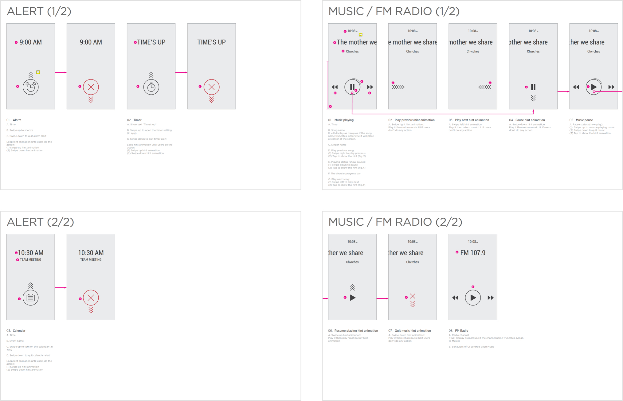
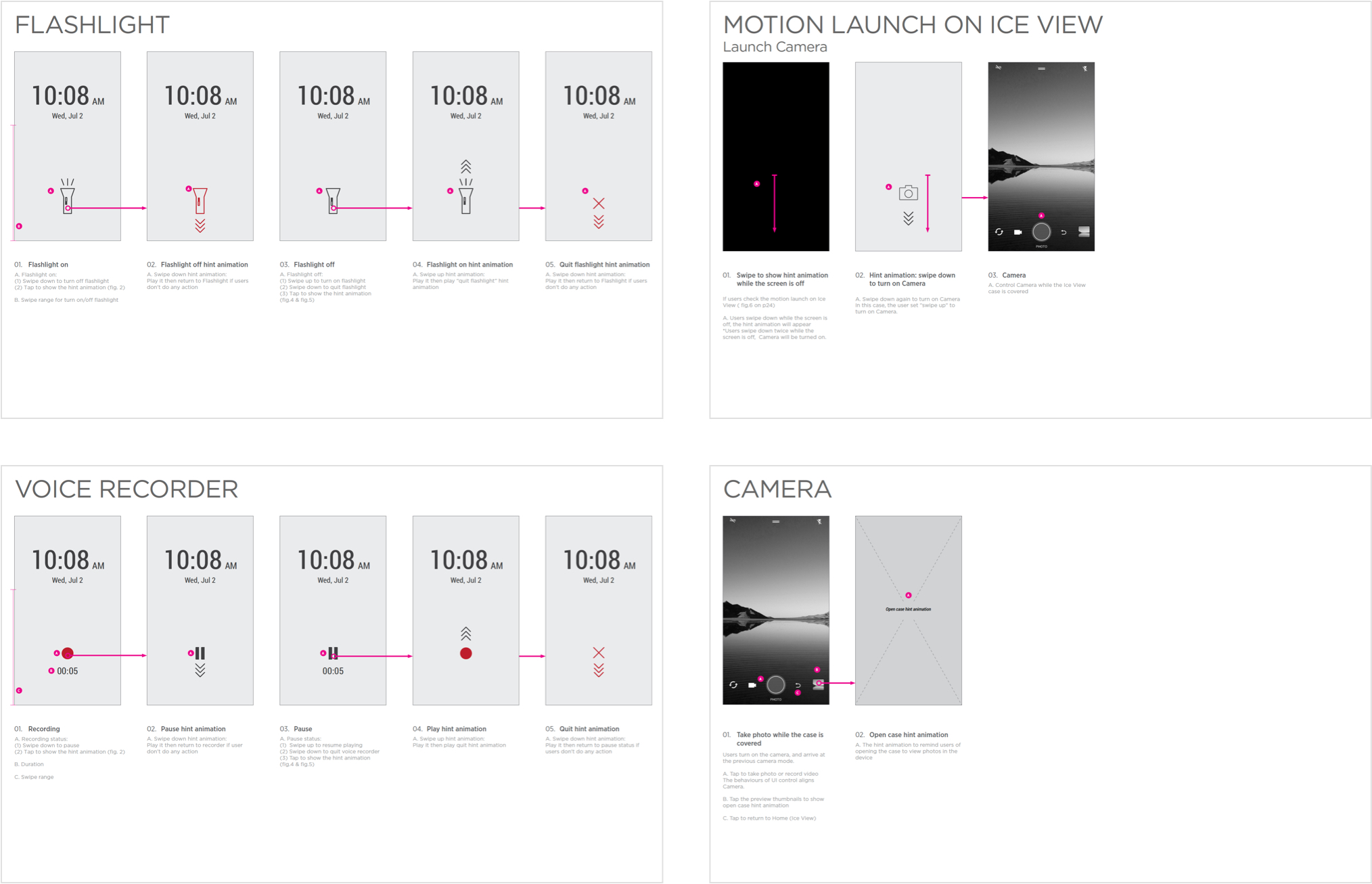
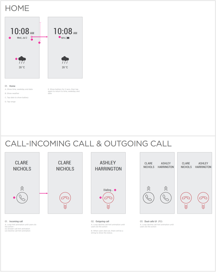
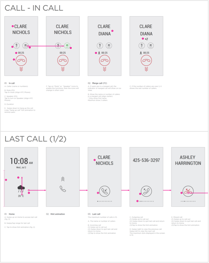
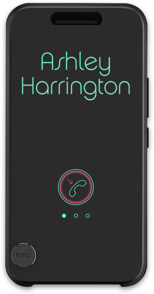
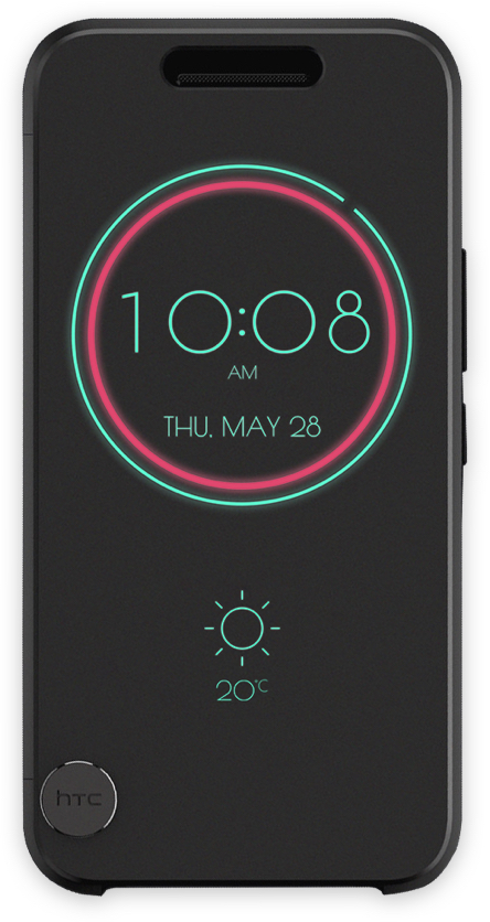
After the launch, the HTC Ice View both obtain positive and negative feedback. The ice view was based on the previous product Dot view, most users to compare these cases, and it is perceived to be an upgrade version of Dot View with new functions. Base on our design intention, users can do more functions on the Ice View, such as taking photos without opening the case.

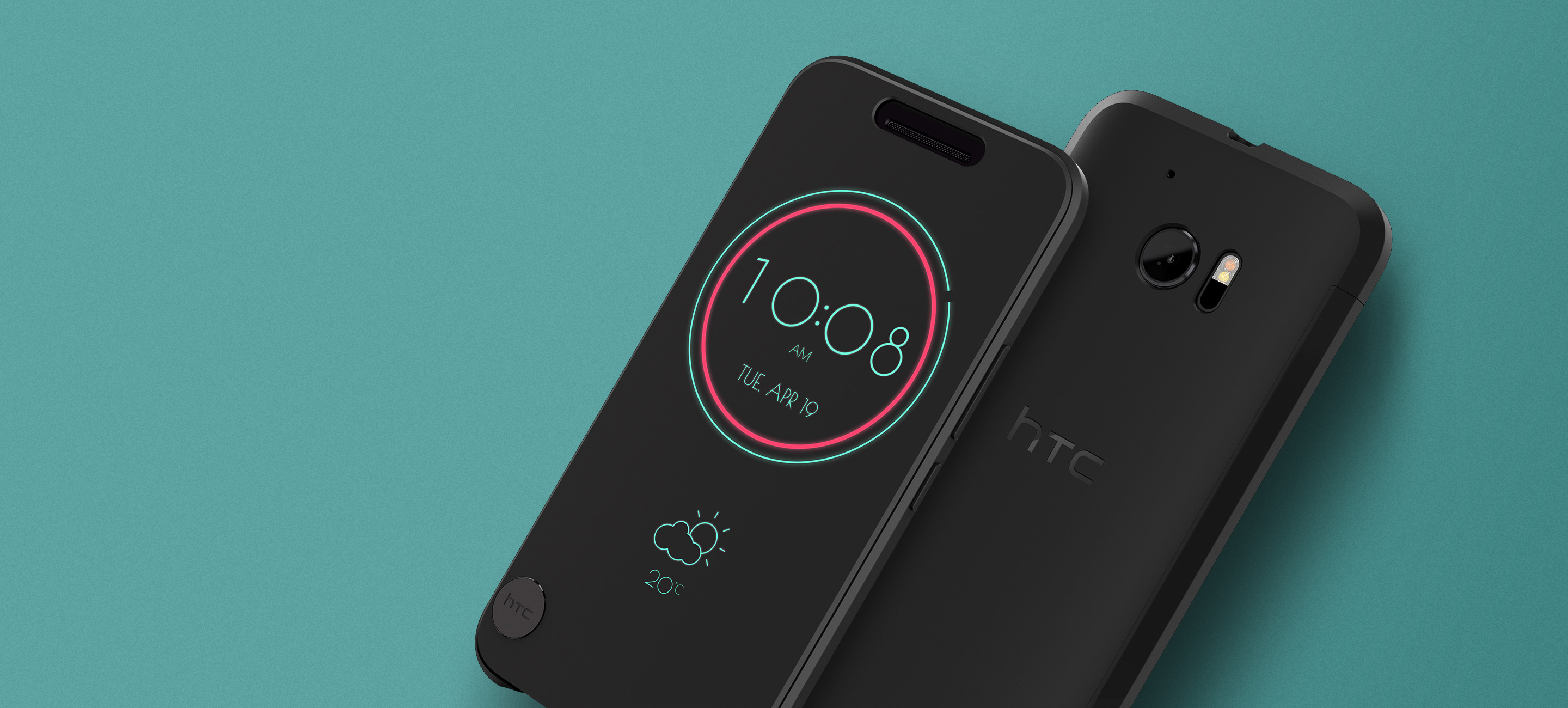
“HTC has upgraded its cool see-through case for the 10

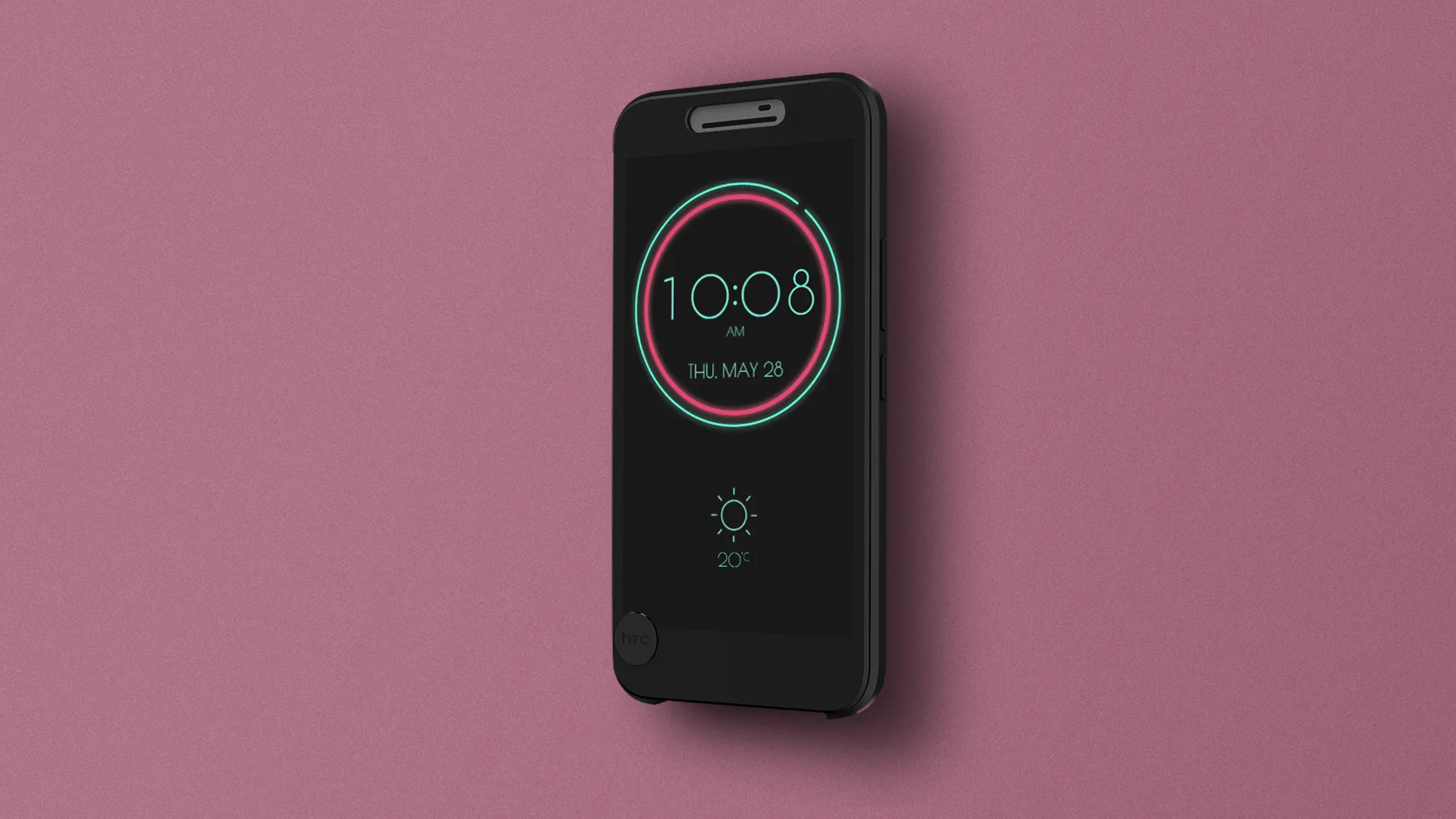
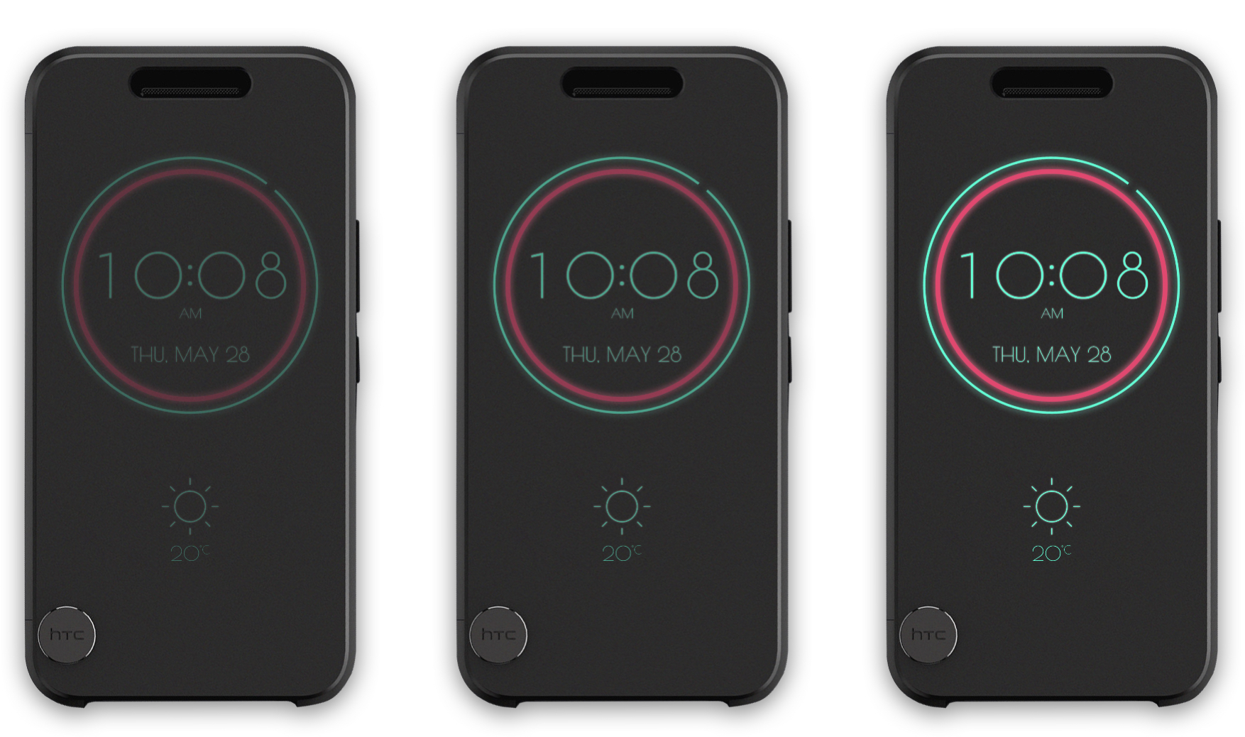
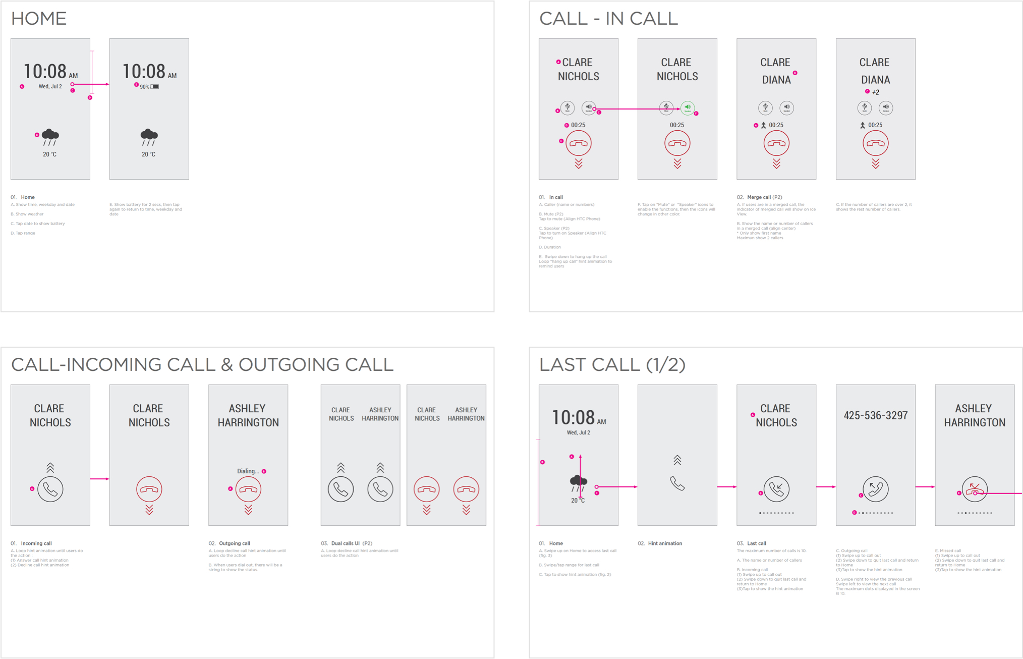
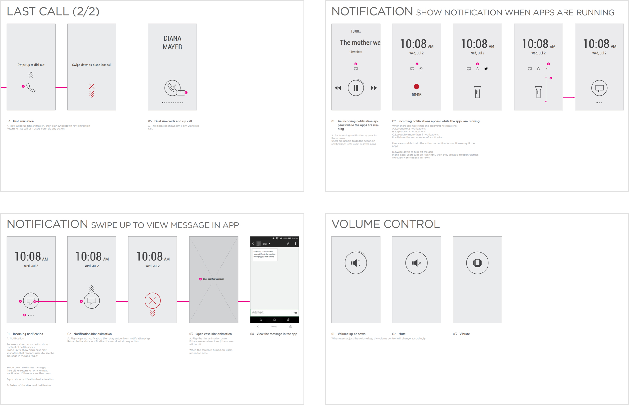
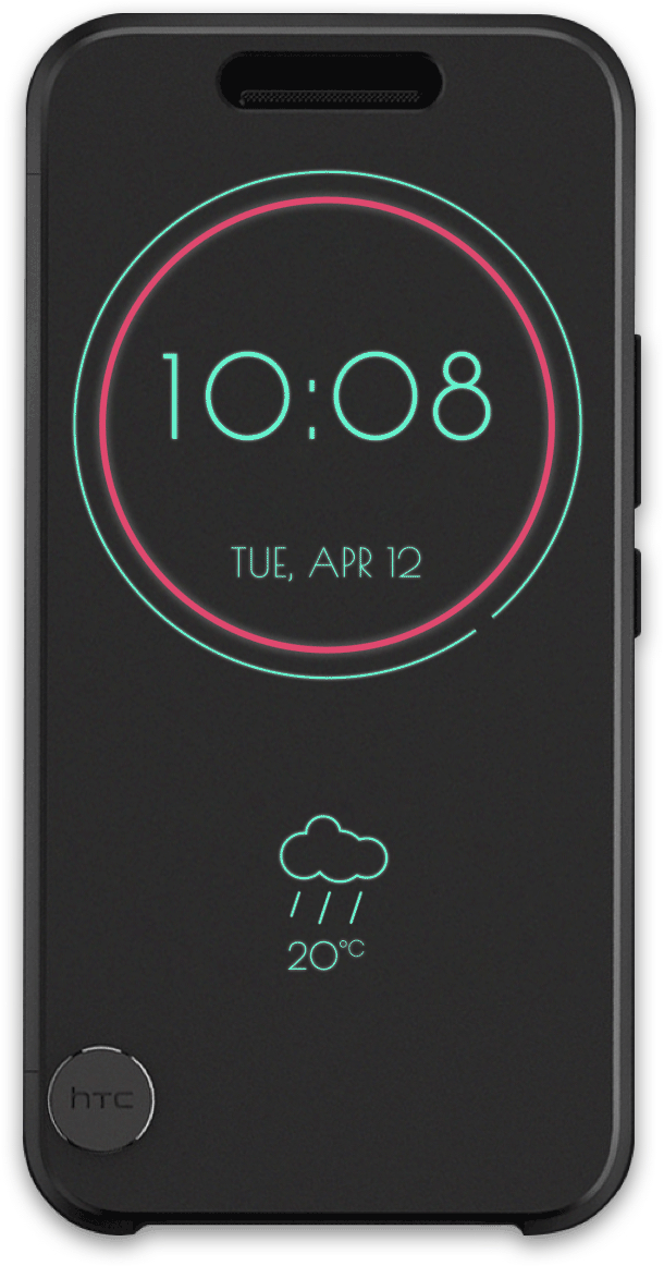
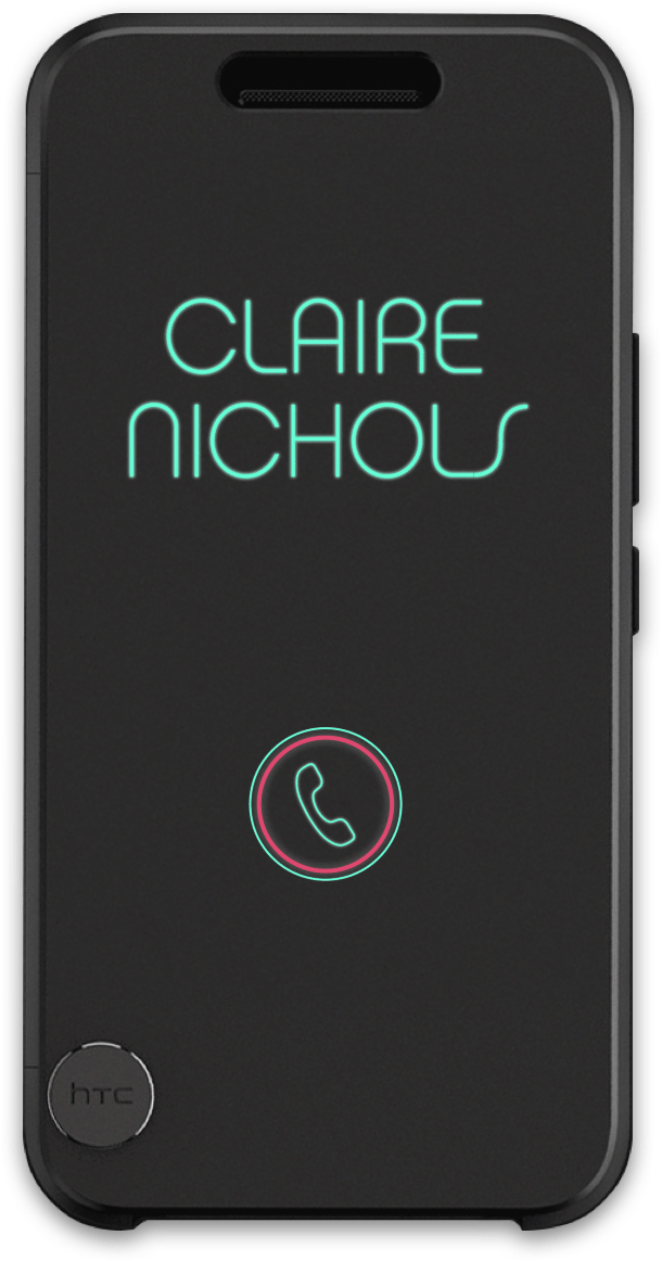
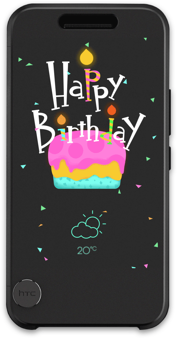
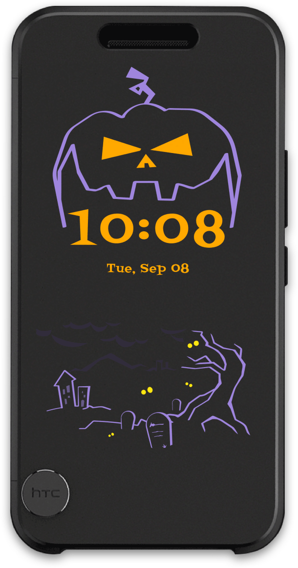
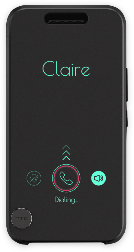
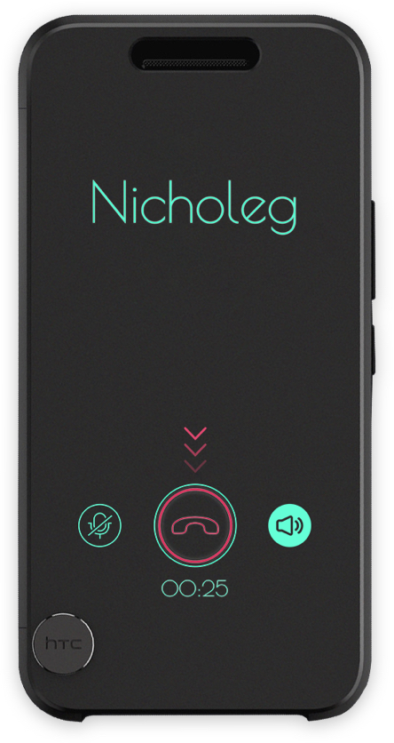
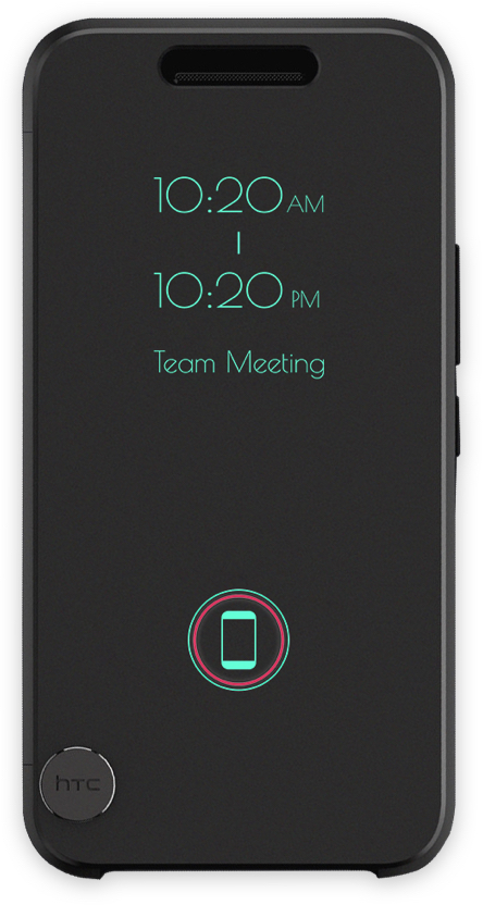
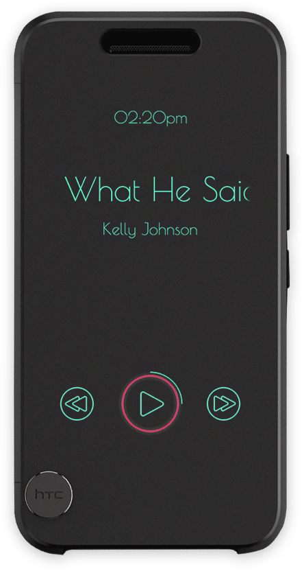
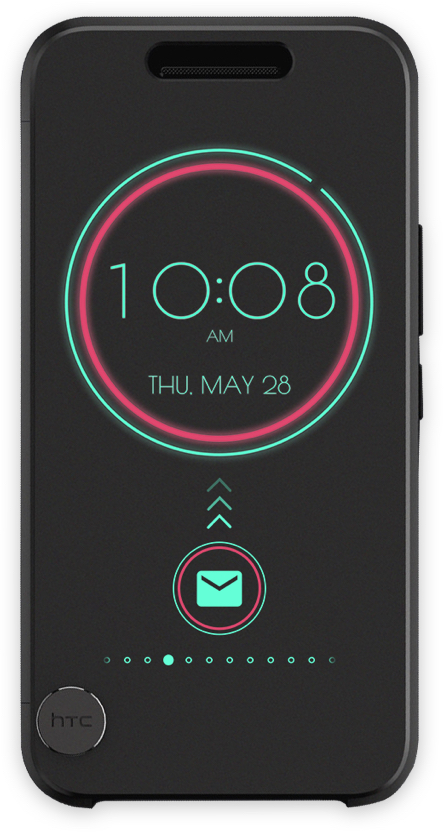
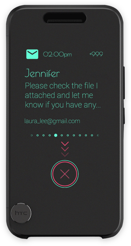
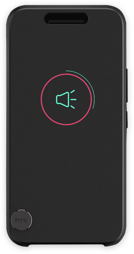
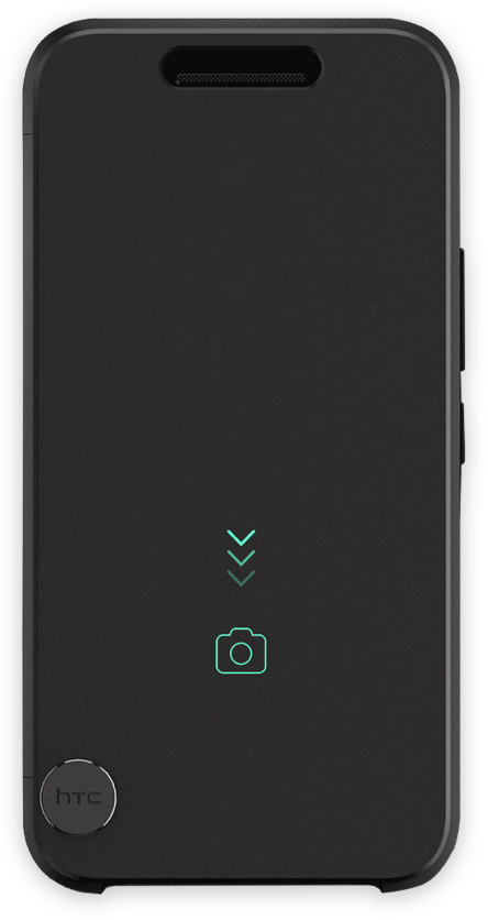
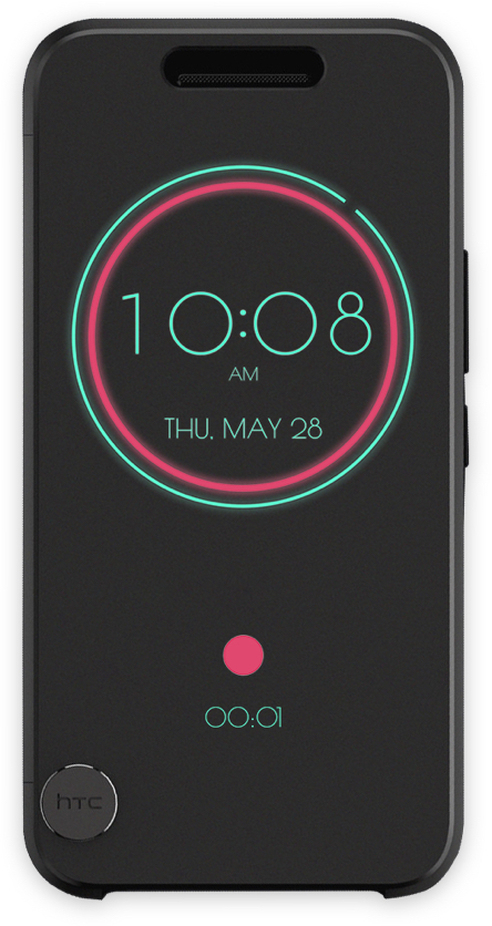
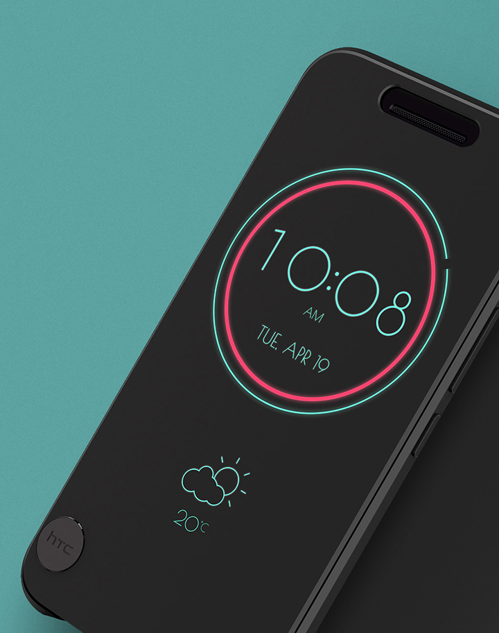
The Ice View case does away with the dot matrix pattern for a semi-transparent pane that the 10's screen can shine through. As a result, text and images displayed on the case are much higher resolution and have a greater variety of colors. The case can show notifications, weather, time, music controls, and you can even open the camera and take a picture while the case is closed, something the Dot View case could never accomplish.”
-The Verge

“Love it. Great idea. Simply a great Case.

Such a great case for your HTC 10! So simple and functional. What you need at a glance and extremely cool. Love that your phone knows it’s in case. Also 2 swipes down launches camera. Great job HTC.”
-The review from Google Play Store

“Amazing!!!

BUT needs theme options like dot view and an app launcher/more apps to be compatible with ice view just like how music and flashlight are integrated. “
-The review from Google Play Store

"Works great, could benefit from customisationThe indicated features work like a charm. I only wish I could change the colour scheme or font.”
-The review from Google Play Store

However, the hardware quality and the lack of customization were mainly negative feedback. Users complain about the protection because the case is soft and the surface is easily scratched. We have discussed this with ID designers, and it can improve the next generation of the Ice view. As for other negative feedback, the lack of customization, we want to provide more themes for users to customize their ice view and have designed several mock-ups, but implementing each theme takes a lot of time and hardware limitations. Engineers were unable to reschedule for the first launch. Despite the mentioned problems, users have provided many useful suggestions and look forward to future updates. We are continuing to track if we can improve for the next version.
Project Learnings
//