IXT

IXT

How might we improve the UX for SME insurers by simplifying and digitizing core workflows?

Company

OneDegree Global

My Role

Sr. Product Designer

Platform

Web, SaaS

Period

2021

Project Overview

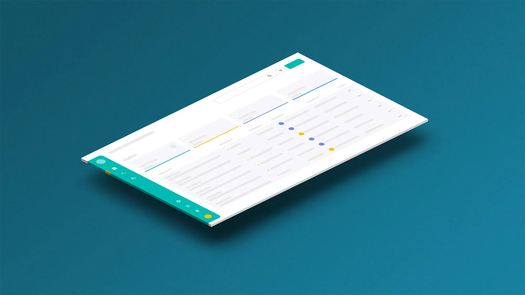
IXT is an enterprise SaaS platform that helps SME insurers digitize insurance operations—from underwriting and policy administration to claims handling. Following the 2.0 release in 2021, I drove ongoing UI, interaction, and motion iterations for decision-heavy workflows. I translated aligned UX definitions into production-ready screens, states, and specifications in close collaboration with UX, PM, and engineering.

responsibilities

UI / Interaction Design
Collaborated with a dedicated UX designer to translate core flows into production-ready UI. While not owning overall UX, I applied a UX mindset in UI execution—clarifying hierarchy, task flow, and error risks through ongoing discussions and reviews. Designed screens, layout structures, and interaction patterns for decision-heavy workflows across the platform.
Complex Forms & Tables
Designed and refined dense form and table experiences common in insurance operations. Focused on readability, hierarchy, and interaction clarity to support accurate input and review.
Calculation-related UI States
Worked with UX and PM to clarify calculation-related steps and states (e.g., validations, warnings, confirmations). Ensured users could understand what changed, why it changed, and what action to take next.
Interaction & Motion
Defined micro-interactions and motion behaviors to improve feedback and state clarity—such as selection, expand/collapse, loading, and transitions—making complex workflows easier to follow.
Design System & Reusable Patterns
Contributed reusable UI patterns and component behaviors to support scalability and consistency across modules. For new features, I maximized reuse of existing components and interaction patterns to reduce engineering effort and delivery risk. Helped reduce repeated design effort and improve handoff quality.
Cross-functional Collaboration & Delivery
Aligned with PM and engineering to confirm feasibility, define edge cases, and deliver annotated specs. Supported implementation and iteration through reviews and quick design turnarounds.

GOAL

Our goal was to accelerate business growth at speed and scale with an insurtech platform—enabling SME insurers to roll out new insurance products more rapidly and efficiently, especially in Asian markets where financial regulations are particularly stringent.

Problem Insights

The core issue was that SME insurers face high operational friction and adoption barriers when digitizing core insurance workflows.
1
Inefficient underwriting workflows and poor usability in legacy systems, driven by manual, paper-based processes and time-consuming approval steps.
2
Digital transformation requires significant resources and cost—especially difficult for smaller insurers to adopt.

Scope

The system is divided into five modules: Product, Policy, Application, Claim, and Member. We dedicated significant effort to improving the usability and functionality of the Product, Policy, and Application modules, balancing both business requirements and consumer needs.

Inputs that shaped the design

I worked closely with product managers to clarify the product proposition and direction. We also conducted competitor comparisons and expert interviews (e.g., actuaries and insurance product managers) to gather qualitative input that informed design decisions. When necessary, we aligned with stakeholders to ensure the design met expectations. Early in the project, clarifying business requirements was a top priority, and we used multiple methods to validate that we were on the right track.

Design Challenge

Insurance products involve complex premium and policy-period logic, and multiple products introduce interlocking rules. The challenge was to deliver UX clarity within tight timelines while staying within the existing framework—without expanding the design system excessively.

Design Process / Strategy

Given the complexity of insurance rules and the delivery constraints of the existing framework, our strategy focused on translating aligned business and UX definitions into scalable, production-ready UI patterns.
Align on workflow and rule definitions
I worked closely with PMs and UX designers to clarify business requirements, product direction, and rule logic. We confirmed key decision points and exceptions early to reduce late-stage rework.
Translate flows into production-ready UI
Based on aligned UX definitions, I designed UI for decision-heavy workflows—structuring dense forms and tables with clearer hierarchy, grouping, and progressive disclosure to support accurate input and review.
Define UI states, validations,
and edge cases
In collaboration with engineering, we defined UI states and edge cases (e.g., validations, warnings, confirmations, loading/empty/error states), ensuring calculation-related steps were explainable and system feedback was unambiguous.
Use prototypes to reduce ambiguity
We used lightweight prototypes (and motion studies where helpful) to validate interaction behaviors and state feedback before implementation, especially for complex table interactions and step-based flows.
Scale with reusable patterns under the existing framework
To stay within the existing framework, we prioritized reusable patterns and documented guidelines for typography, spacing, and component usage—keeping delivery consistent without expanding the design system excessively.
Implementation support and iteration
I supported delivery through design reviews, spec clarification, and iterative refinements based on engineering constraints and stakeholder feedback.

Design Result

My Contributions
  • Improved clarity in decision-heavy workflows by establishing a consistent information hierarchy and interaction structure, making complex operations easier to scan and complete.
  • Increased consistency across the platform by standardizing reusable components and usage rules—reducing confusion and shortening the learning curve for users.
  • Reduced input errors and strengthened user confidence by defining clear UI states and system feedback patterns (editable/read-only, required/optional, validation, warnings).
  • Enabled scalable delivery as the platform evolved by aligning closely with PMs and engineers on feasibility, edge cases, and implementation details.
✅ Workbench
Design Rationale

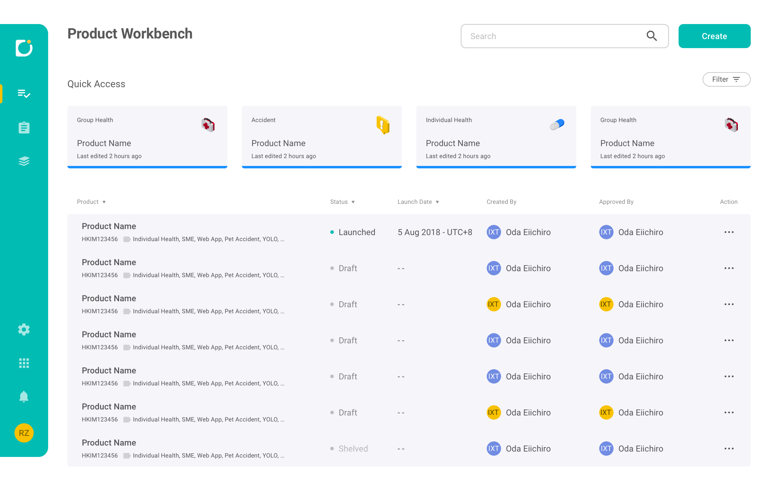
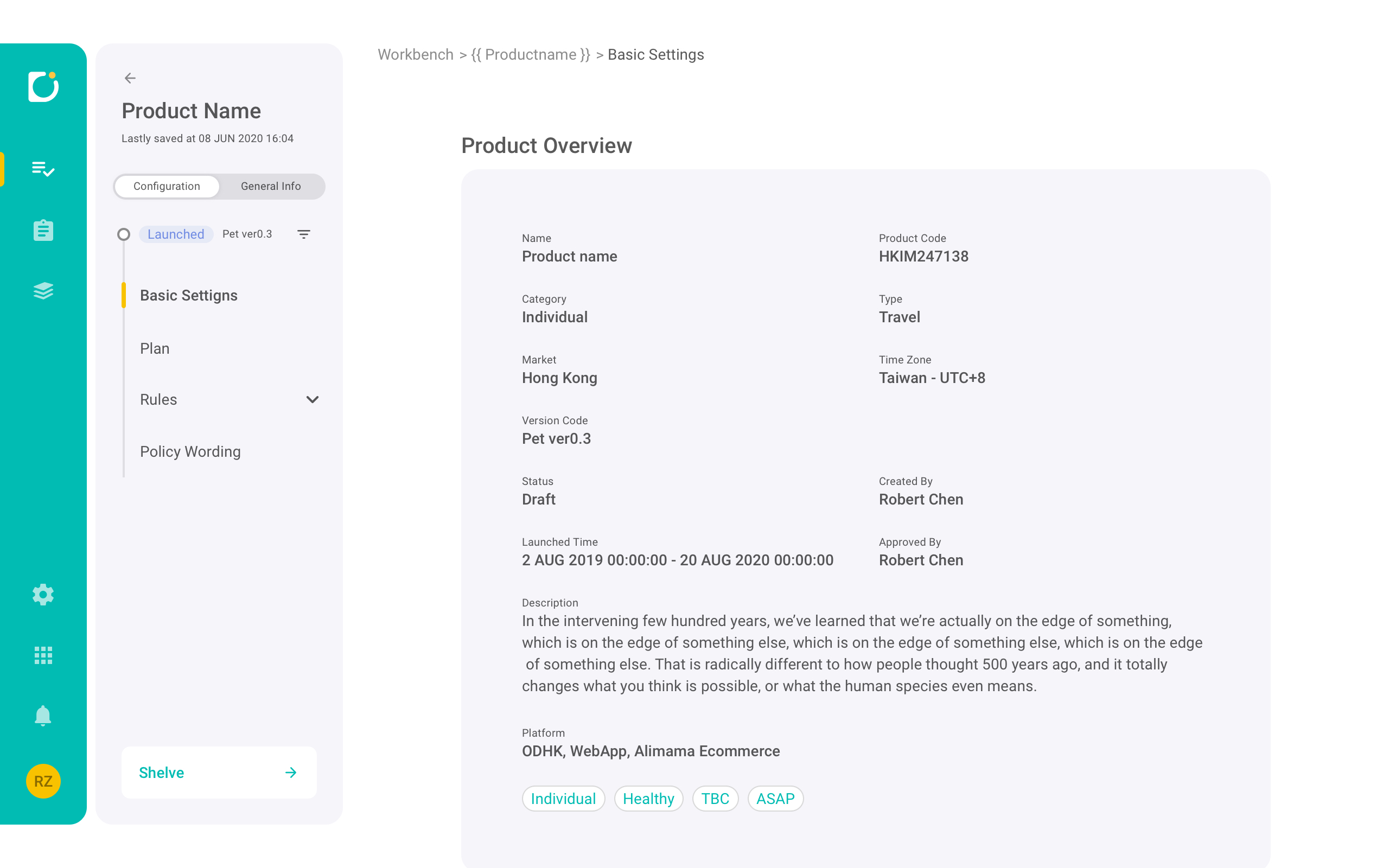
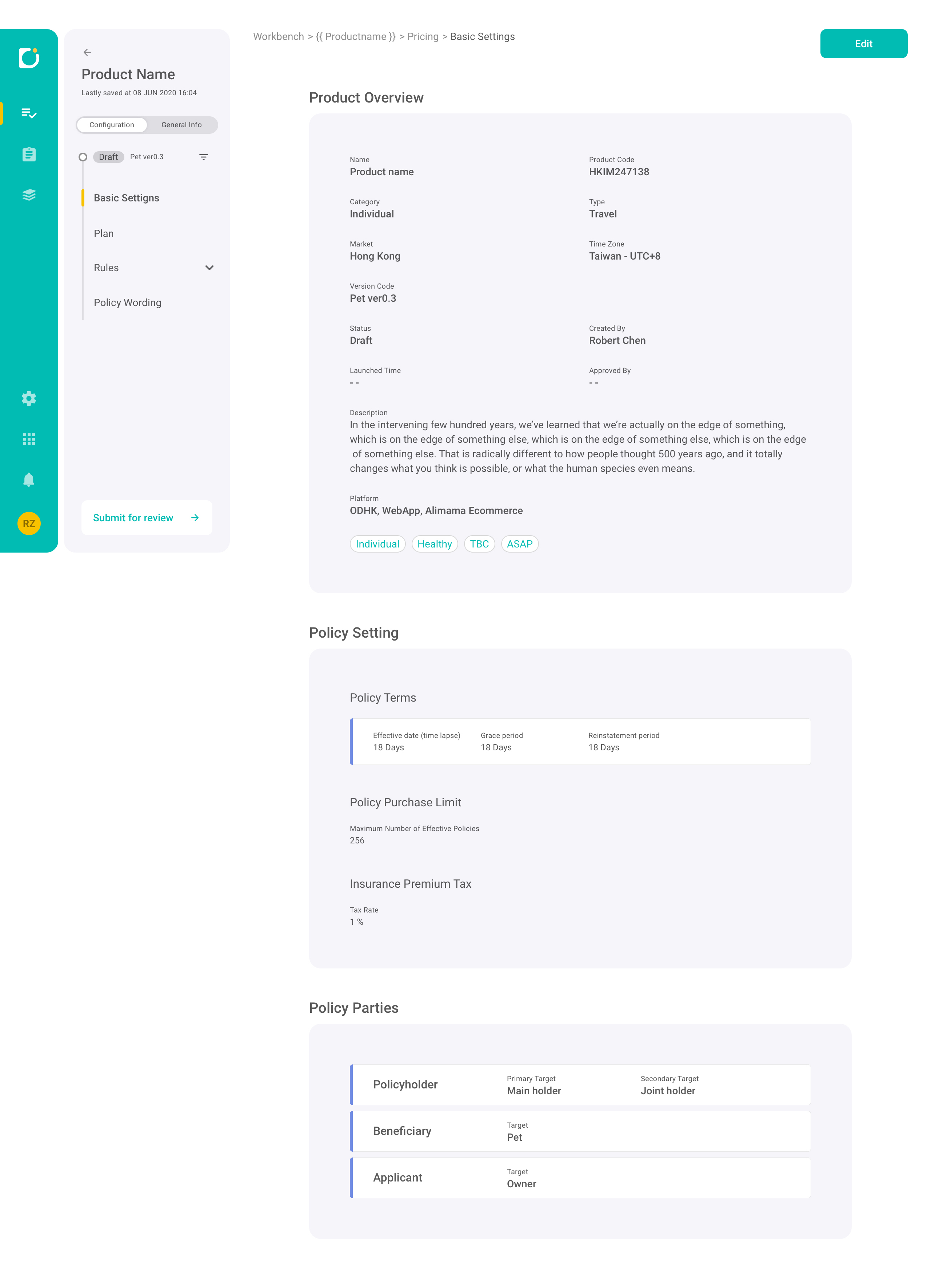
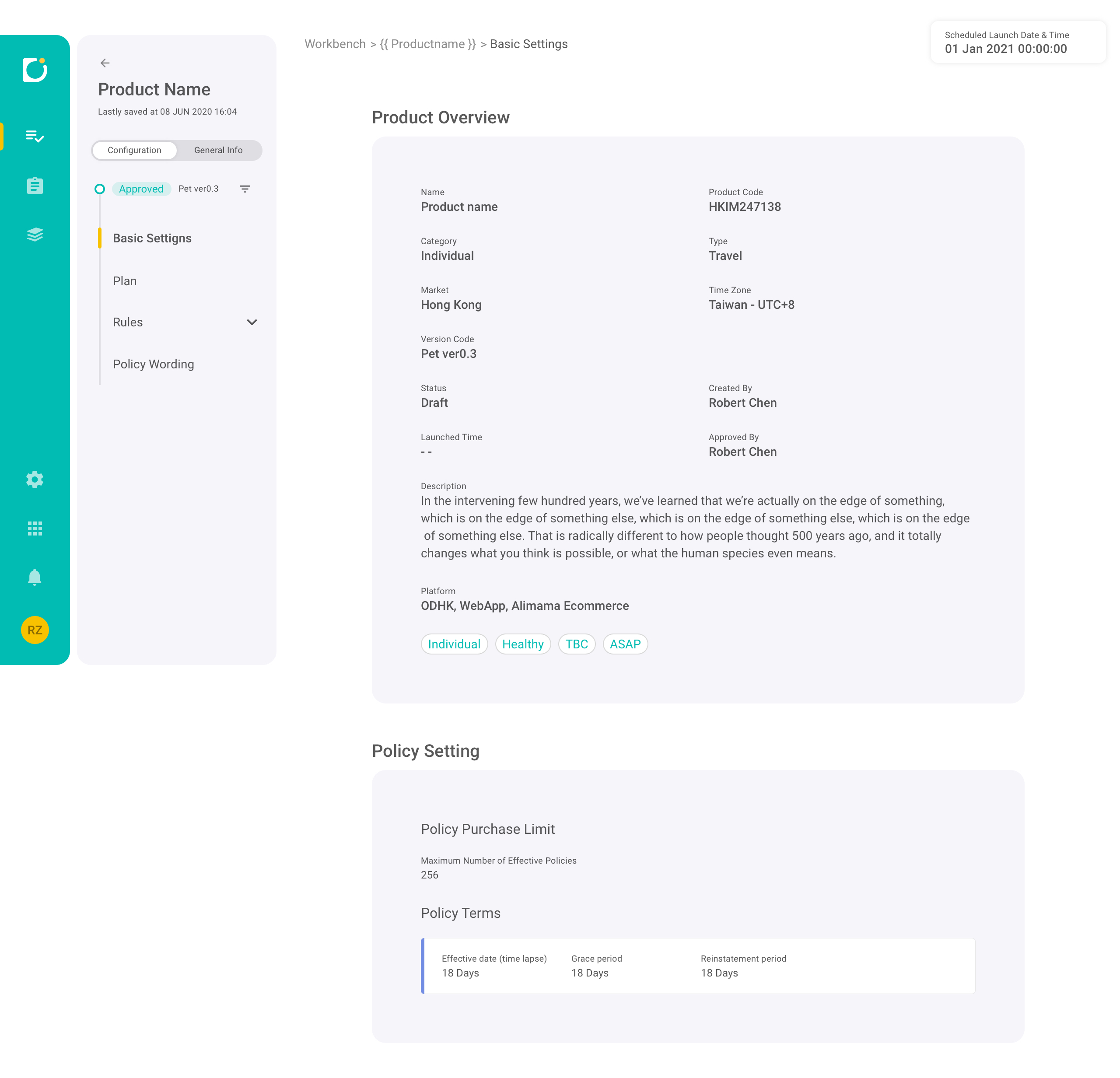
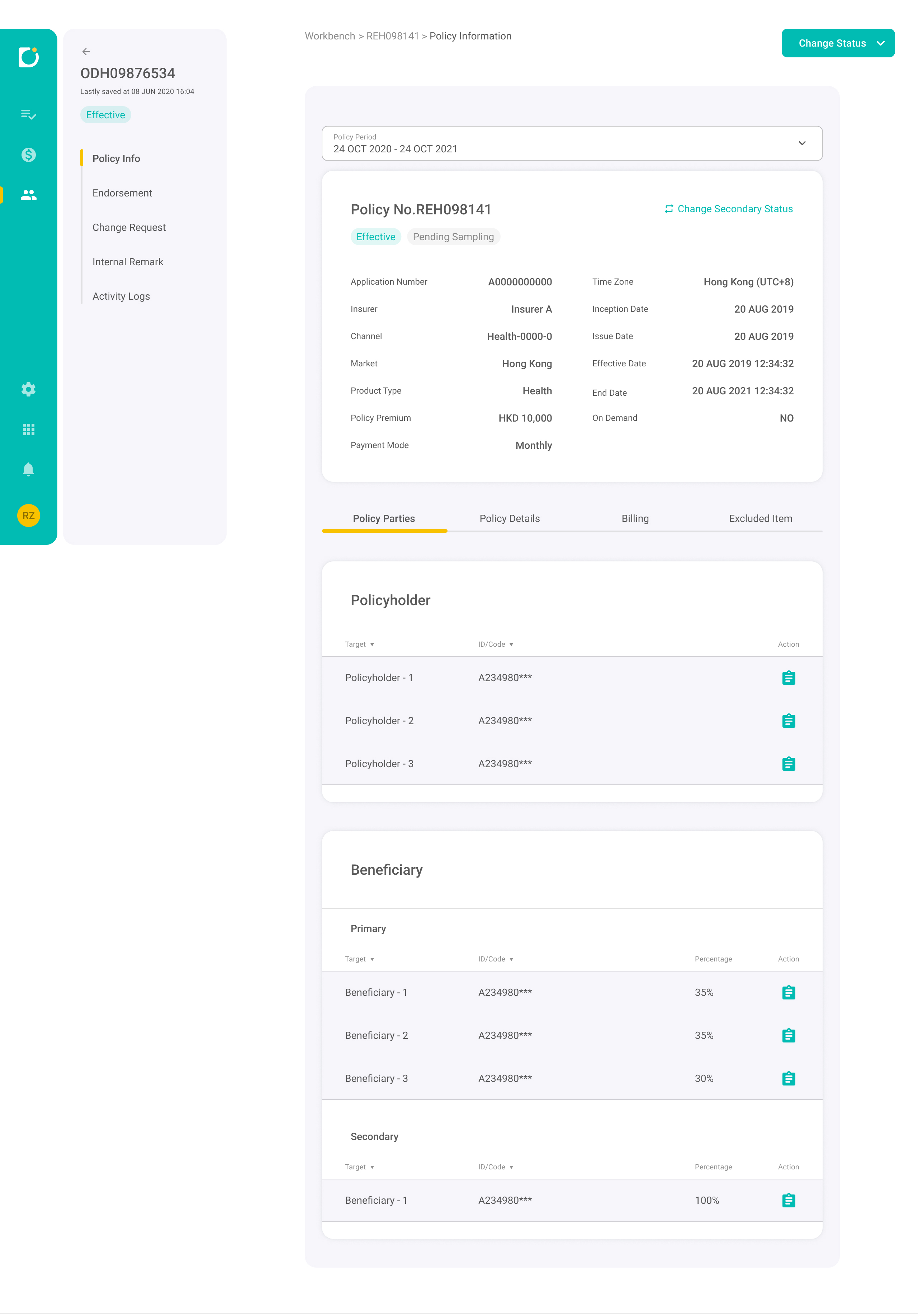
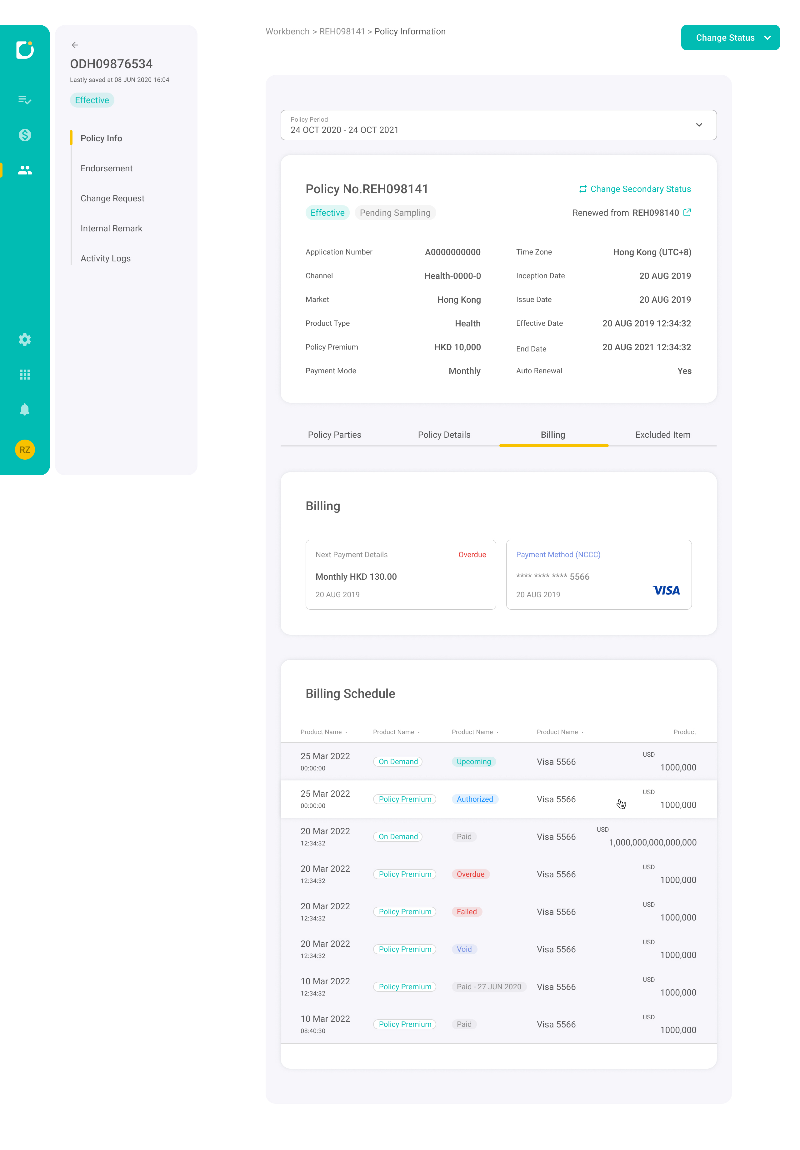
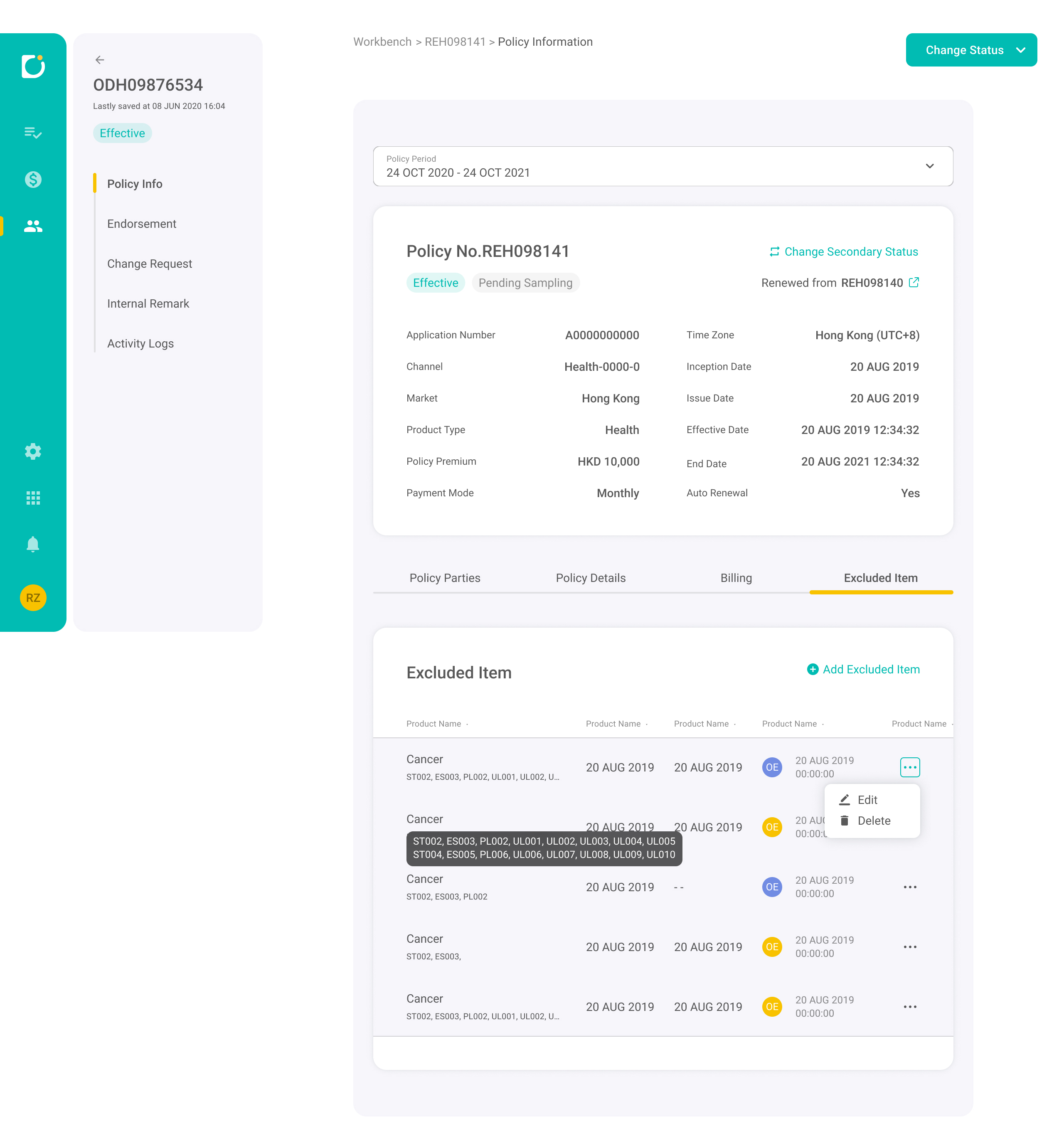
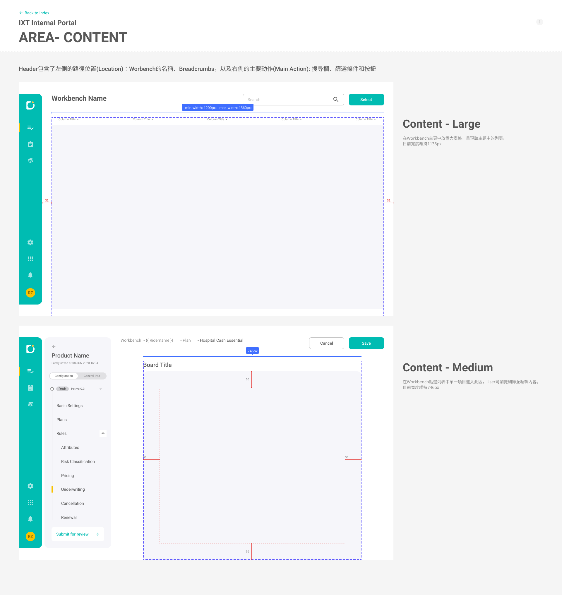
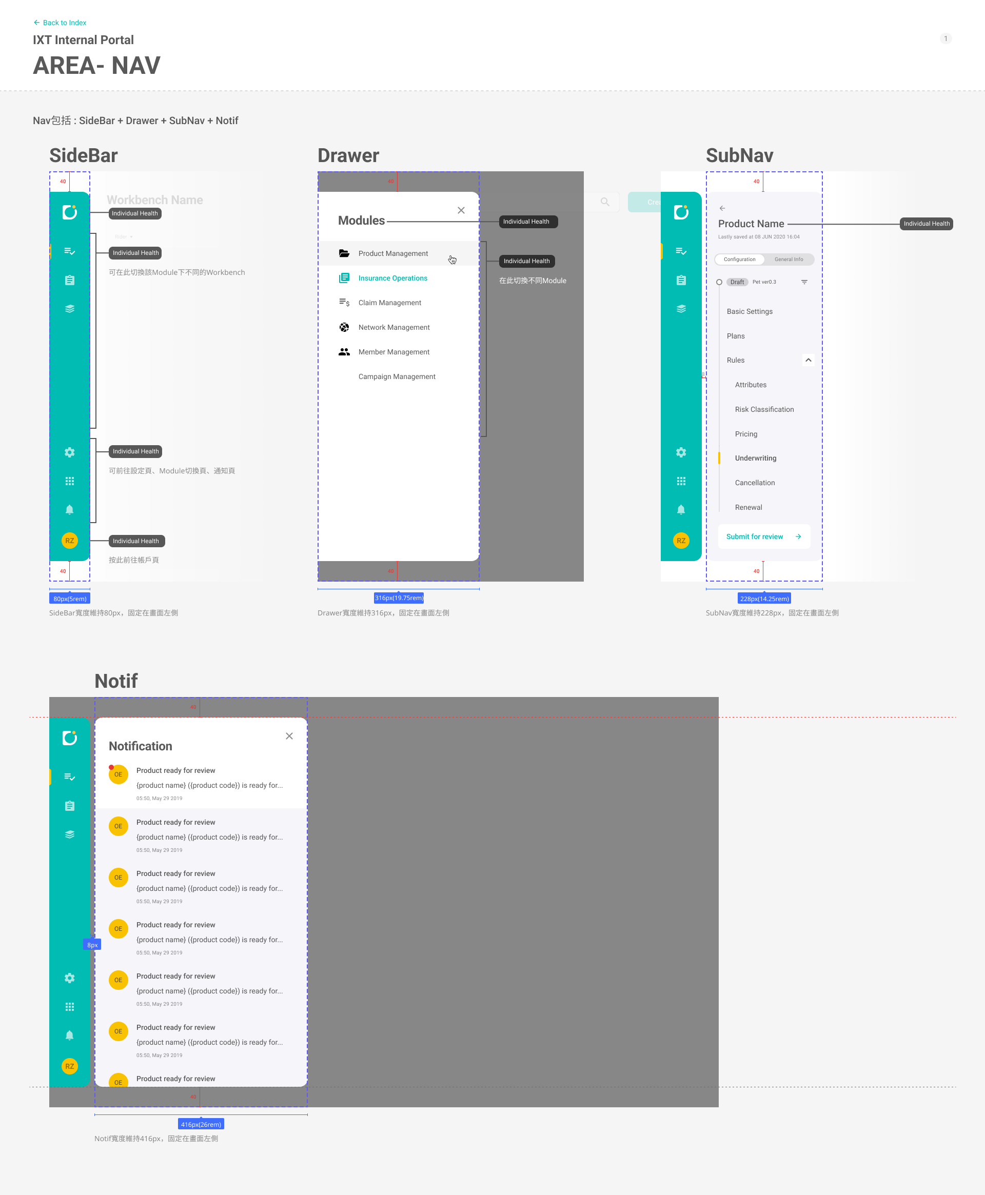
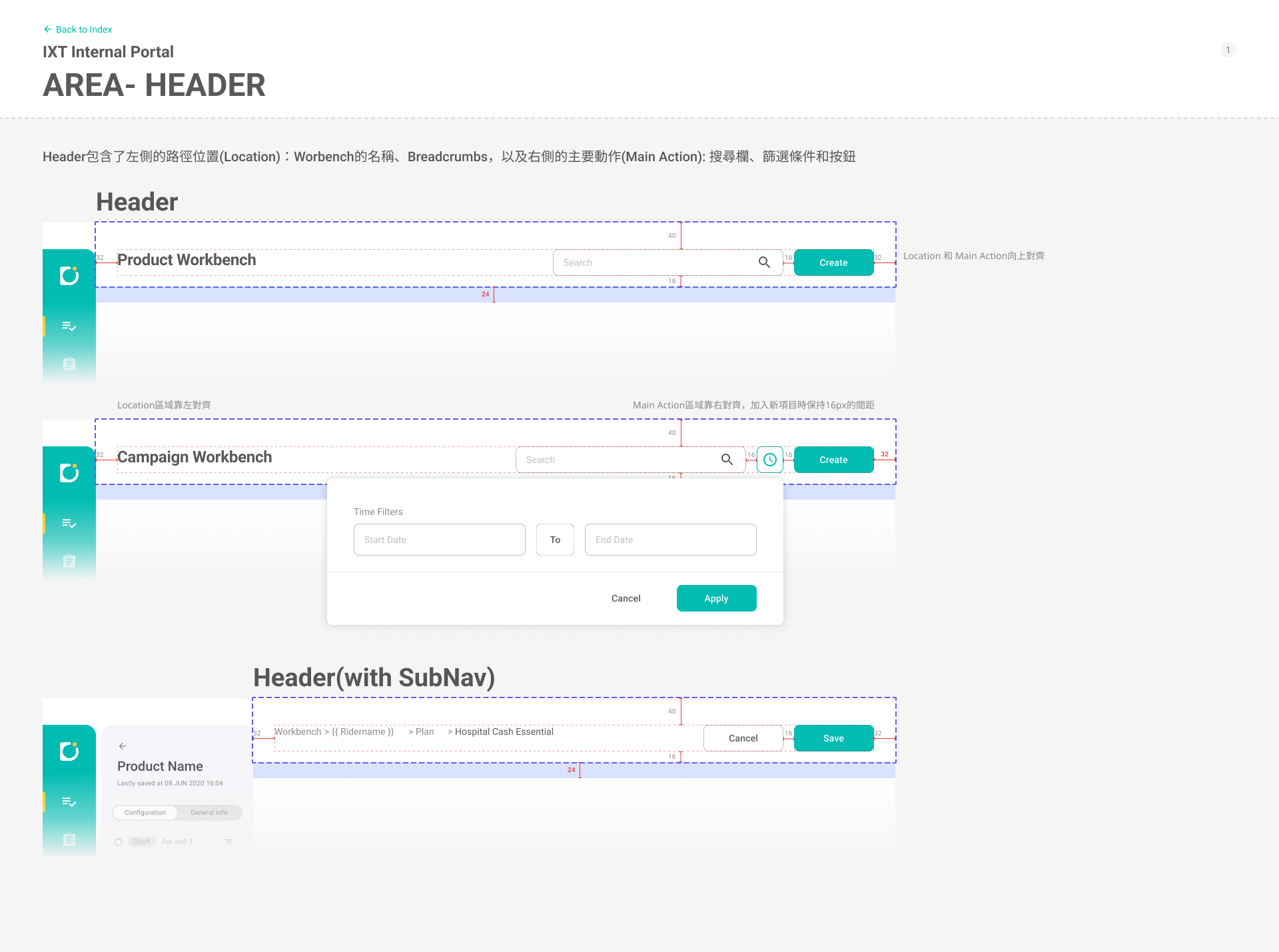
Workbench pages are long and information-dense. The UI needs to help users stay oriented, scan key status quickly, and move between sections without losing context.

Result
  • A consistent page frame: left navigation + a central content canvas with generous spacing for readability.
  • A context header that keeps entity identity and status visible (e.g., policy/product ID, current status, key timestamps).
  • Card-based sections to break dense content into scannable blocks, with tables used only where list comparison is needed.
✅ View mode
Design Rationale

After editing, users often need a stable “review” view for checking details, sharing, or confirming correctness. The UI should clearly communicate read-only vs. editable states and reduce accidental changes.

Result
  • A distinct view mode that presents information as structured blocks/cards for top-to-bottom reading.
  • Clear state cues (e.g., disabled fields, read-only styling) to differentiate viewing from editing.
  • Content grouped by hierarchy so users can verify key information quickly without scrolling through raw form fields.
✅ Navigation Bar (Left)
Design Rationale

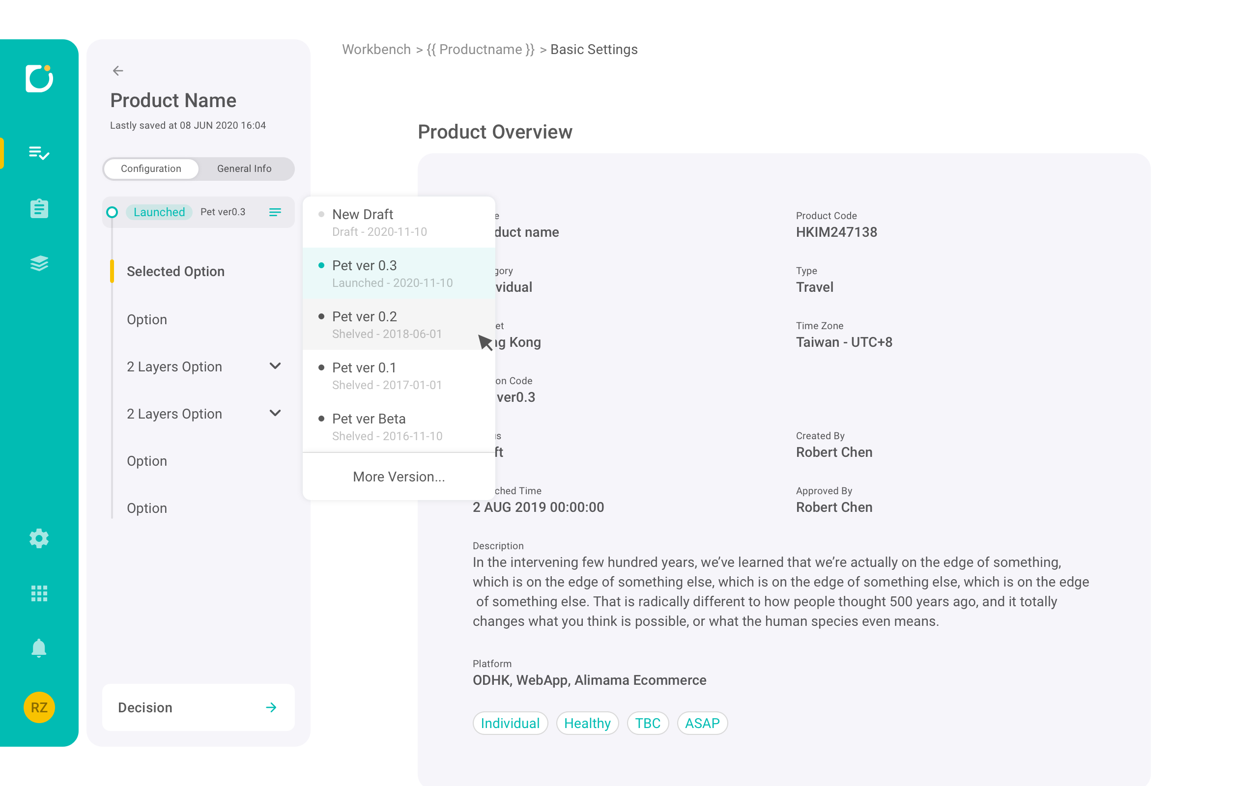
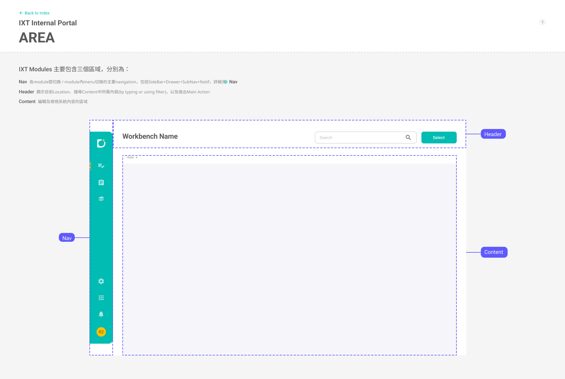
Users frequently jump across areas during decision-heavy workflows. Navigation should support fast switching while preserving a stable mental model.

Result
  • A two-layer navigation: a fixed icon rail for global areas and an inner section list for the current workspace.
  • Consistent labeling and hierarchy (including expandable groups) so users can predict where settings live.
  • Optional collapse behavior when users want maximum space for dense content.
✅ Policy detail view
Design Rationale
  1. Keep critical context always visible
    Users need immediate answers to “What policy is this?”, “What’s its status?”, and “What period am I looking at?” I anchored a summary header that surfaces the policy number, primary/secondary status, key metadata, and actions (e.g., Change Status) so users don’t lose context while navigating long content.
  2. Separate review from actions to reduce mistakes
    Policy servicing often involves high-impact operations. I structured the page so the default experience is review-first (readable, card-based sections), with actions clearly separated (top-right global actions, row-level actions in tables, and contextual actions like “Add Excluded Item”). This reduces accidental edits and supports confident decision-making.
  3. Use consistent information hierarchy across tabs
    To reduce learning cost, each tab follows the same pattern:
    (a) policy context → (b) section navigation → (c) card-based blocks → (d) tables for dense lists.
    This creates a predictable rhythm for scanning and helps users build a stable mental model across “Policy Parties / Policy Details / Billing / Excluded Item.”
  4. Turn dense content into scannable blocks
    Insurance data is inherently dense (multiple parties, plans, documents, billing schedules). I used card sections and grouped fields to make long content readable, then used tables only where list comparison is required—keeping each area focused on a single decision.
  5. Make state and exceptions explicit
    Servicing workflows depend on understanding state: Effective vs. Pending, Overdue vs. Paid, renewed relationships, etc. I emphasized state with clear labels/badges, surfaced exception signals (e.g., overdue indicator), and provided status-change entry points in consistent locations.
Result
  • Persistent context header with policy identity, primary/secondary status, key dates, and a clear “Change Status” action—supporting quick verification and reducing back-and-forth.
  • Tabbed navigation (Policy Parties / Policy Details / Billing / Excluded Item) to separate tasks while keeping the same information structure across sections.
  • Policy Parties organized into scannable card blocks (e.g., Policyholder, Beneficiary) with compact tables for multiple entries, enabling quick review and targeted actions.
  • Policy Details presented as stacked plan cards (core/rider plans) plus supporting sections (campaigns, policy documents, agreements), enabling users to review coverage composition without digging through multiple pages.
  • Billing designed around “what needs attention now” (next payment + payment method summary) and a detailed Billing Schedule table with status tags for fast reconciliation.
  • Excluded Item built as an exception-handling workspace with a clear “Add” entry point and row-level actions (edit/delete) so users can manage exclusions safely and efficiently.
✅ Plans Viewer
Design Rationale

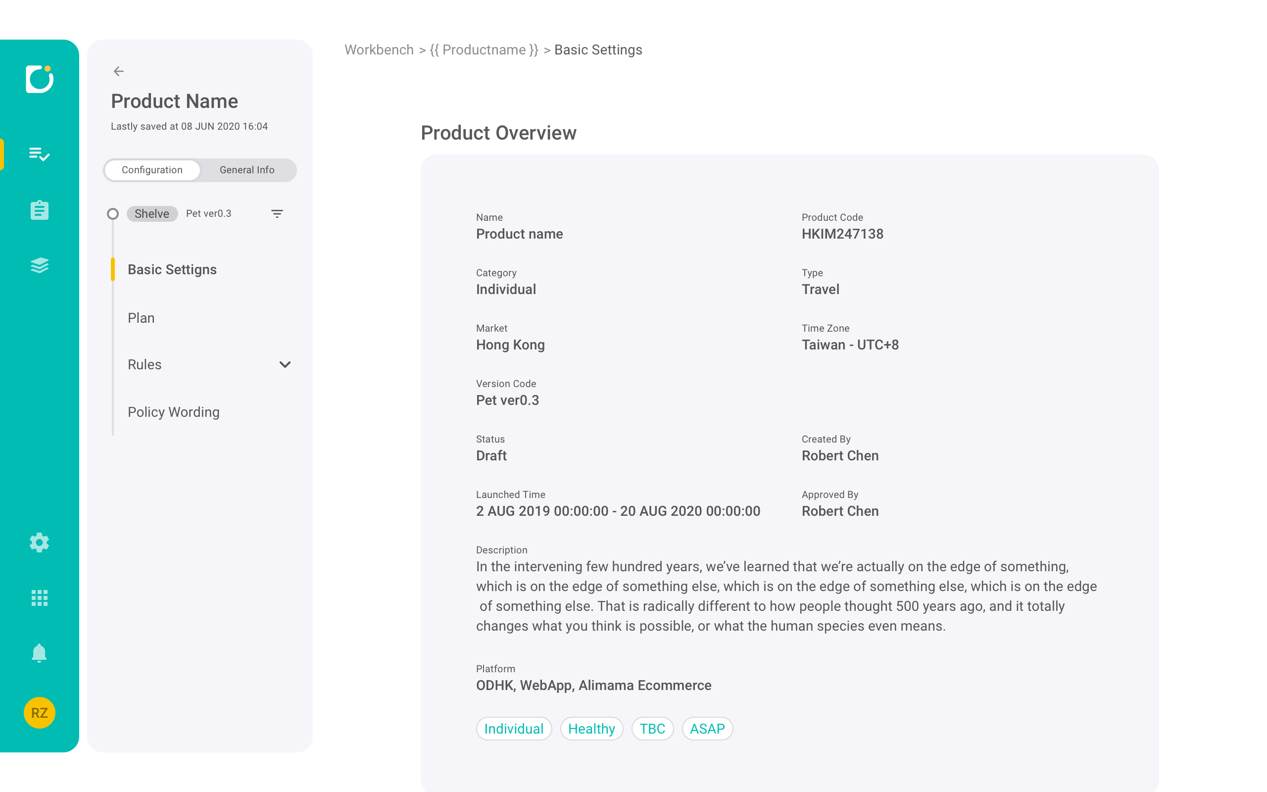
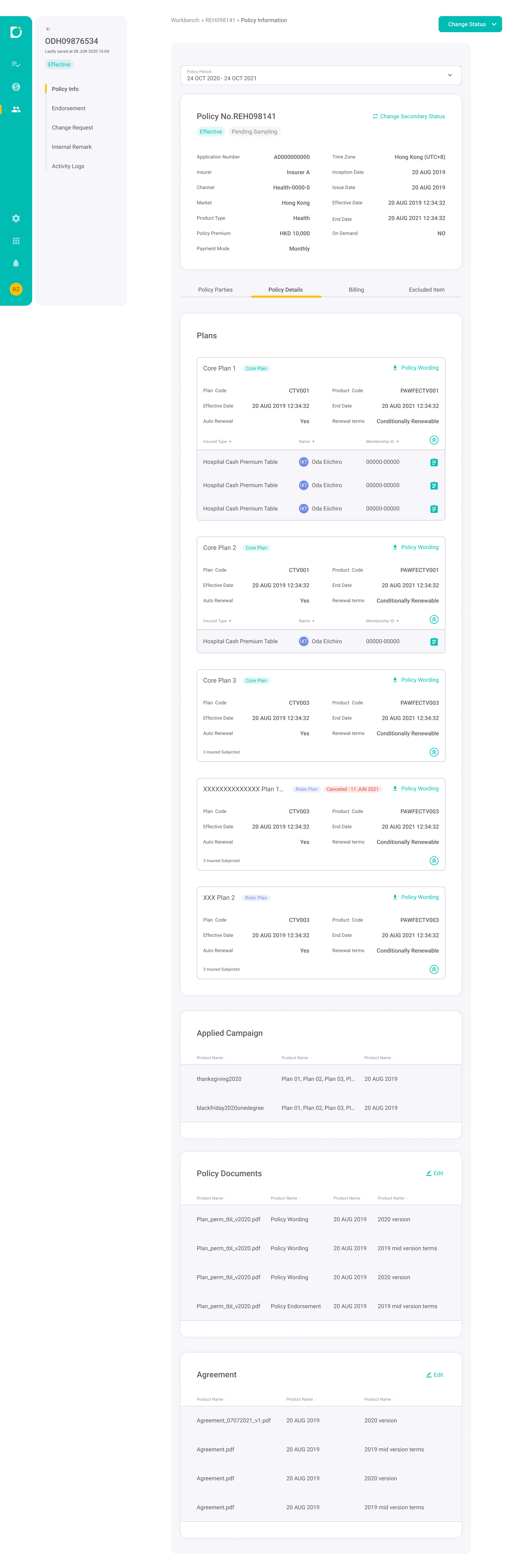
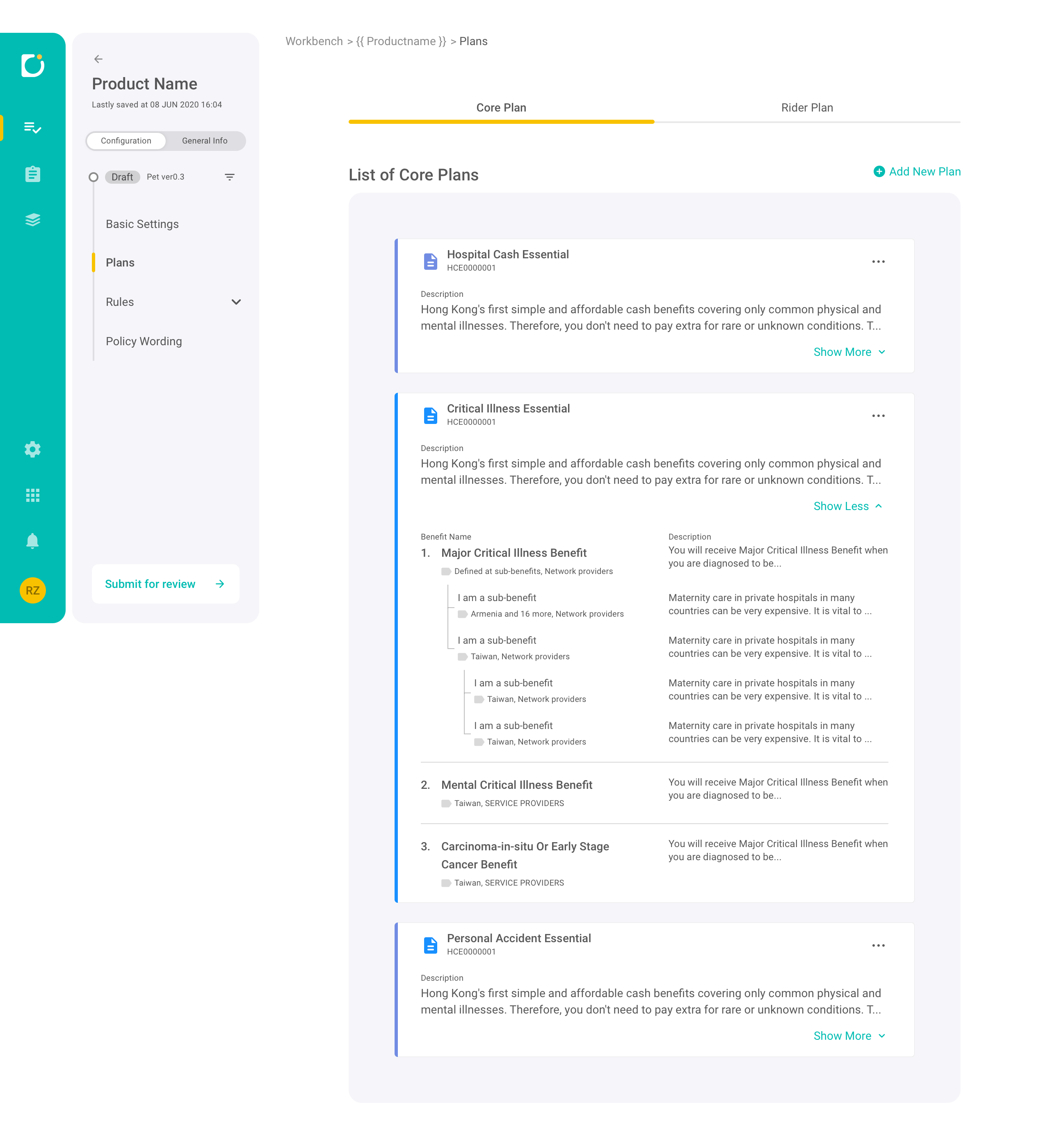
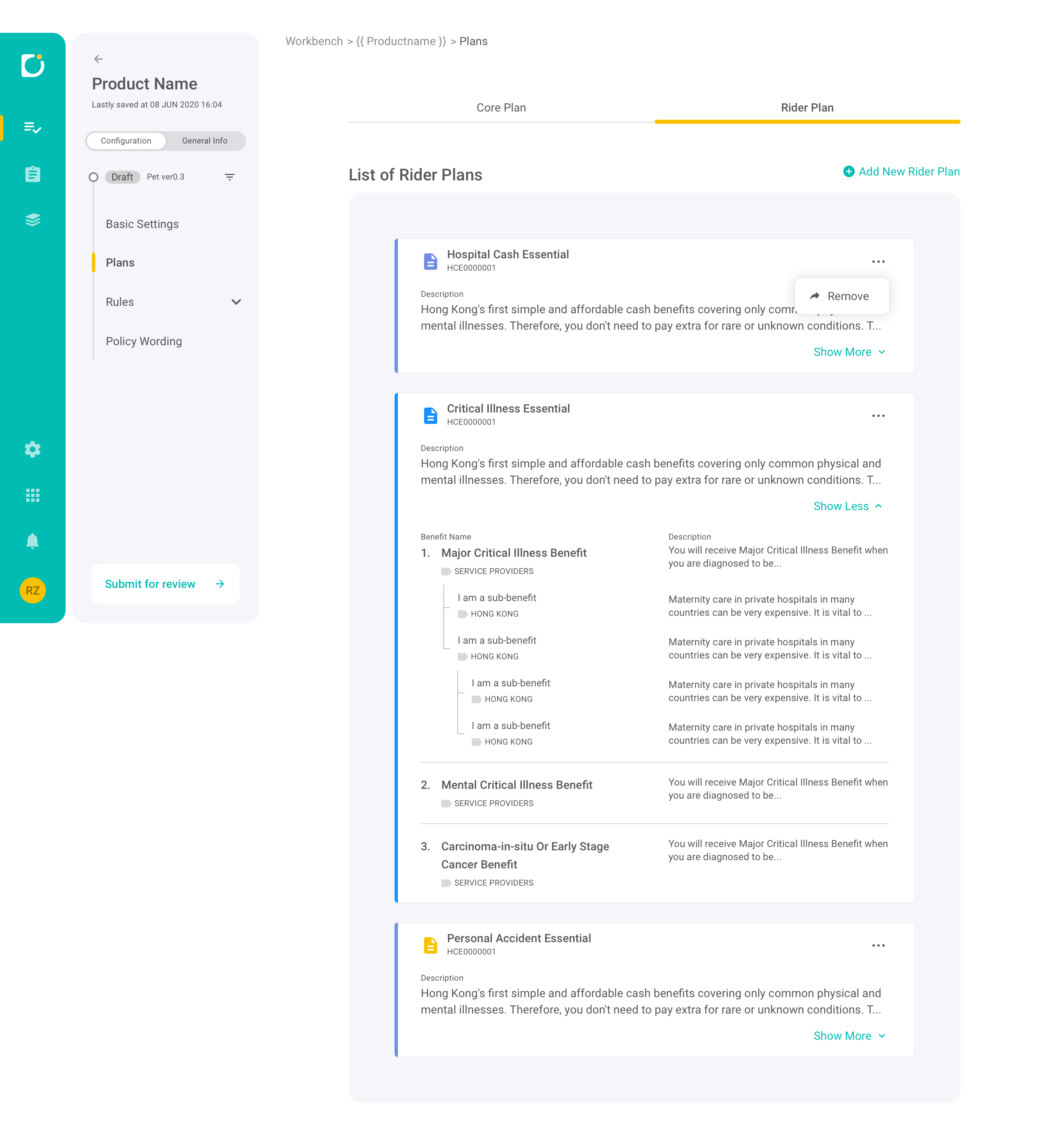
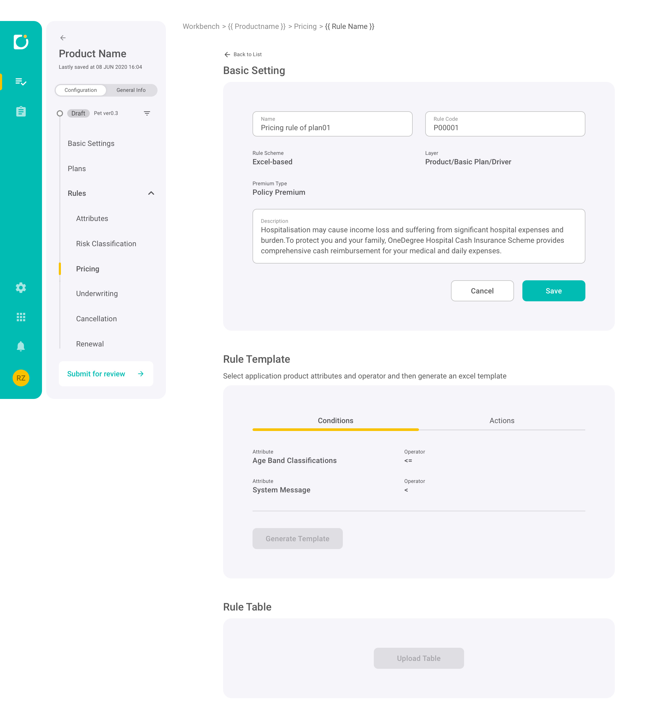
Plan content is often contract-like and dense, with nested structure (main clauses, conditions, riders). The UI should improve readability without “simplifying away” important details.

Result
  • A document-style viewer with clear typographic hierarchy and spacing to support dense reading.
  • Structured grouping to reflect clause relationships (main items → sub-items / conditions).
✅ Rule-Based Filtering
Design Rationale

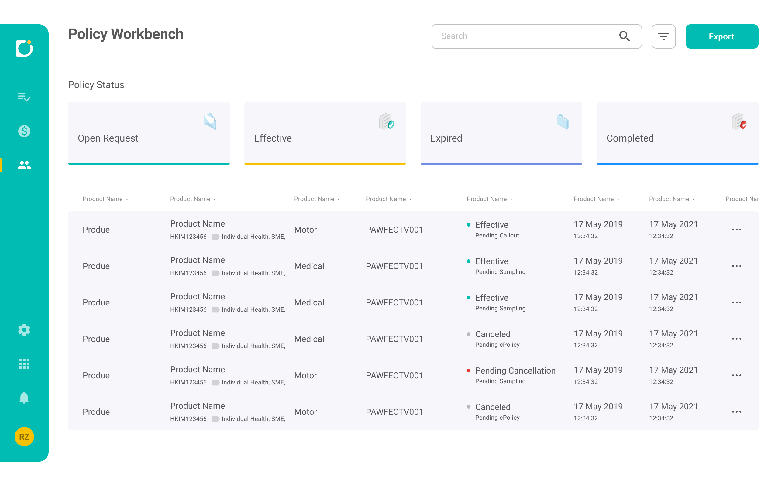
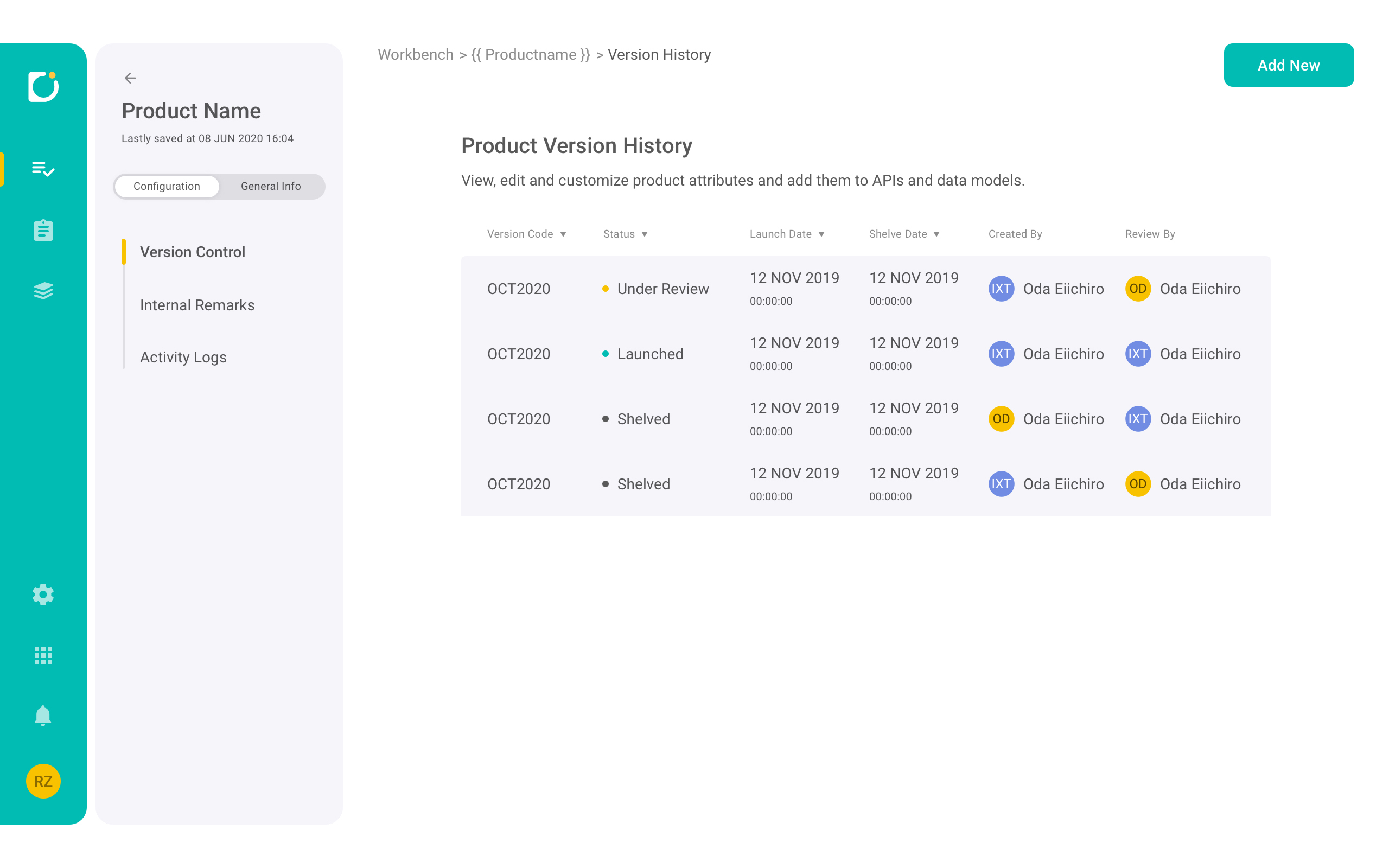
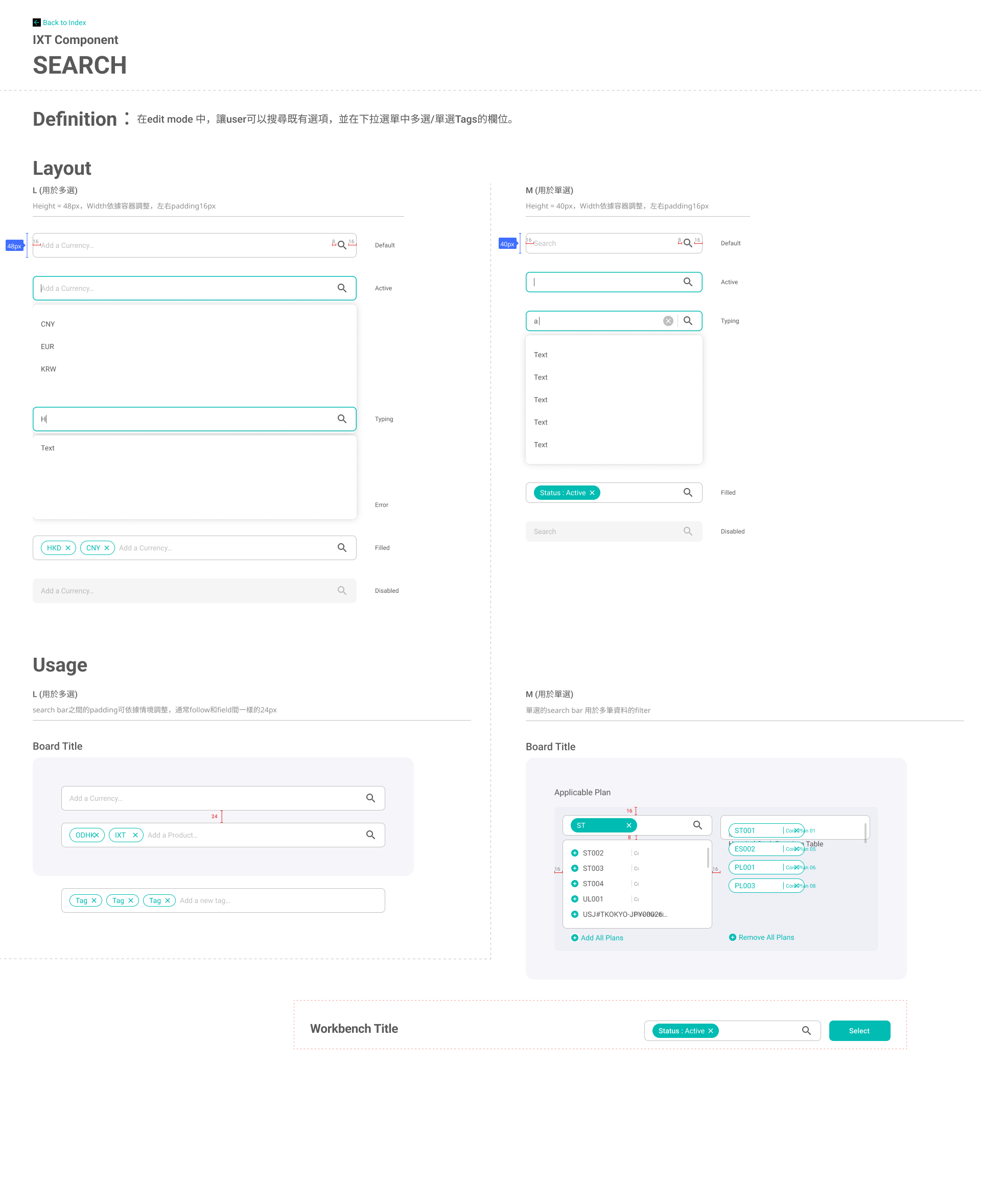
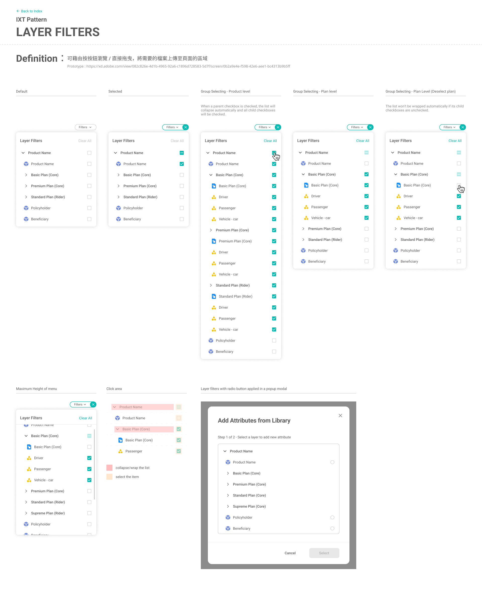
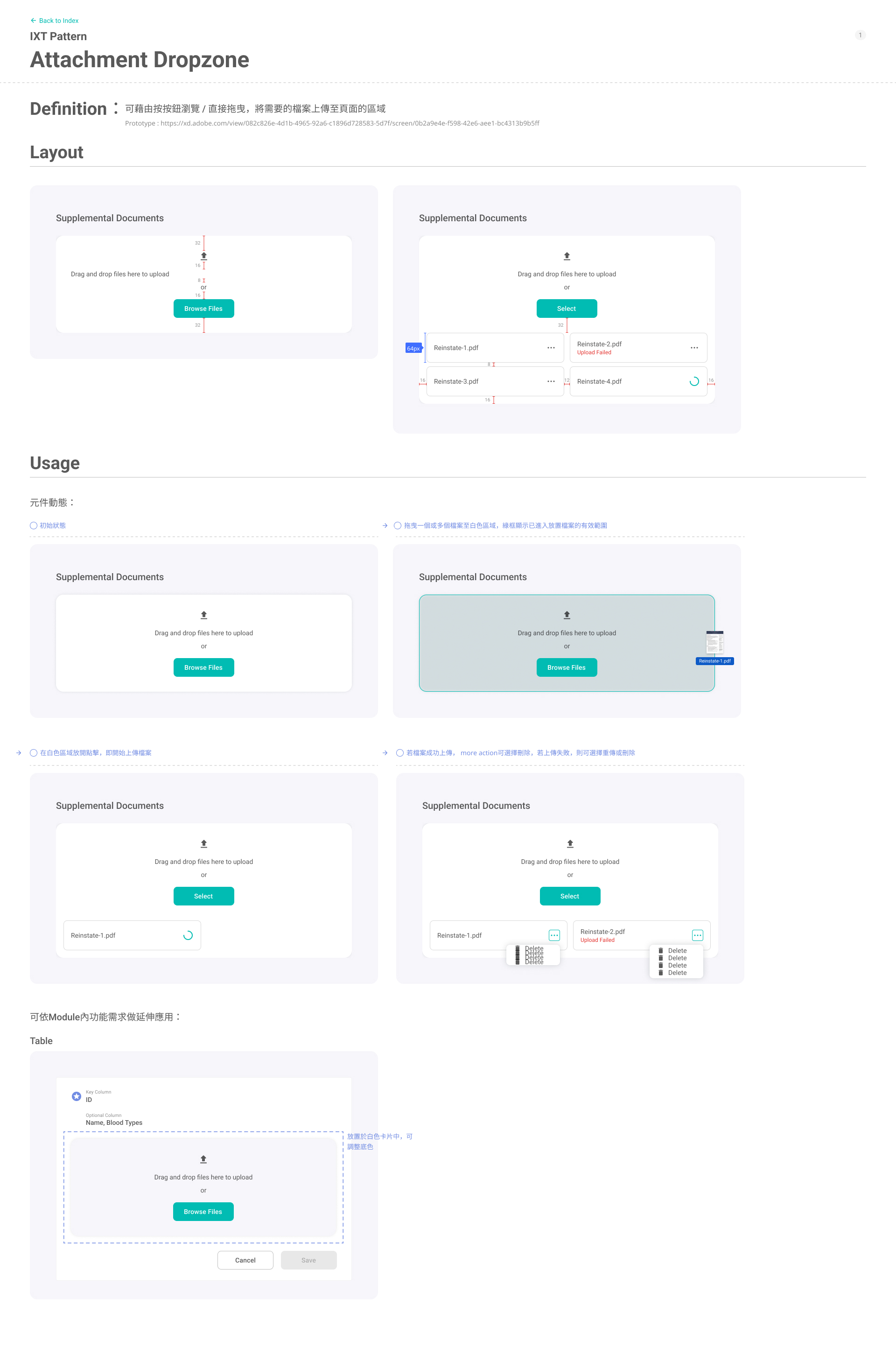
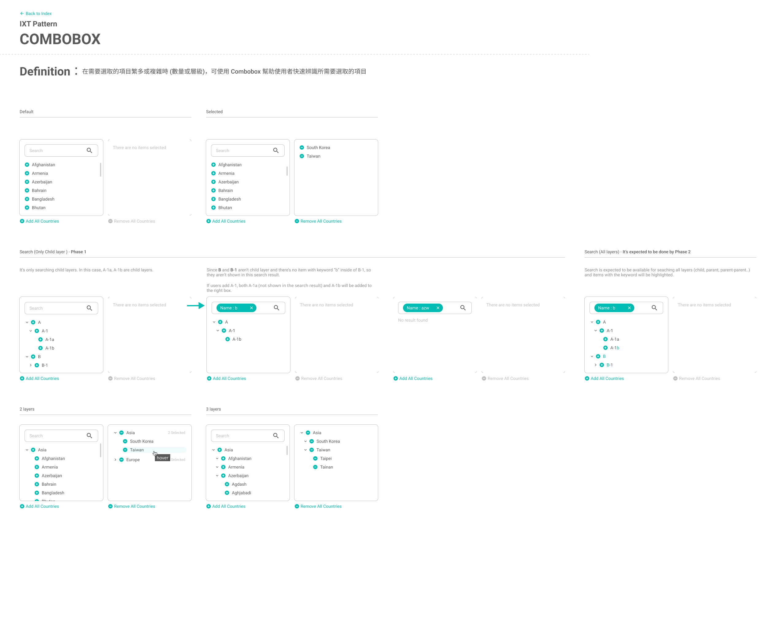
Workbench lists require flexible filtering, but the UI should remain lightweight and safe. Users need to refine criteria without losing their place or triggering unintended changes.

Result
  • A top-down drop-down filter panel from the header to keep list context and scroll position.
  • A consistent rule structure (Field × Operator × Value) that scales to multi-condition filtering.
  • Autocomplete with type labels to reduce mismatches.
  • Apply / Cancel to allow safe iteration before committing changes.
✅ Forms / Editing
Design Rationale

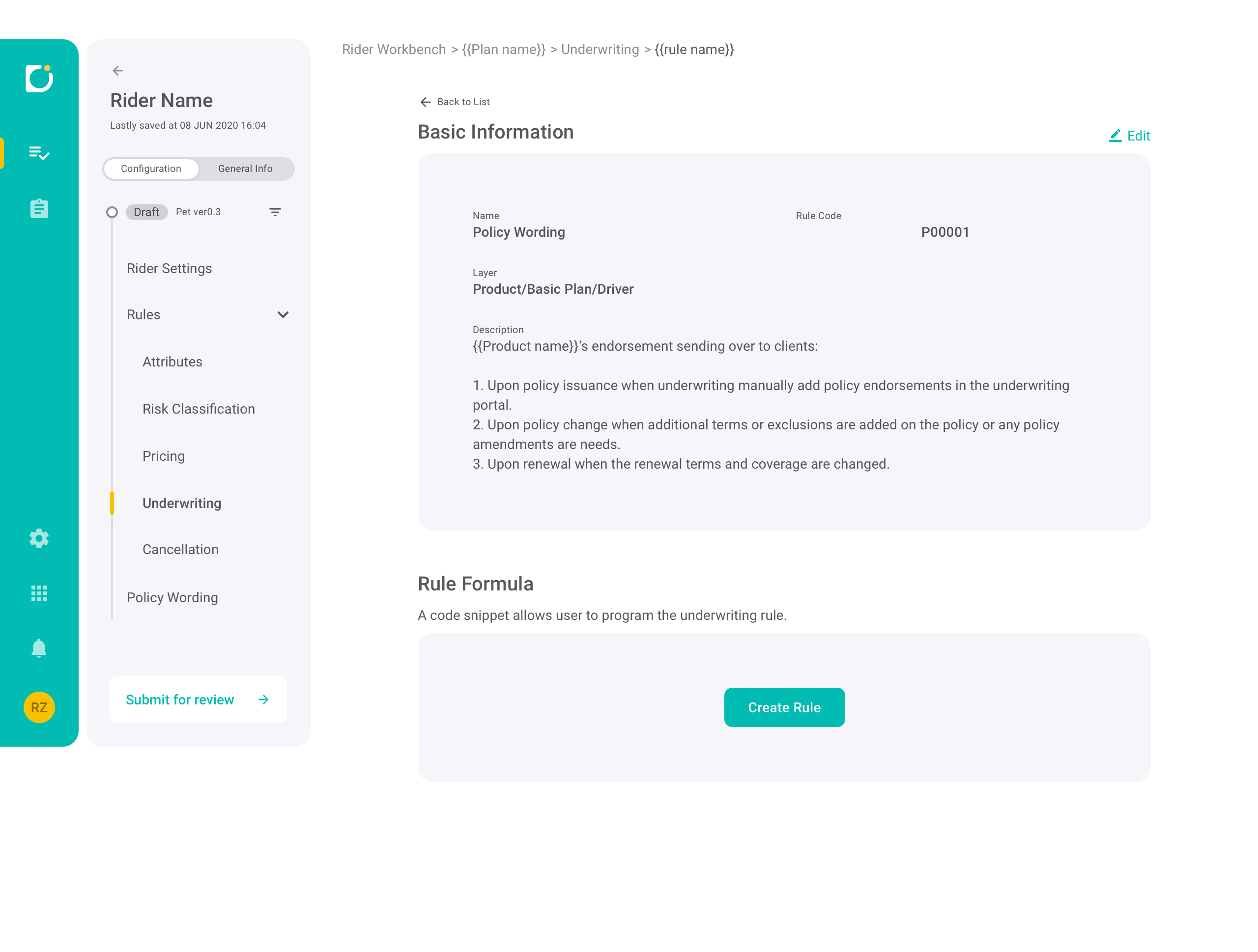
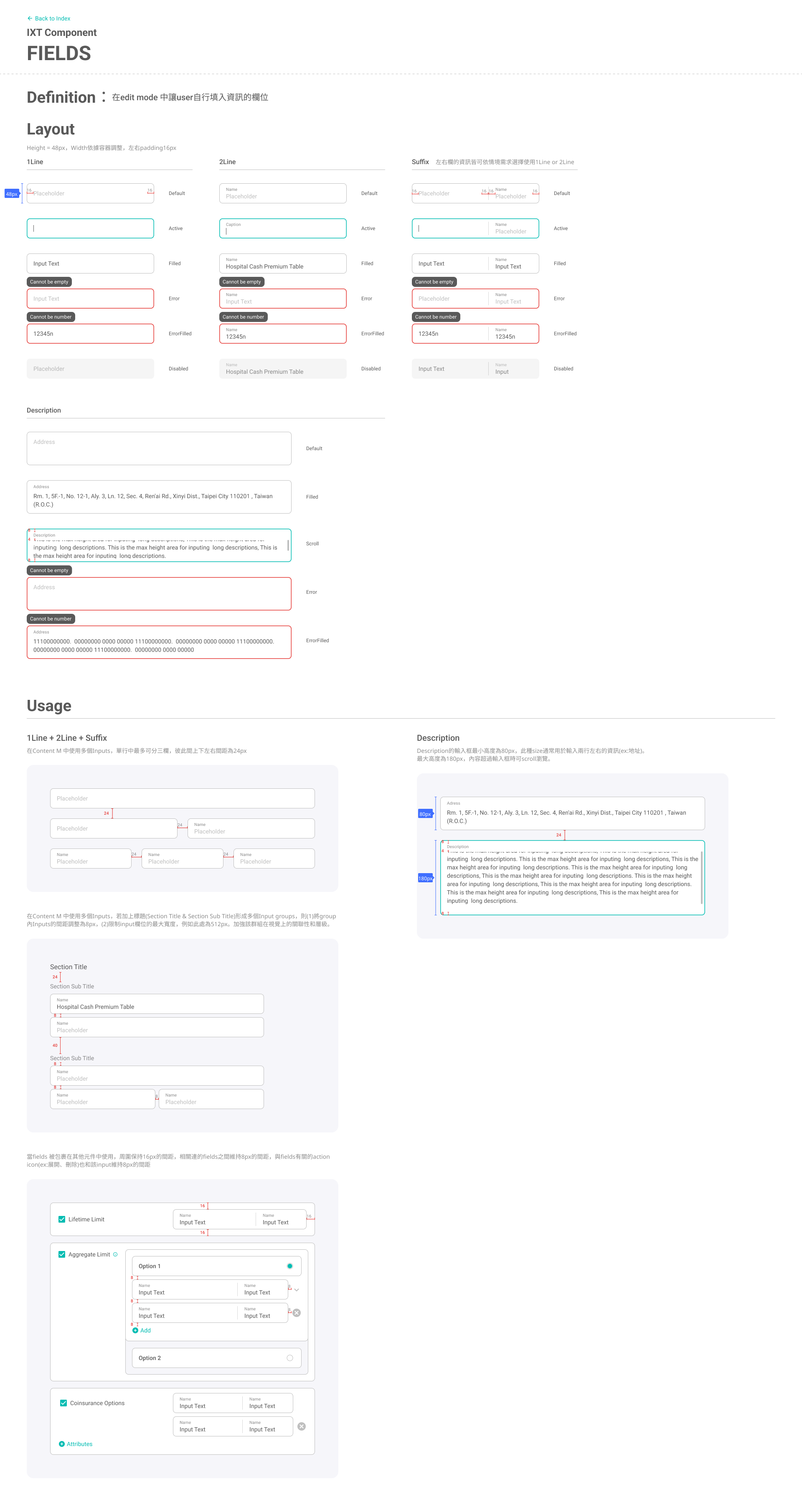
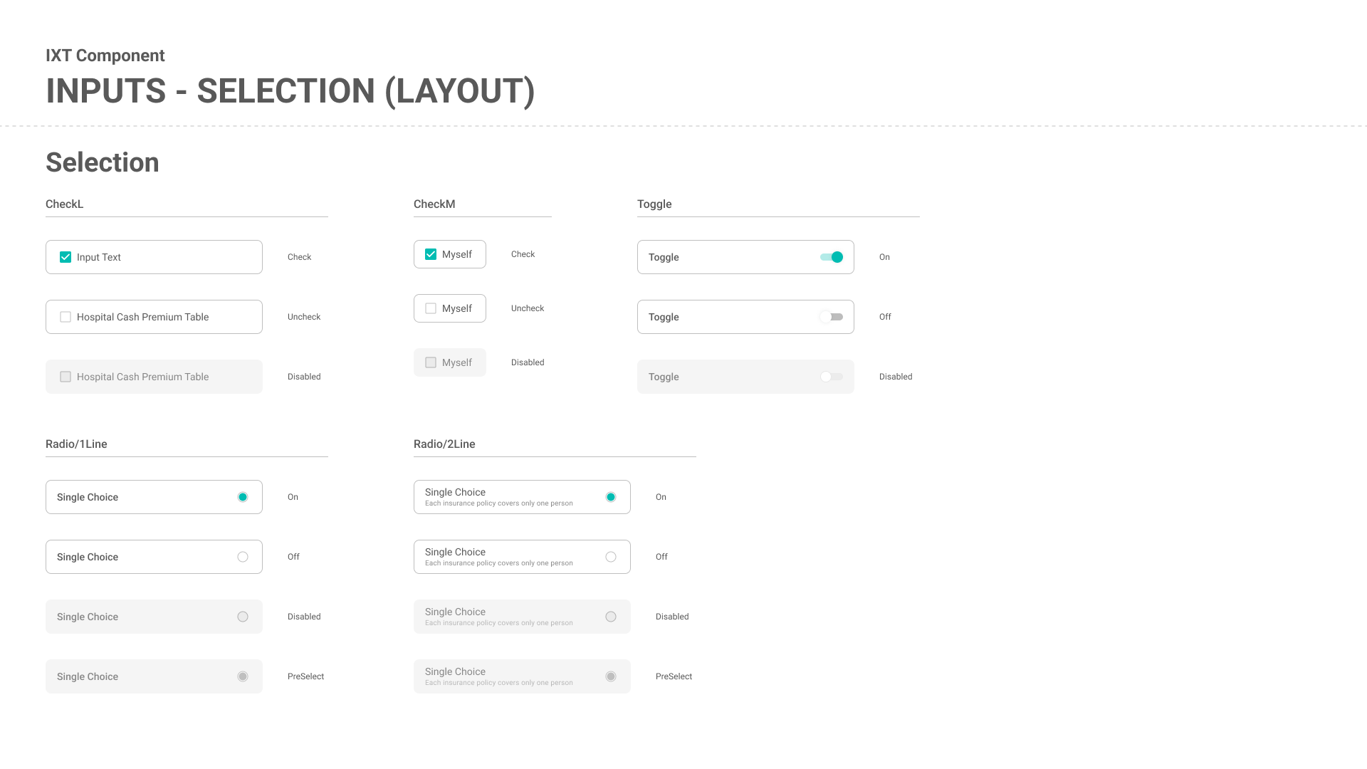
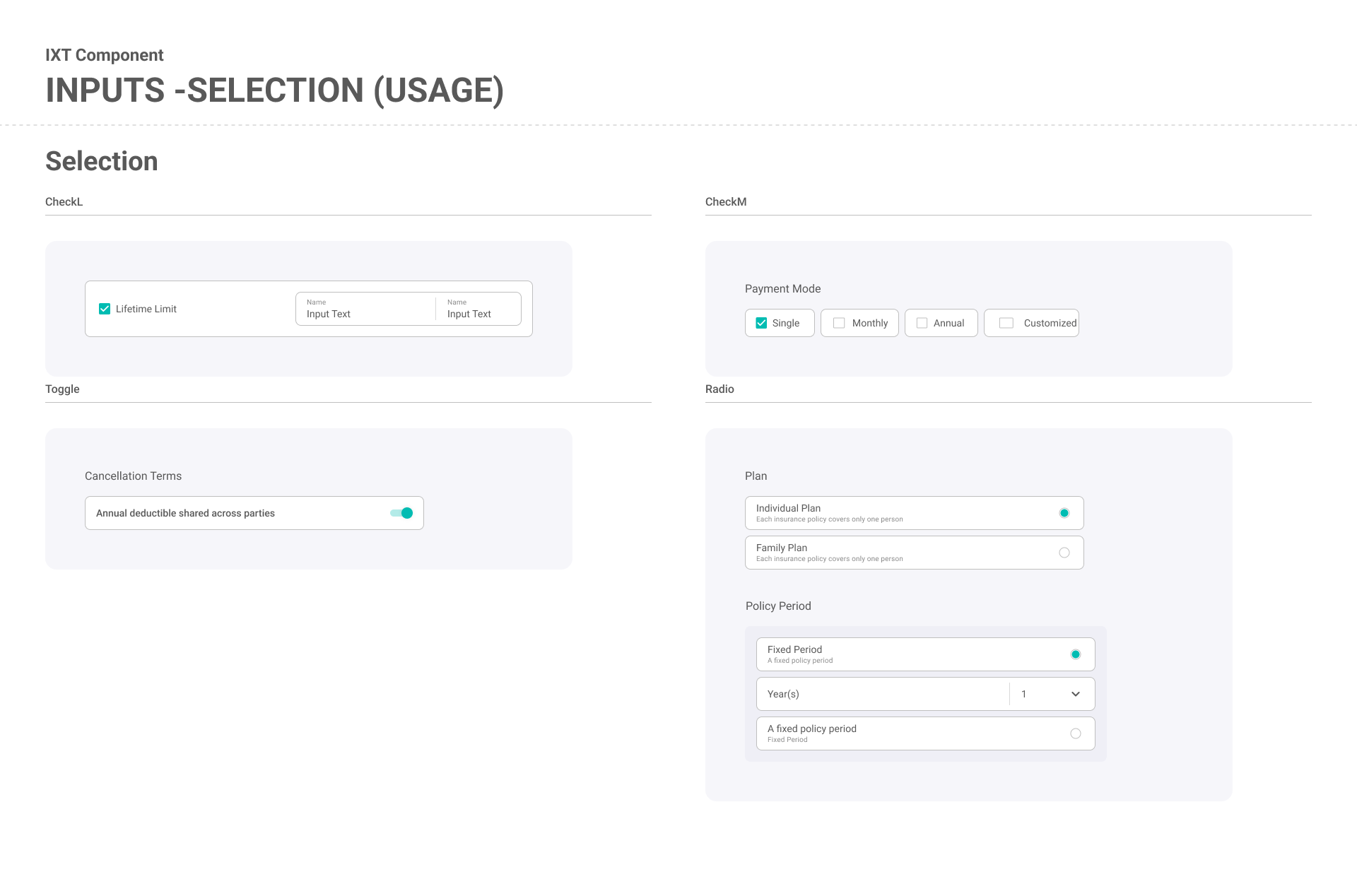
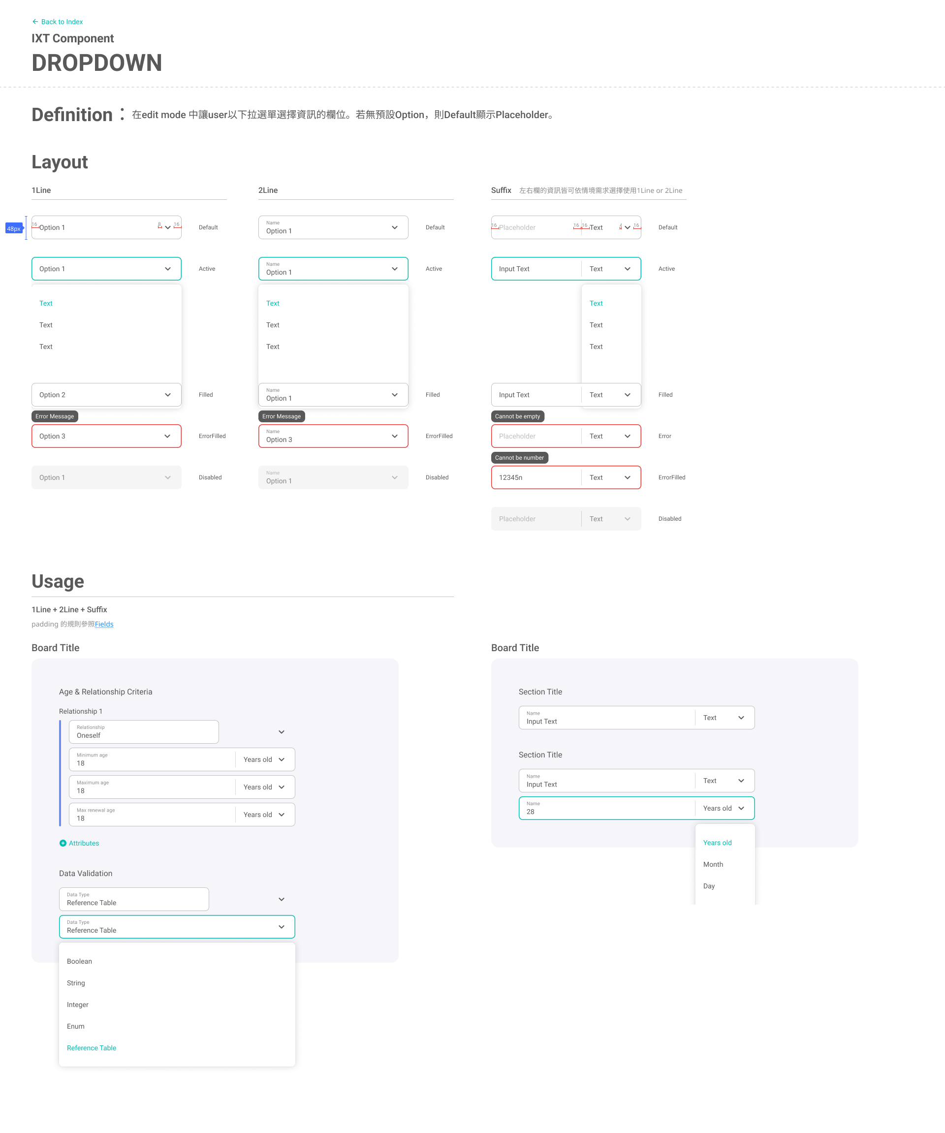
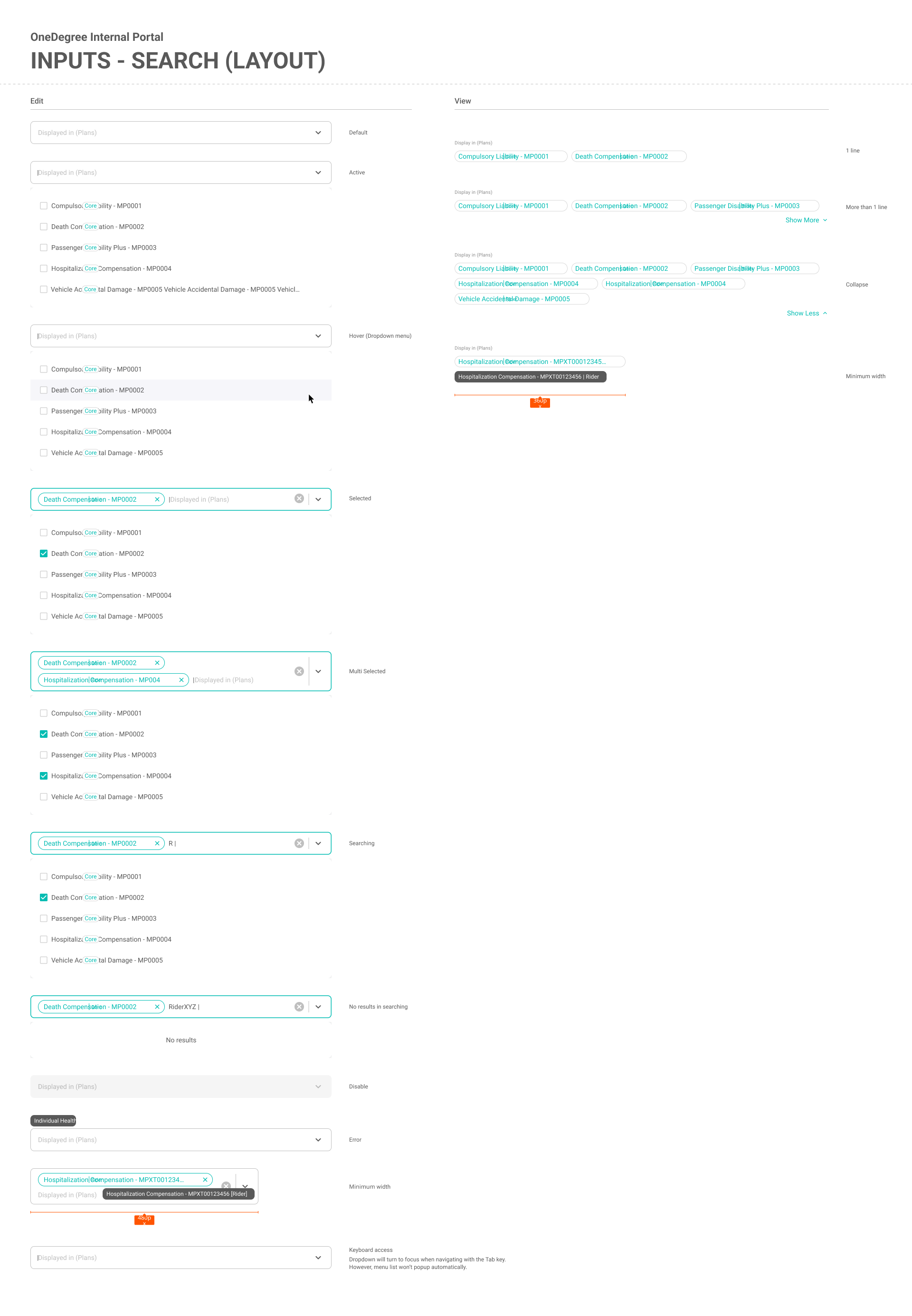
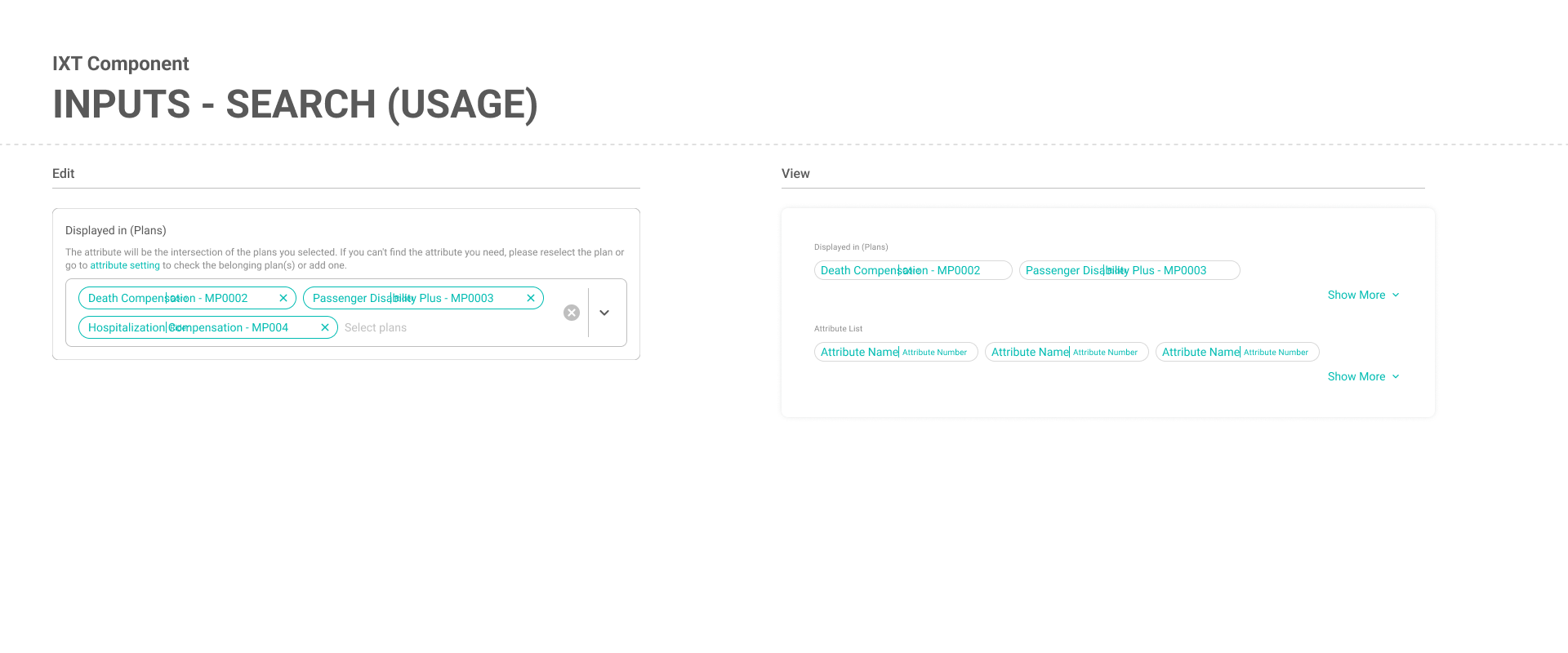
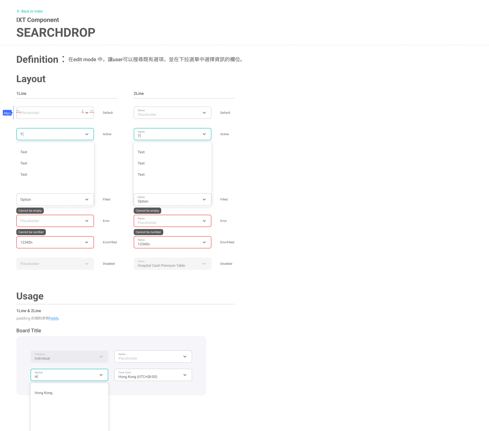
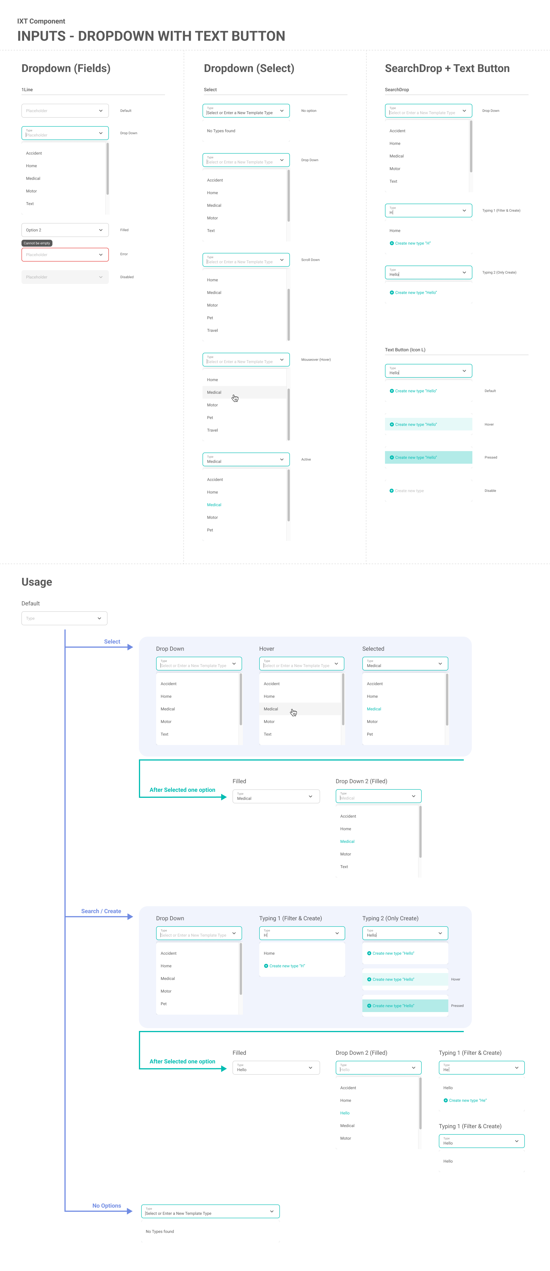
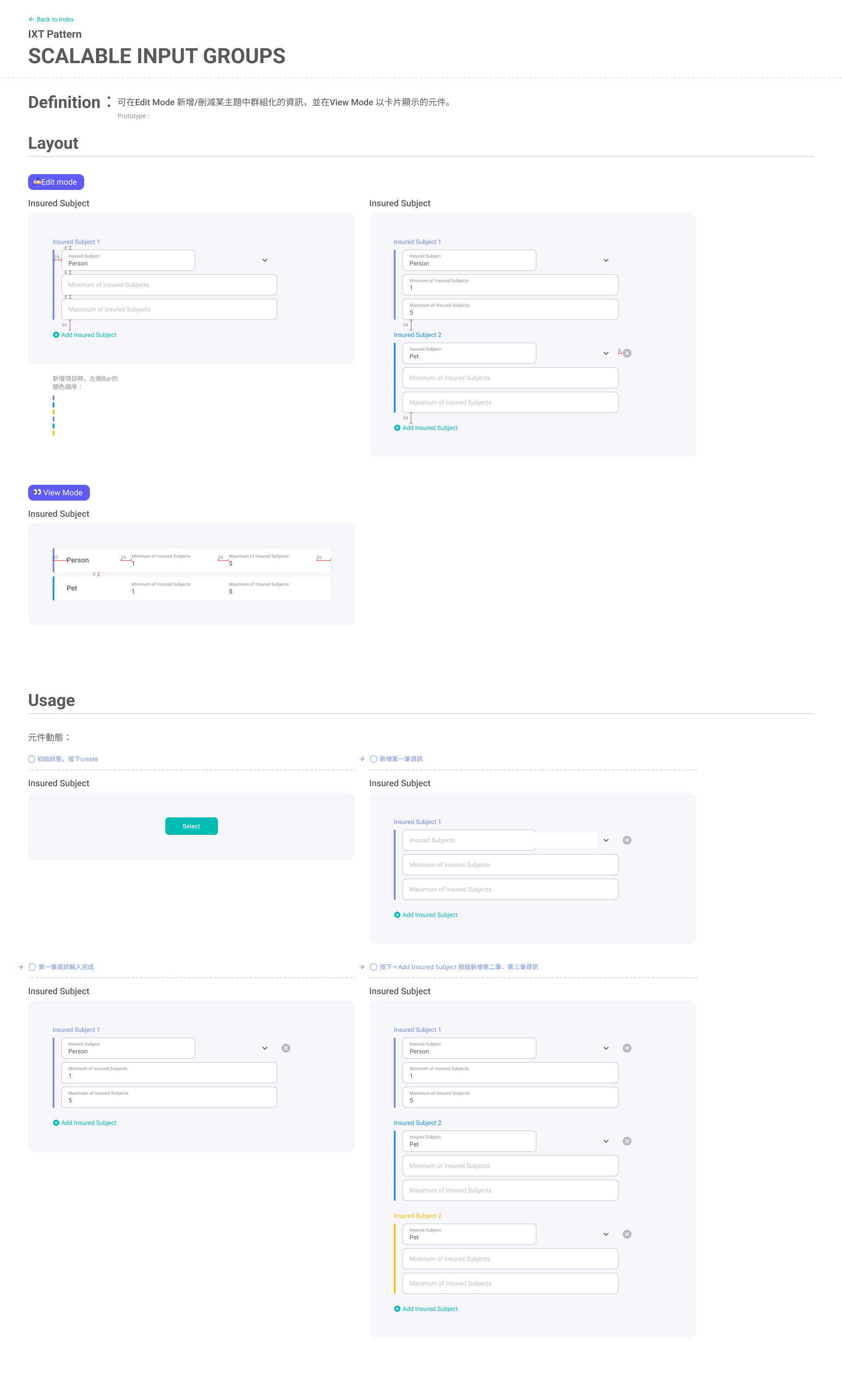
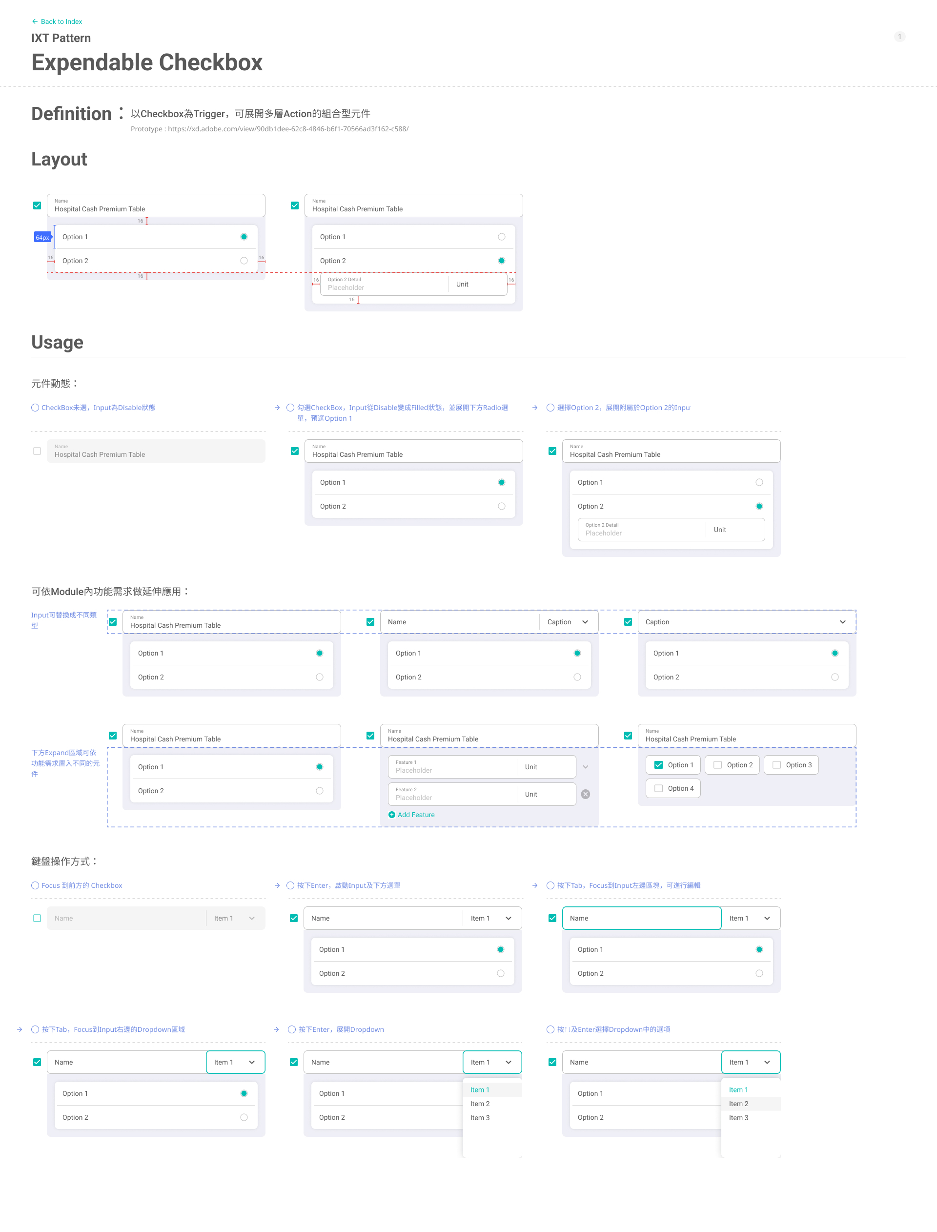
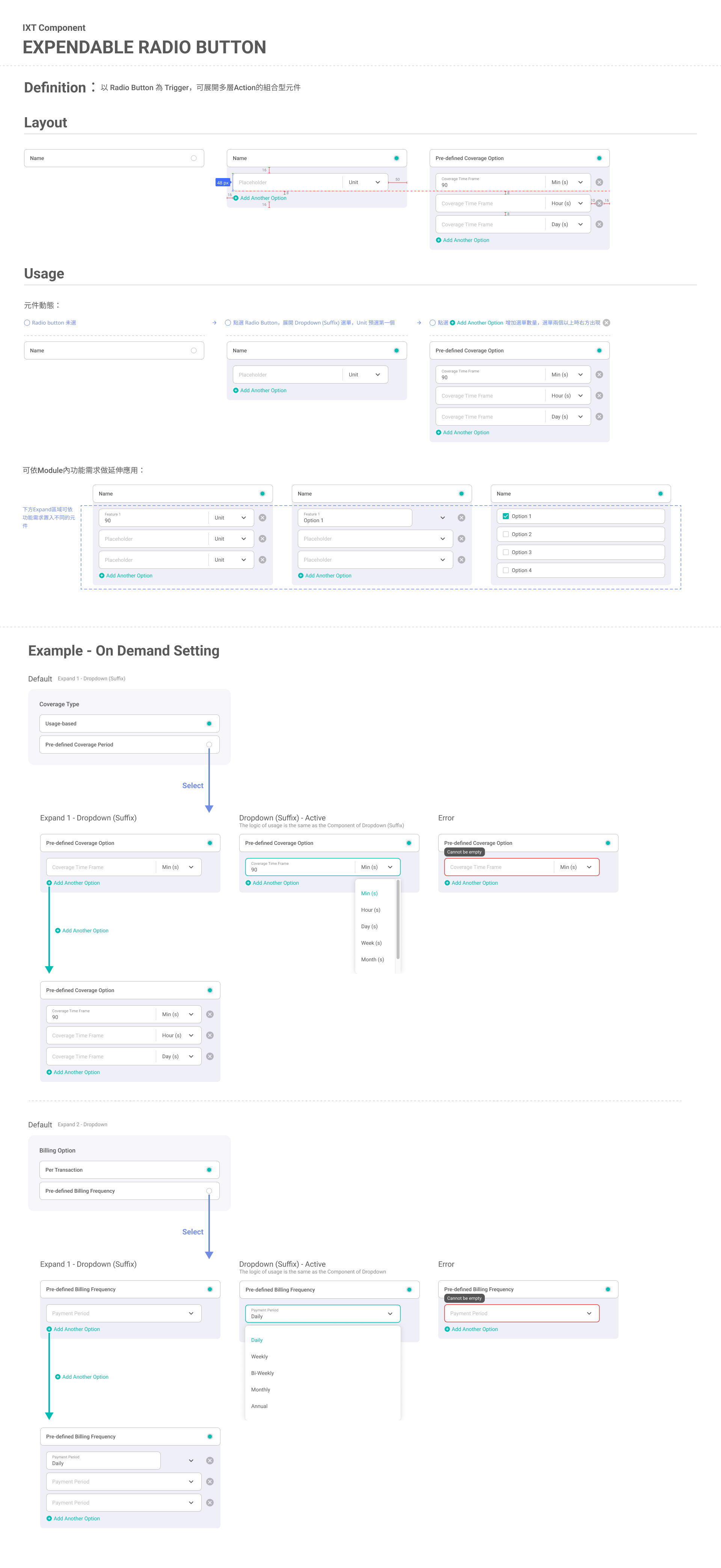
Across the platform, editing screens are rule-driven and input-heavy. Many fields affect calculations and downstream behavior, so the key UI challenge is making complex inputs scannable, unambiguous, and hard to misconfigure—without forcing users to relearn patterns in every module.

UI Focus
  • Hierarchy and grouping
    Structured long forms into consistent sections and blocks, using headings, spacing, and alignment to clarify what belongs together and what depends on what.
  • Reusable patterns across forms and tables
    Standardized common components (dropdowns, toggles, add-another rows, inline help, table actions) so the same interaction behaves consistently across different editing contexts.
  • Clear states and feedback
    Emphasized editable vs. read-only states, required/optional cues, validation, and warnings to reduce mistakes in calculation-sensitive setups.
Result

A consistent editing experience where users can scan structure quickly, understand field relationships, and complete configurations with fewer errors and less cognitive load.

Custom Rule Editor (Python)
Design Rationale

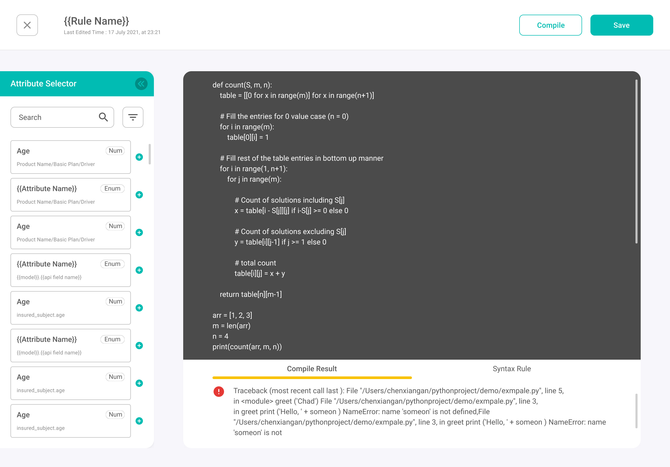
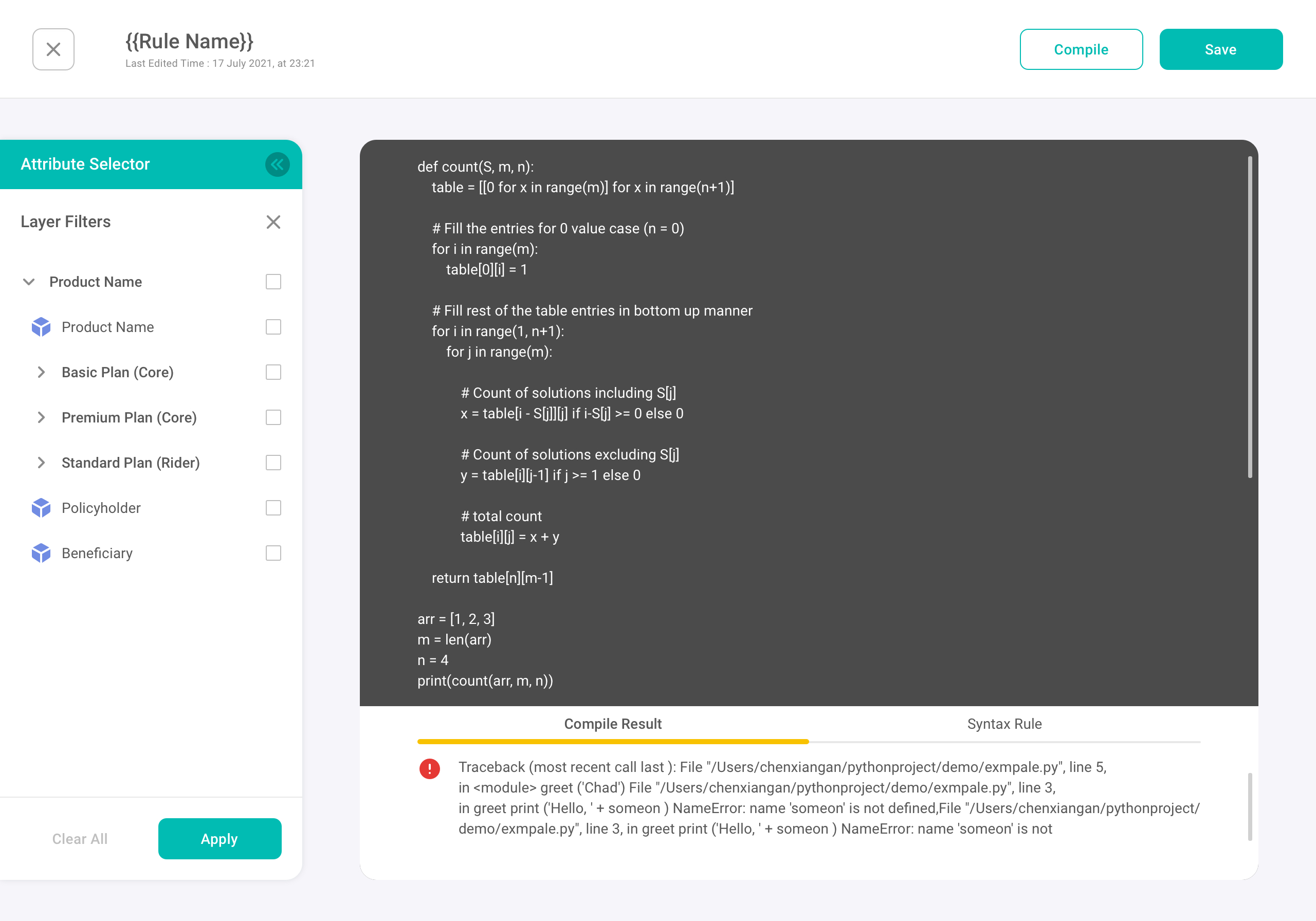
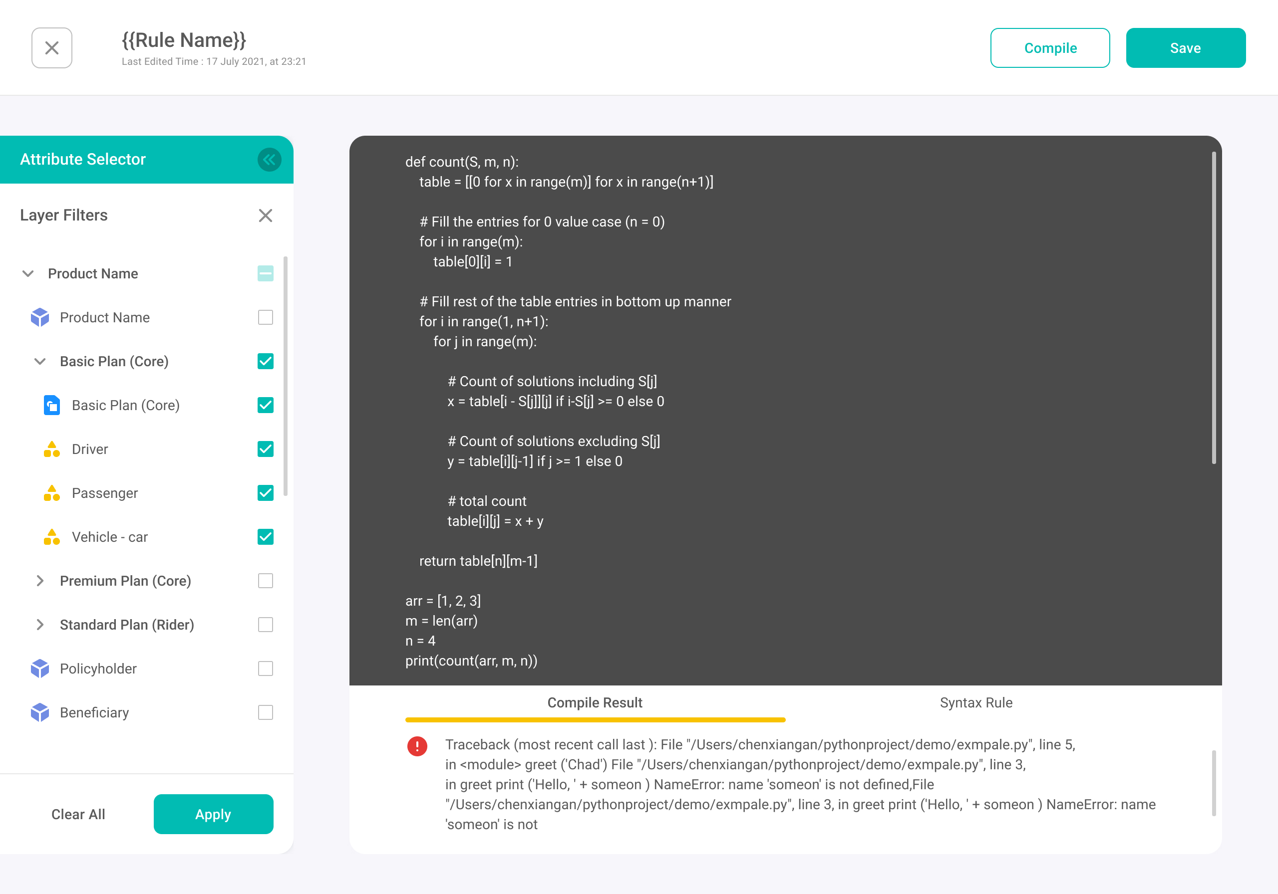
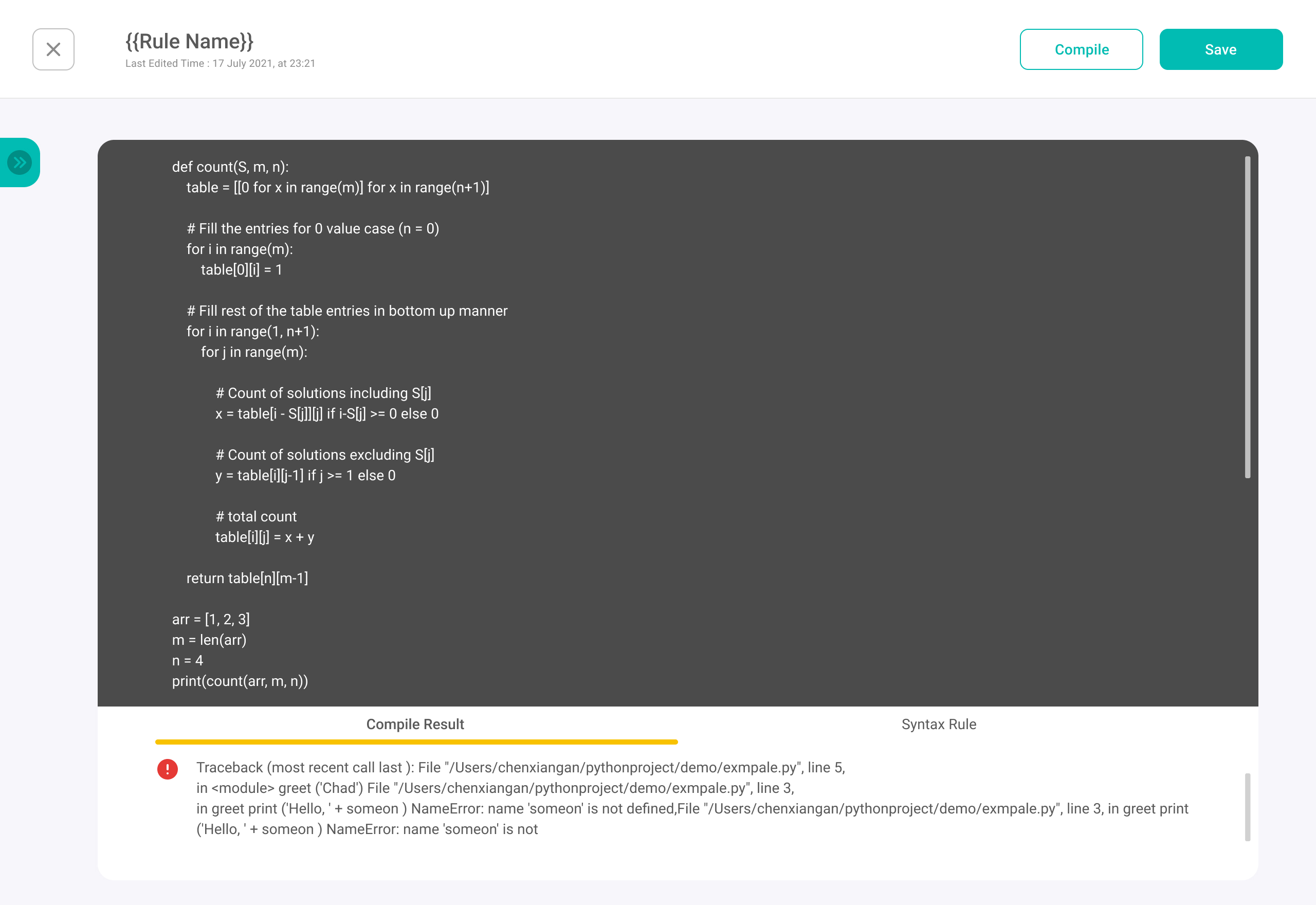
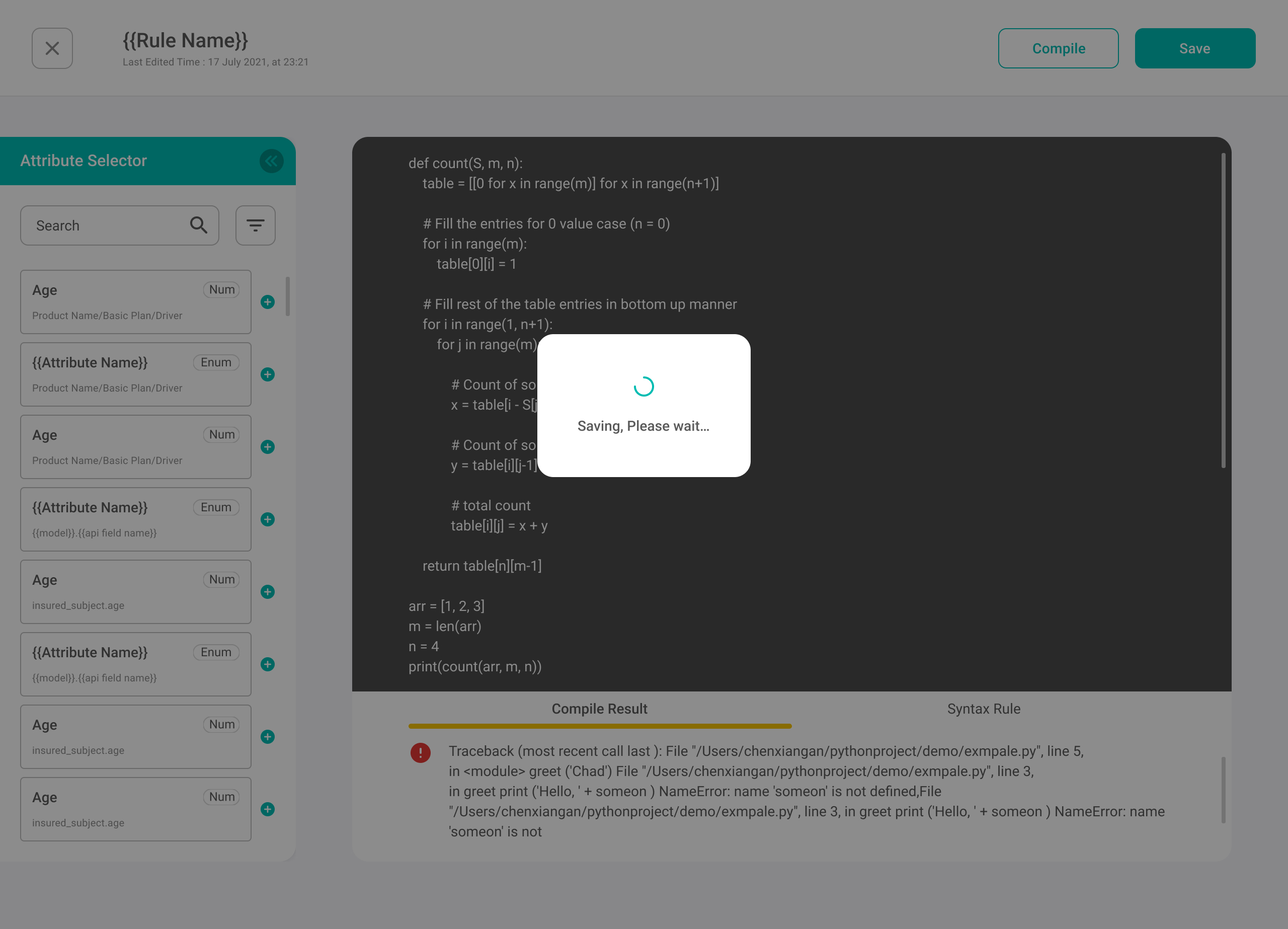
To support advanced rule authoring, I designed a dedicated workspace that still feels consistent with the rest of the platform. The UI needed to balance two modes: focused code writing and fast attribute discovery, while keeping feedback readable when errors occur.

Result
  • A consistent left-tools / right-content layout to match the platform’s Workbench structure and reduce context switching.
  • A collapsible Attribute Selector so users can expand it when searching for fields and collapse it to maximize editor focus.
  • Two discovery patterns: hierarchical layer filters for browsing and search + type cues (e.g., Num / Enum) for faster, safer selection.
  • Quick “add/insert” actions from the selector to reduce copy/paste and memory load when writing rules.
  • A dedicated feedback area with Compile Result (errors/logs) and Syntax Rule guidance, keeping debugging readable without leaving the page.
  • A dark editor surface paired with lighter surrounding UI to create a clear visual hierarchy and a familiar coding feel.
Cancellation & Refund Wizard

Design Rationale

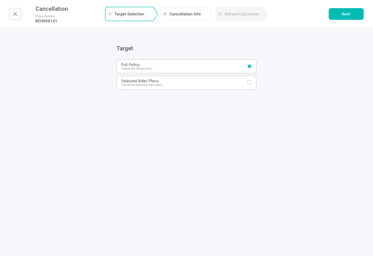
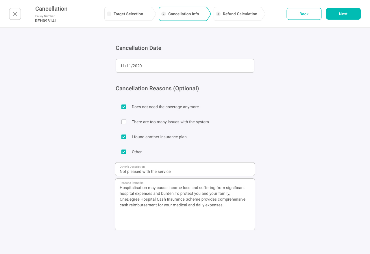
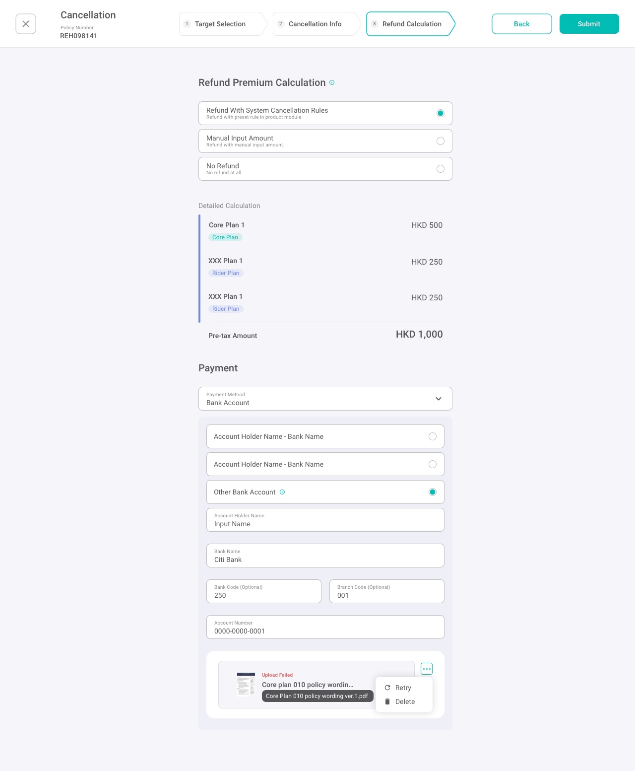
Cancellation is a high-stakes operation: a small mistake can cascade into incorrect refunds, billing updates, or document mismatches. I designed a step-by-step wizard to make decisions explicit, reduce cognitive load, and keep each step focused and reviewable—especially when users handle partial cancellations (rider plans) and rule-driven refund outcomes.

Result

  • Made risk-heavy actions safer with a clear 3-step flow
    Target Selection → Cancellation Info → Refund Calculation, with a persistent progress indicator so users always know where they are and what they’re about to confirm.
  • Used progressive disclosure to keep the UI lightweight
    The default screen stays minimal (full policy), and rider selection only appears when users choose partial cancellation—supporting fast scanning without losing verification capability.
  • Improved form completion accuracy through hierarchy and spacing
    A centered, single-column layout with clear grouping and “Optional” labeling guides attention to the fields that matter, reducing input errors under time pressure.
  • Built confidence before submission with a refund preview and breakdown
    Users can choose system rule / manual amount / no refund, then verify a plan-by-plan breakdown before totals—making calculation context and outcomes transparent.
🔎
More product module screens
Design System
Design Rationale

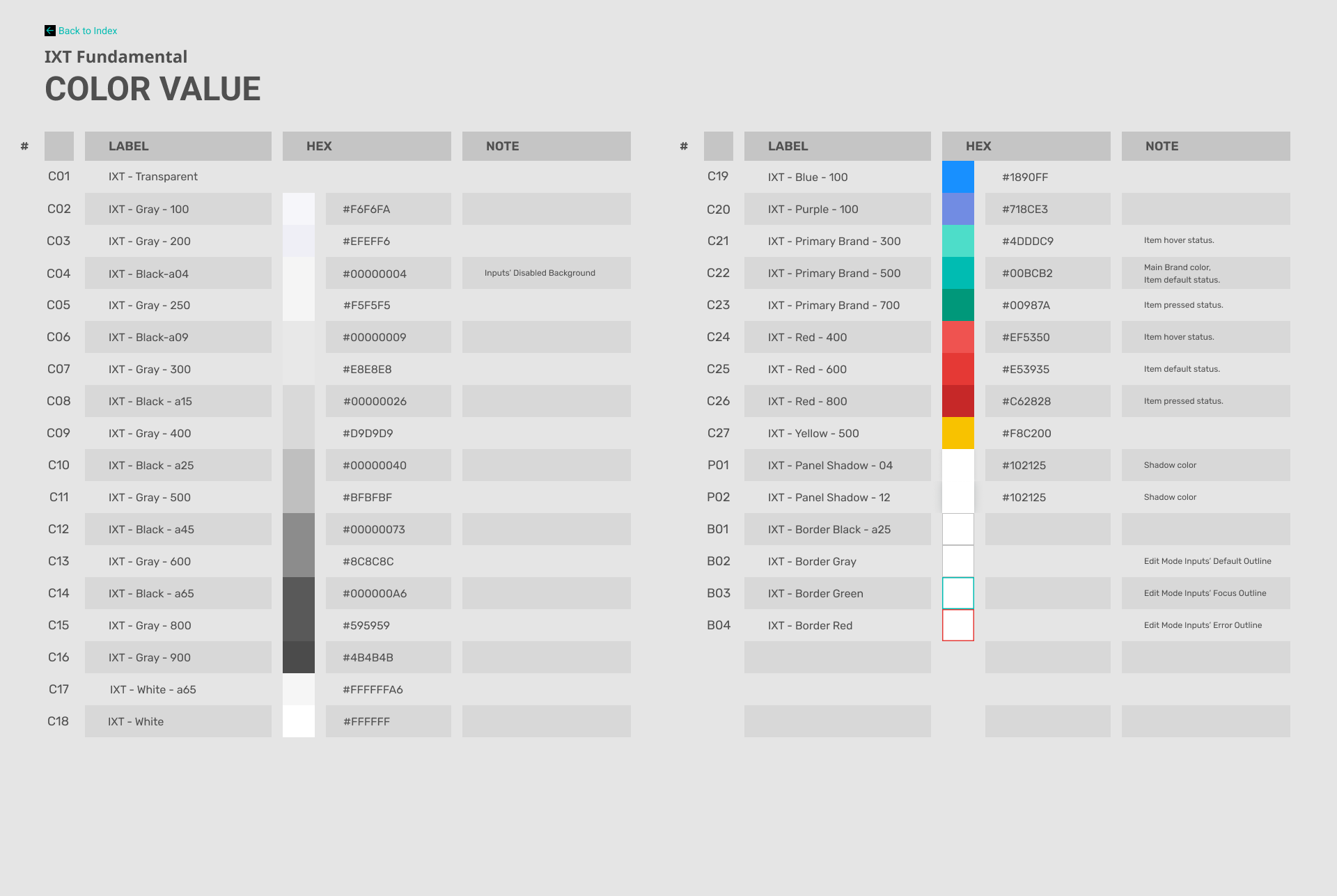
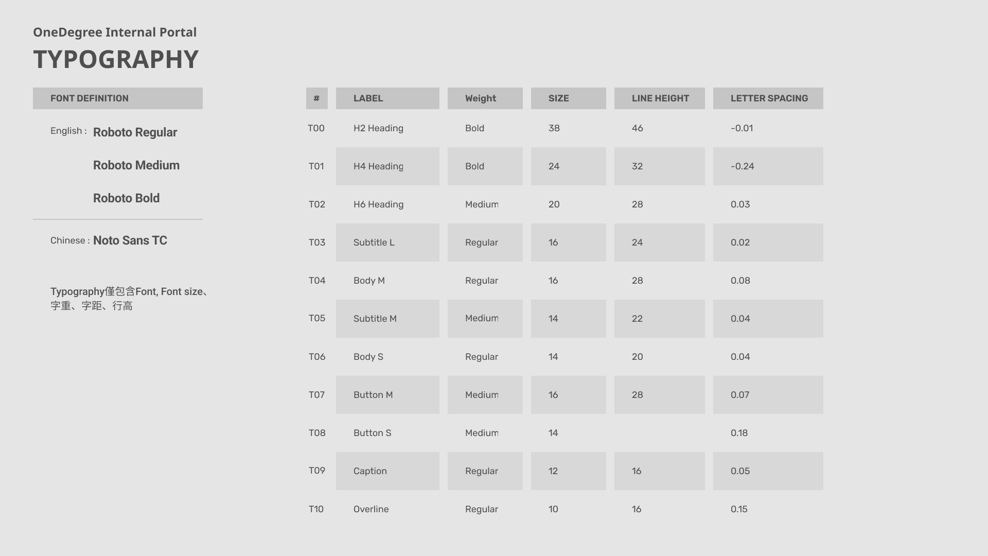
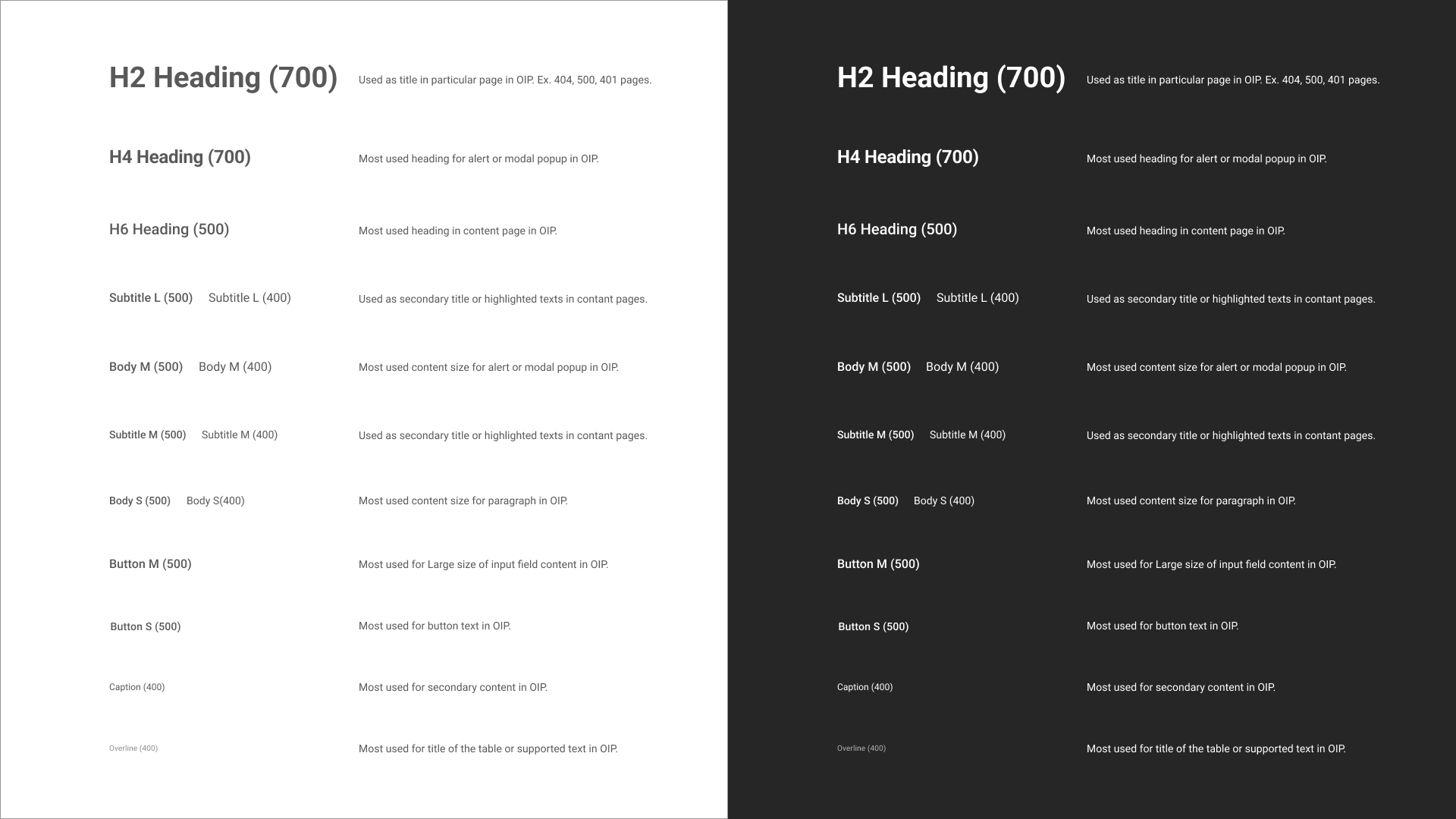
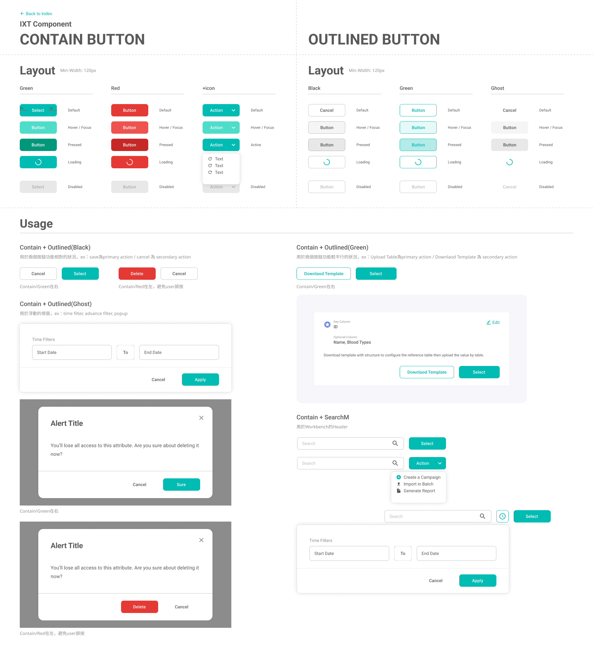
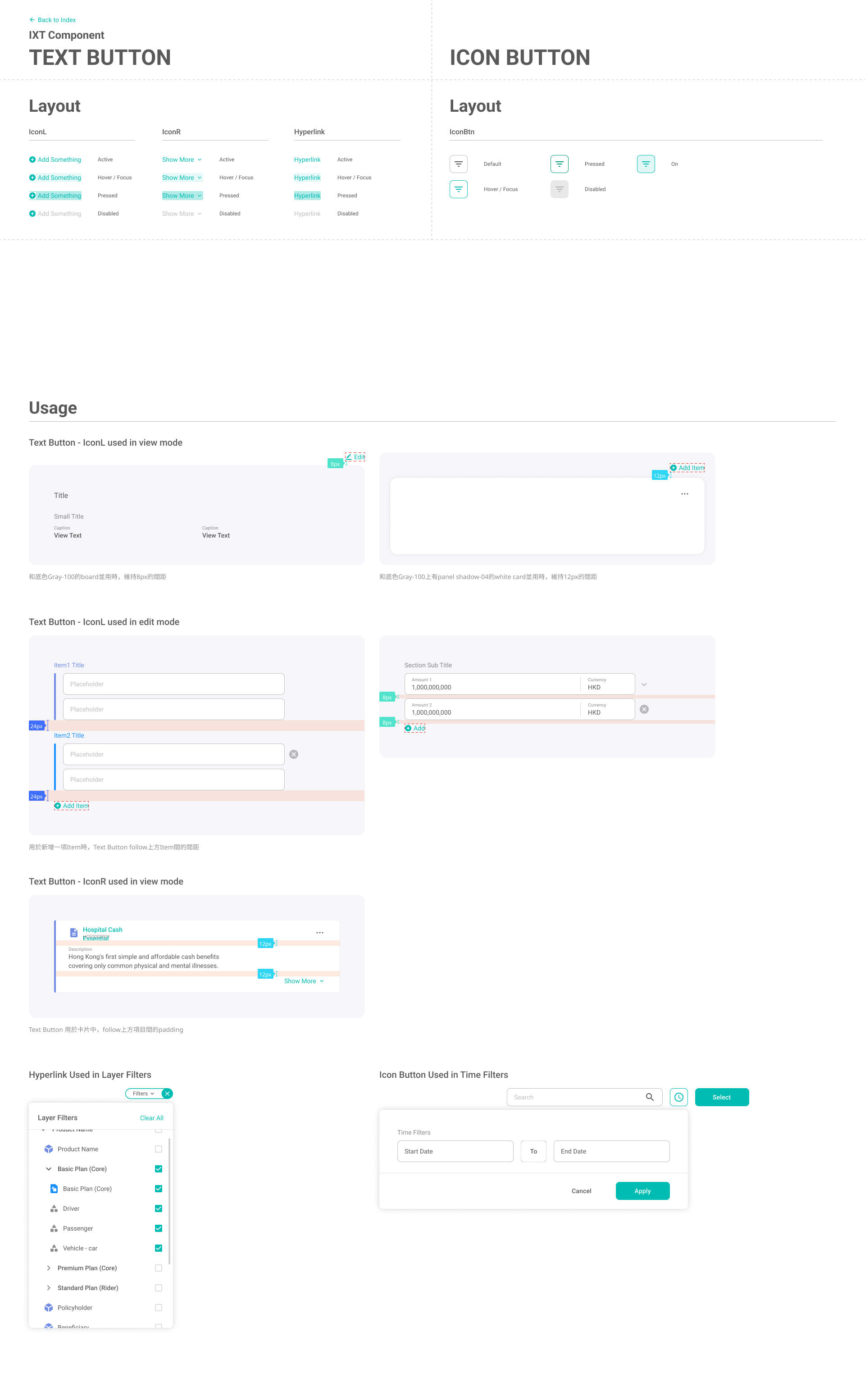
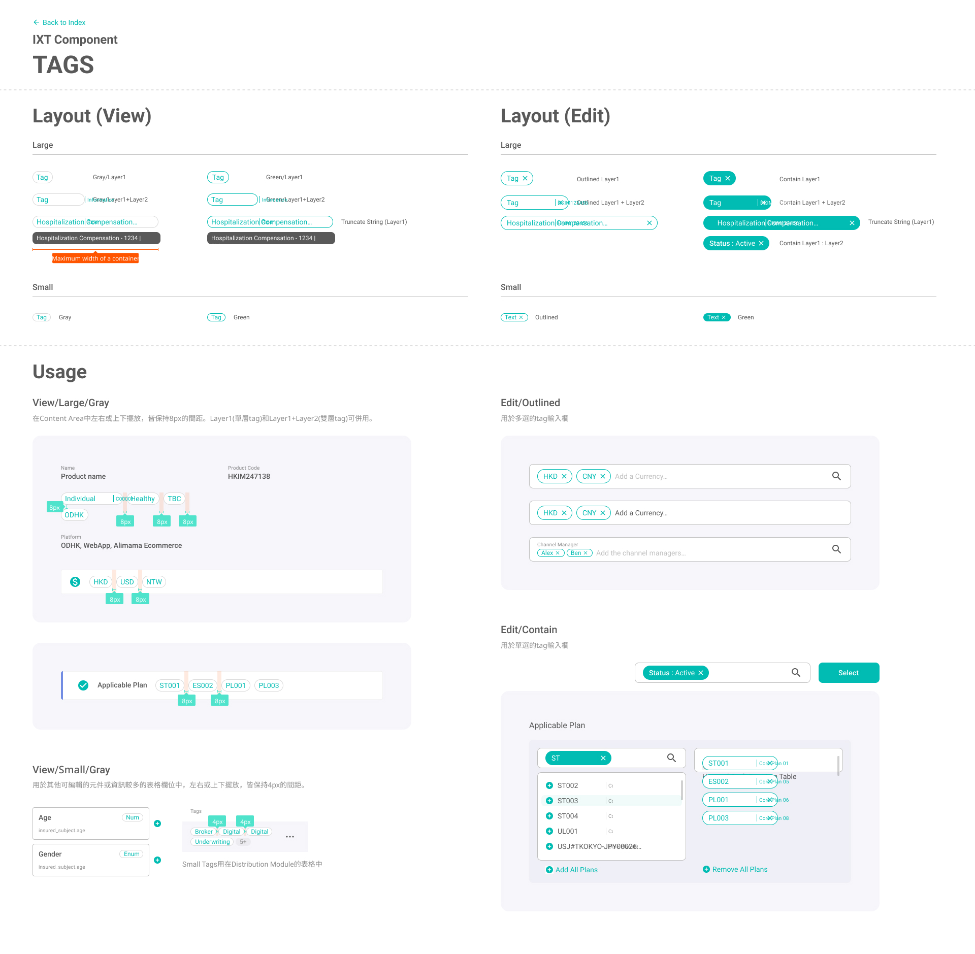
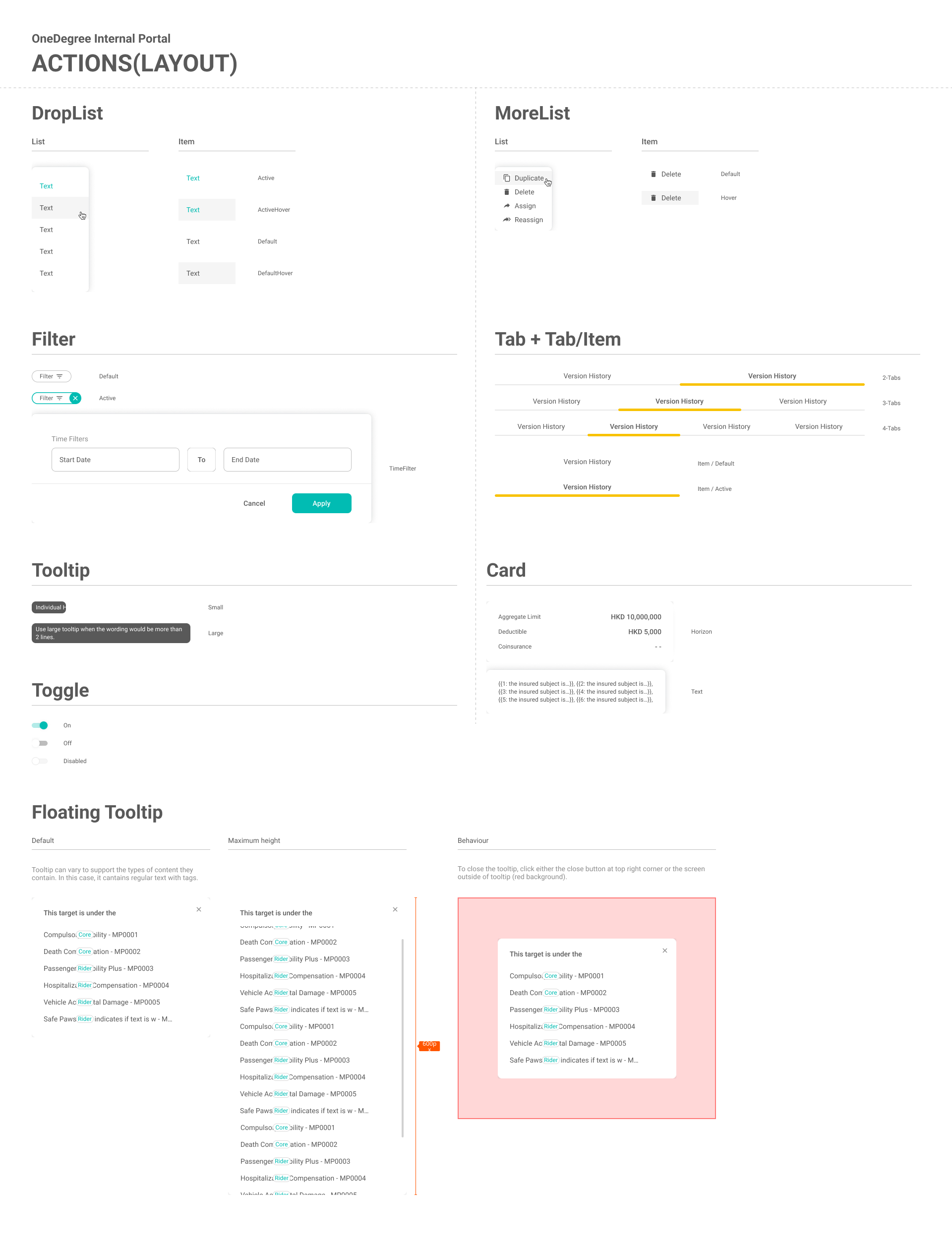
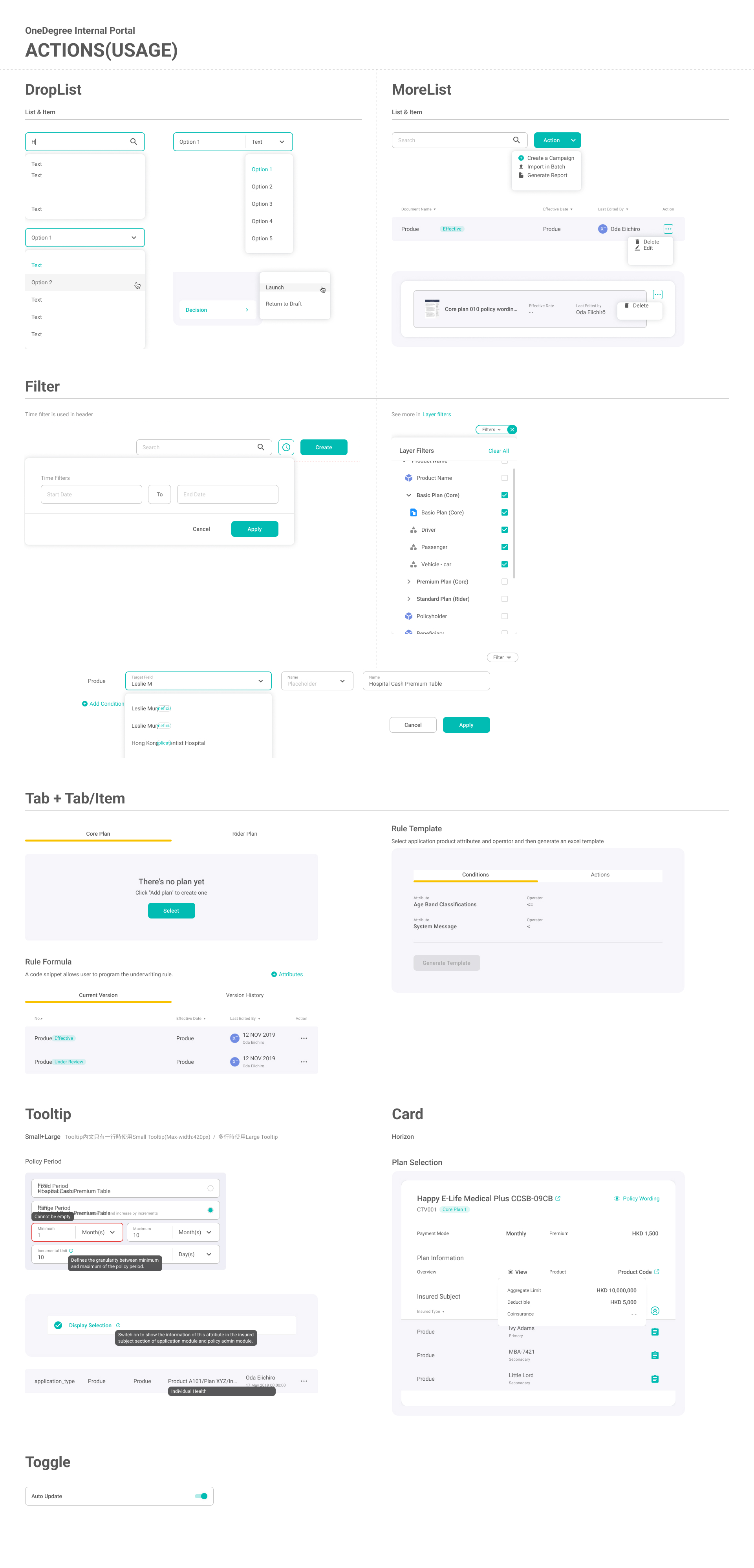
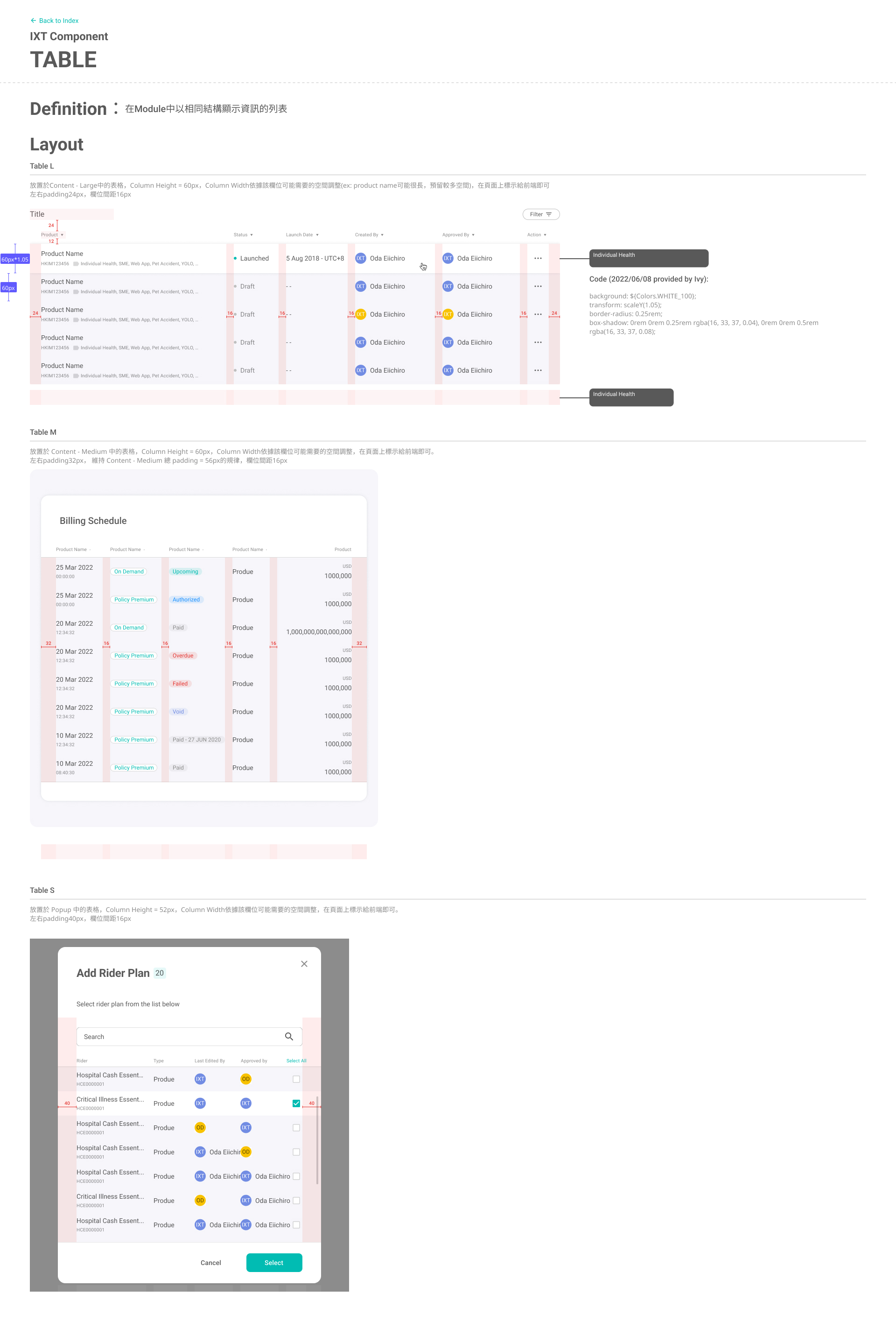
As the platform expanded across multiple modules and workflows, we needed a shared UI language that could scale without increasing design or engineering rework. I established a systemized visual foundation aligned with the corporate identity, then translated it into reusable rules for layout, typography, color, and interaction components—so teams could build new screens with consistent behavior and predictable implementation.

What it enabled
  • A system that mirrors real product structure
    Organized from global layout to reusable UI building blocks: Area → Fundamentals → Components & Patterns, making the guideline easier to navigate and apply in day-to-day production.
  • Cross-module consistency through shared layout and spacing rules
    Area-level definitions ensured navigation, headers, and content regions behaved consistently across workbenches, reducing relearning and preventing UI drift.
  • Reusable components that accelerate complex form building
    Components shipped with layout rules, states, and usage examples (e.g., fields, selection, dropdown + search), enabling teams to assemble workflows faster with fewer one-off designs.
  • Clear interaction rules that reduce handoff friction
    Documented patterns (selection behaviors, action placement, validation states) reduced interpretation gaps and supported predictable implementation as the platform evolved.
Part 3 - Component -
Part 4 - Pattern -

Outcomes & Insights

Working on IXT was an exercise in designing for complexity and constant change. As new functions were added, misalignment often surfaced—not because people lacked effort, but because rules, edge cases, and terminology evolved faster than shared understanding.

What I learned is that senior design impact is not limited to producing clean UI. It also means creating alignment mechanisms: clarifying decision principles, documenting interaction rules, and facilitating conversations that keep product, engineering, and operations moving in the same direction. In practice, this meant translating ambiguous requirements into reviewable flows, building reusable components to reduce repeated implementation effort, and using a shared design system to keep quality consistent as the platform scaled.

The project strengthened my ability to lead design in evolving systems—balancing usability, correctness, and delivery speed while keeping the team aligned on a clear product experience.